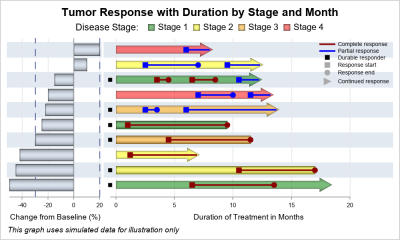
Author

Sanjay Matange
RSS
Director, R&D

Sanjay Matange is R&D Director in the Data Visualization Division responsible for the development and support of the ODS Graphics system, including the Graph Template Language (GTL), Statistical Graphics (SG) procedures, ODS Graphics Designer and related software. Sanjay has co-authored a book on SG Procedures with SAS/PRESS.

Data Visualization
Sanjay Matange 0
Stock chart

In the previous article on Getting Started with Vertical HighLow Plot, I described how we can use the HighLow plot to display the stock price by date.  The HighLow plot is specifically designed for such use cases as shown below. The data is downloaded from the Nasdaq web site, and

Data Visualization
Sanjay Matange 0
Lollipop Charts

Recently, while reading up on Wilkinson and Cleveland Dot plots, I saw this excellent article by Xan Gregg on the topic.  I also saw some interesting examples of Lollipop Charts, kind of a dot plot with statistics along with a drop line, maybe more suitable for sparse data.  I thought

Data Visualization
Sanjay Matange 0
Image backgrounds

As many of the regular readers of this blog know, SGPLOT and GTL, provide extensive tools to build complex graphs by layering plot statements together.  These plots work with axes, legends and attribute maps to create graphs that can scale easily to different data. There are, however, many instances where

Data Visualization
Sanjay Matange 0
Stem and Leaf plot

A Stem and Leaf plot is a visual that can help quickly visualize the distribution of the data.  This graph was particularly useful before the advent of modern statistical graphs including the Histogram and Box Plot.  One nice feature of the plot is it shows the actual values in the

Data Visualization
Sanjay Matange 0
Scatter with mean value

A frequently requested statistical graph is the scatter plot by with discrete categories along with mean value for each category.  Searching for a "Scatter with Mean" will return a lot of requests for such a graph in SAS, Stata, R and other statistical software. Such a graph is very easy

Data Visualization
Sanjay Matange 0
Category highlighting

When presenting information in form of a graph we show the data and let the reader draw the inferences.  However, often one may want to draw the attention of the reader towards some aspect of the graph or data.  For one such case, a user asked how to highlight one

Data Visualization
Sanjay Matange 0
Should we move to Ireland?

Recently, while browsing health care data, I came across the graph shown below.  The graph includes the healthy life expectancy at birth by countries in the EU, along with the associated per capita expenditure.  The graph also shows estimate of potential gain in life expectancy by increasing expenditure efficiency. The

Data Visualization
Sanjay Matange 0
Diagonal tick values

Fitting of long category values on a x-axis is usually a challenge.  With SAS 9.4, the SGPLOT procedure tries to fit the values by first splitting the values at white space to see if the values will fit in the space available.  This normally works well for a small number

Data Visualization
Sanjay Matange 0
Box plot legend

A grouped box plot created by SGPLOT VBOX / HBOX statement or GTL BOXPLOT statement will display groups within categories using group colors and puts the color swatches representing the group values in the legend.  This works well for a color graph created as shown below. title 'Distribution of Cholesterol

Data Visualization
Sanjay Matange 0
Getting Started with SGPLOT - Part 4 - Series Plot

This is the 4th installment of the Getting Started series.  The audience is the user who is new to the SG Procedures.  Experienced users may also find some useful nuggets of information here. Series plots are frequently used to visualize a numeric response on the y-axis by another numeric variable on

Data Visualization
Sanjay Matange 0
Funnel Graphs

Funnel graphs are useful to track the number of visitors passing through various pages of a website or the number of patients in a study.  The graph shows visually the retention of users or subjects in a study across levels of a marketing cycle or the study. One common representation

Data Visualization
Sanjay Matange 0
Scatter with box

Previously, I discussed ways to create a Box Plot with Stat Table and Markers in the linked article.  One of the graphs showed a Box Plot of Cholesterol by Death cause along with the display of the actual observations.  The main goal for that article was display of statistics with

Data Visualization
Sanjay Matange 0
Hotel Text

Yesterday, I published an article on Axis values display, where I mentioned the desire expressed by many users to get x-axis tick values in Hotel text orienttion.  The name comes from the way many hotel signs are displayed as shown on the right.  Such arrangement of text can also be very

Data Visualization
Sanjay Matange 0
Axis values display

Displaying nicely rendered axis values reduces clutter and makes the graph more readable.  With SAS 9.4, we added the ability for splitting x-axis tick values on white space to create a nice and readable x-axis as shown in the graph on the right. It is always a challenge to fit

1 2 3 4 10