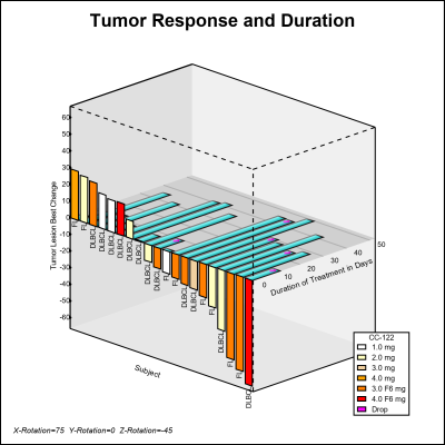
Author

Sanjay Matange
RSS
Director, R&D

Sanjay Matange is R&D Director in the Data Visualization Division responsible for the development and support of the ODS Graphics system, including the Graph Template Language (GTL), Statistical Graphics (SG) procedures, ODS Graphics Designer and related software. Sanjay has co-authored a book on SG Procedures with SAS/PRESS.

Data Visualization
Sanjay Matange 0
Coffee Recipes

For a long time, Starbucks represented to me as the good coffee cup, with me paying upwards of $4 for a Latte.  But on a recent visit to San Francisco, my son introduced me to a few other options. Philz crafts a great cup of java, with the barista making

Data Visualization
Sanjay Matange 0
Diagrams with curved links

Let us continue with our journey beyond standard plots and charts.  Often we need to create some simple diagrams to visualize the connections between different entities such as patients and providers or even a social network. Many of you may not have a custom tool to create diagrams.  But you have Base SAS, so

Data Visualization
Sanjay Matange 0
Infographics Bar Chart

Last week I posted an article on creating Infographics using SAS.   The interest shown by the SAS community in this topic came as a surprise.  Also, it so happened by coincidence, a SAS users also  called into Tech Support just about the same time with a query about creating  Infographics type graph

Data Visualization
Sanjay Matange 0
Infographics using SAS

Infographics are all the rage today.  Open any magazine or newspaper and we see data and numbers everywhere.  Often, such information is displayed by adding some graphical information to add context to the data.  A couple of good examples are Communicating numeric information, and Facts about Hot Dogs. Riley Benson, our UX

Data Visualization
Sanjay Matange 0
Legend Order

In the previous article on managing legends, I described the way to include items in a legend that may not exist in the data.  This is done by defining a Discrete Attribute Map, and then requesting that all the values defined in the map should be displayed in the legend. In

Data Visualization
Sanjay Matange 0
Legendary

Entries in a legend are populated automatically based on the data.  When creating a graph with group classification,  the display attributes for each bar are derived from the GraphData1-12 style elements from the active style. The graph on the right shows you the result of creating an adverse event timeline

Data Visualization
Sanjay Matange 0
Boxplot with connect

This blog post is motivated by a post by a user on the communities page about creating a box plot with colored boxes by category and multiple connect lines. Normally, a box plot can be drawn by category, with a single connect line for one of the statistical values of

Data Visualization
Sanjay Matange 0
Axis Customizations

All axis customization features are always welcome.  Especially since SGPLOT statements can often be used to create non standard graphs, having the ability to customize the axes is important.  This article presents ways in which you can customize the discrete axes. By default, the x axis will try to display the

Data Visualization
Sanjay Matange 0
Broken Axis Redux

Often when the data includes some extreme difference in measures or some outliers, the plot of the data points can get skewed due to the need to accommodate the extreme outliers.  The bulk of the observations get squeezed into a smaller region of the plot.  While this may be useful

Data Visualization
Sanjay Matange 0
Big Data Visualization

Big data is a popular topic, with multiple articles about the analysis of the same.  Today, "Big Data" is measured in multiple of Tera Bytes, and SAS provides special software for analysis and visualization of Big Data - Visual Analytics. When data is very big, it may be meaningless, let alone inefficient, to plot

Data Visualization
Sanjay Matange 0
Row Lattice Headers

The SGPANEL procedure makes it easy to create graph panels that are classified by one or more classifiers.  The "Panel" layout is the default and it places the classifier values in cell headers at the top of each cell. When using LAYOUT=Latice or RowLattice, the row headers are placed at

Data Visualization
Sanjay Matange 0
Bubble Plots

Bubble Plots provide additional ways to visualize your data.  The plot supports display of multiple response characteristics of the data in one graph.  Bubble plots were introduced with SAS 9.3 in GTL and SG Procedures. A bubble is drawn at each (x, y) point in the graph, and each bubble is

1 2 3 4 5 6 10