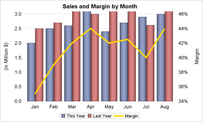
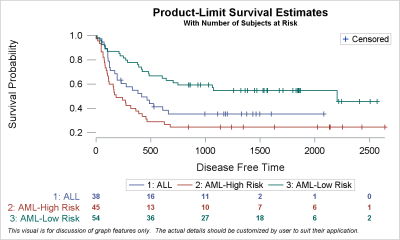
Author

Sanjay Matange
RSS
Director, R&D

Sanjay Matange is R&D Director in the Data Visualization Division responsible for the development and support of the ODS Graphics system, including the Graph Template Language (GTL), Statistical Graphics (SG) procedures, ODS Graphics Designer and related software. Sanjay has co-authored a book on SG Procedures with SAS/PRESS.

Data Visualization
Sanjay Matange 0
Is that Annotate?

The SGPLOT procedures includes features to add annotations to your graph in many different ways.  Annotations provide you a flexible way to add features to your graph that are not available through the standard plot statements. Recently, I saw this graph on the web that caught my attention.  Clearly, this looks like

Data Visualization
Sanjay Matange 0
Report from PharmaSUG 2015

PharmaSUG 2015 in Orlando was held at the Renaissance had a record breaking attendance of over 650.  Weather was great, except for a huge downpour on the evening of the last day.  All the popular presenters were in attendance including Art Carpenter, Kirk Lafler, Arthur Li and many others. Presentations

Data Visualization
Sanjay Matange 0
Report from SGF 2015

SGF 2015 was a blast with a focus on Visual Analytics, SAS Studio, Hadoop and more.  Graphs were everywhere, and it was a banner year for ODS Graphics with over 15 papers and presentations by users on creating graphs using SG Procedures, GTL and Designer. Dan Heath, Prashant Hebbar, Scott

Data Visualization
Sanjay Matange 0
Micro Maps

MicroMaps are a powerful way to display data where the display includes small, lightweight maps to provide geographical information regarding the data.  This geographical information gives clues to the relationship between the data that could lead to more insight. The SAS SG Procedures and GTL do not currently have built-in

Data Visualization
Sanjay Matange 0
Sankey Diagrams

Sankey Diagrams have found increasing favor for visualization of data.  This visualization tool has been around for a long time, traditionally used to visualize the flow of energy, or materials.   . Now to be sure, GTL does have a statement design for a Sankey Diagram which was implemented only in Flex for use

Data Visualization
Sanjay Matange 0
Margin Plots

Last week a user wanted to view the distribution of data using a Box Plot.  The issue was the presence of a lot of "bad" data.  I got to thinking of ways such data can be visualized.  I also discussed the matter with our resident expert Rick Wicklin who pointed

Data Visualization
Sanjay Matange 0
Cancer Deaths Averted

Significant progress in reduction of Cancer mortality is shown in a graph that I noticed recently on the Cancer Network web site.  This graph showed the actual and projected cancer mortality by year for males.  The graph is shown on the right. The graph plots the projected and actual numbers

Data Visualization
Sanjay Matange 0
Displaying Unicode Symbols in Legend

Including special Unicode symbols into the graph is getting more popular.  In general, SG procedures support Unicode strings in places where these strings are coded into the syntax such as TITLE, FOOTNOTE.  These support Unicode characters and also the  special {SUP} and {SUB} commands.  This is because these statements are rendered

Data Visualization
Sanjay Matange 0
Marker Symbols

There has been much discussion on the SAS Communities page on usage of different symbols in a graph.  The solutioin can vary based on the SAS release.  New features have been added at SAS 9.4 releases to SG Procedures and GTL that make this very easy.  With SAS 9.4M1, almost any combination is

Data Visualization
Sanjay Matange 0
Custom Labels

Over the Christmas Holidays I saw an graph of agricultural exports to Russia in 2013.  The part that caught my eye was the upper part of the graph, showing the breakdown of the trade with Russia as a horizontal stacked bar with custom labels. The value for each region / country

Data Visualization
Sanjay Matange 0
Graph Table

A common scenario is where we have a table of multiple measures over time. Here we have a simple example of Frequency and Response by Day.  The Response is a linear function of the Frequency, as shown in the table on the left below. The  shape of the data is

Data Visualization
Sanjay Matange 0
Fun with Bar Charts

As Sheldon Cooper would say, this is the first episode of "Fun with Charts".  I did not find a cool term like "Vexillology" and "Cartography" is taken by map making, so let us go with "Chartology". Yesterday, I saw a couple of interesting bar charts as shown on the right.  I thought

Data Visualization
Sanjay Matange 0
Clinical Graphs

This week I had the opportunity to present a 1/2 day seminar on creating clinical graphs using the SG procedures during an In-House SAS Users' group meeting.  I have presented this seminar quite a few times now, and I always learn something. The audience was very receptive, with some people

Data Visualization
Sanjay Matange 0
Axis Thresholds

Have you ever wondered why sometimes a SGPLOT or GTL graph has markers drawn beyond the extreme tick and value on an axis and sometimes not?  And, if you prefer your graphs to always have tick values on the axis that cover the whole range of data, how can you

Data Visualization
Sanjay Matange 0
Bar with Statistics

One of the key benefits of using a horizontal bar chart is the ability to display statistics for each bar.  This is a popular feature for the HBAR statement with the SAS/GRAPH GCHART procedure.  So, let us review the options available to us to create such graphs using SGPLOT. The

Data Visualization
Sanjay Matange 0
Likert Graphs

Just this morning I received a request for a brief survey from Apple on my feedback about the new iPhone6+.  Yes, I finally got one, dead last in the family.  The survey followed the usual format, with a number of questions on what I like or dislike about it, with

Data Visualization
Sanjay Matange 0
Report from MWSUG 2014

The Mid-West SAS Users' Group conference in Chicago was a great success, with over 400 attendees and great weather.  The conference hotel was in downtown with nice view of the river and a stroll down "Magnificent Mile".  The city does a great job with the flower beds down Michigan Ave., along

Data Visualization
Sanjay Matange 0
CandleStick Chart

A HighLow plot is very popular in the financial industry, often used to track the periodic movement of a stock or some instrument or commodity.  The CandleStick Chart is one specific type of high low plot, purportedly originating in Japan for tracking of financial instruments in the rice trade. Creating a

Data Visualization
Sanjay Matange 0
Splines

Many users of SGPLOT and GTL know how to mix and match various plot statements to create graphs, sometimes in ways not originally intended.  You are also aware that you can go a step beyond, and use these systems to create completely non-standard graphs such as the Spiral Plot, the Polar

Data Visualization
Sanjay Matange 0
PharmaSUG-China 2014

The Third PharmaSUG-China conference was held in Beijing last week, and I had the pleasure to attend this excellent conference along with a record number of attendees. On Thursday, I presented two 1/2 day seminars on ODS Graphics.  One titled "Advanced Topics in GTL" and another titled "Complex Clinical Graphs

Data Visualization
Sanjay Matange 0
Binary Response Graph

Often we need to plot the response values for binary cases of a classifier.  The graph below is created to simulate one seen at http://www.people.vcu.edu/ web site of the shock index for subjects with or without a pulmonary embolism.  In this case, the data is simulated for illustration purposes only. There

1 3 4 5 6 7 10