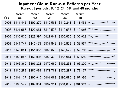
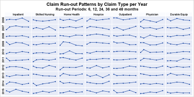
Author

Sanjay Matange
RSS
Director, R&D

Sanjay Matange is R&D Director in the Data Visualization Division responsible for the development and support of the ODS Graphics system, including the Graph Template Language (GTL), Statistical Graphics (SG) procedures, ODS Graphics Designer and related software. Sanjay has co-authored a book on SG Procedures with SAS/PRESS.

Data Visualization
Sanjay Matange 0
Two-in-one Graphs

A large variety of graphs fall in the category of what I call a "Single-Cell" graph.  This type of graph consists of a single data region along with titles, footnotes, legends and other ancillary objects.  Legends and text entries can be included in the data area.   The data itself is displayed

Data Visualization
Sanjay Matange 0
Broken Axis

In my previous post I described the new Polygon plot statement that is included with the SAS 9.4M1 release.   So, a valid question is - what is my motivation for discussing the new features in SAS 9.4M1 when most users are at SAS 9.3 or SAS 9.2 versions?  Here are a

Data Visualization
Sanjay Matange 0
New Polygon Plot

The SAS 9.4 Maintenance 1 release is now shipping to users. This is great news for GTL and SG procedures users as this release includes some useful new features. Some of these are in direct response to your requests, and others are enhancements that we think you will come to like.

Data Visualization
Sanjay Matange 0
Survey Charts

Often we have situations where the category values on the graph have long character strings.  This is often the case when graphing survey responses to questions.  The questions may be sentences, sometimes moderately long. With SAS 9.4, GTL and SG now support the ability to display tick values split over

Data Visualization
Sanjay Matange 0
Graphs at WUSS - Part 2

Last week I covered some of the interesting graph-related papers presented at WUSS.  There were quite a few, so I broke up the report into two parts.  Here is the second installment. In the paper  Creating Graphical Patient Profiles using SAS by William Garner of Gilead Sciences, the author describes how to create

Data Visualization
Sanjay Matange 0
Graphs at WUSS - Part 1

It is always a pleasure to attend SAS user conferences, regional conferences and in-house events.  In addition to presenting papers, seminars and super demos to the attendees myself, my favorite activity is to attend presentations by users that include graphical data visualization.  These include using SG procedures, GTL, Designer or SAS/GRAPH.  This year

Data Visualization
Sanjay Matange 0
R U Graphing with SAS?

In recent conversations with many SAS users at NESUG, SESUG and WUSS, a pattern emerges on the question of creating graphs with SAS or R.  Many SAS users are aware of the new graph features in SAS that create high quality graphs with minimum fuss.  But, many have not actually used

Data Visualization
Sanjay Matange 0
Comparative Histograms

In reference to a previous article on Violin Plots, a reader asked about creating comparative mirrored histograms to compare propensity scores.  While I had my own understanding of "Mirrored Histograms", I also looked this up on the web.  Google showed many cases of two histograms back to back, either horizontally or vertically. 

Data Visualization
Sanjay Matange 0
Healthcare.gov numbers

Working at SAS, I consider myself fortunate to have the best employee benefits in the industry.  That is one of the factors placing SAS as one of the best companies to work for worldwide, and often THE best company to work for in USA. Given that, I was curious to know the kind

Data Visualization
Sanjay Matange 0
Schedule Chart

Last week Bruno asked about creating a Schedule Chart using SG Procedures.  To me, such projects are very interesting and challenging...How much mileage can we get out of the current set of SGPLOT procedure features to create a visual that was not part of the original requirements? The clear choice for

Data Visualization
Sanjay Matange 0
Visual Index

Some of you may have already noticed the small graphical icon on the lower right side of the blog article labeled "Graphically Speaking Index".   Yes, it is a link to a visual index for all articles published in this blog.  Well, eventually it will have all the articles. So far, I

Data Visualization
Sanjay Matange 0
Graphics with SAS Web Editor

Recently, SAS released SAS Solutions OnDemand for academics.  An academic user who is signed up for this can use the SAS Web Editor application to do all their data analysis over the web using a hosted server at SAS.  This frees up the user from having to install the software on their own computers,

Data Visualization
Sanjay Matange 0
Video says it better

SAS 9.4 was released a month ago, and we are excited about all the new features in SG Procedures, GTL and Designer.  I wrote an article on SAS 9.4 graph features last month, and promised more to come. What then could be better than this Tech Talk video hosted by our

Data Visualization
Sanjay Matange 0
Customizing Plot Appearance

The graphs produced by the SG procedures (and GTL) have a default look and feel designed for the common use cases.  However, everyone has a preference for some special features that make the graphs unique.  Fortunately, extensive customizations can be made to graphs produced by these tools using statement and

Data Visualization
Sanjay Matange 0
Schematic Plot

Recently a user chimed in on the SAS Communities page, requesting a way to add some observation level annotation to a box plot.  Wendy was delighted to see a graph created by the UNIVARIATE procedure called "Schematic Plot".  In this graph, the box plot of the analysis variable is shown with

Data Visualization
Sanjay Matange 0
BarLine Graphs

A Bar Line graph is commonly used in many domains.  The SGPLOT procedure makes it easy to create bar line graphs where the user can customize it in many different ways.  This post is prompted by a recent question on the communities page on creating such a graph, with one bar and

1 5 6 7 8 9 10