The SAS 9.4 Maintenance 1 release is now shipping to users. This is great news for GTL and SG procedures users as this release includes some useful new features. Some of these are in direct response to your requests, and others are enhancements that we think you will come to like.
One new feature that falls in the second category is the new POLYGON plot. This is a "hybrid" plot that has the properties of a plot statement and Annotate. As a plot statement, it can be inserted anywhere in the sequence of plot statements as you are familiar with. So the graphics rendered by this plot will interleave between other plots. However, as the name of the plot suggests, you can draw simple (or complex) polygons defined by you. This will really open up the variety of graphs you can create. We will investigate many such plots in the next few blog article. If you like annotate, you will love this plot.
Simply put, you can draw polygons defined in either interval or categorical data space. The polygon is defined just like you would a SERIES plot. Each polygon has an ID, an X and a Y variable. X and Y can be numeric or discrete. The data set shown below defines two polygons with ids of 'X' and 'Y'. 'X' has a hole.
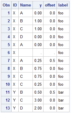
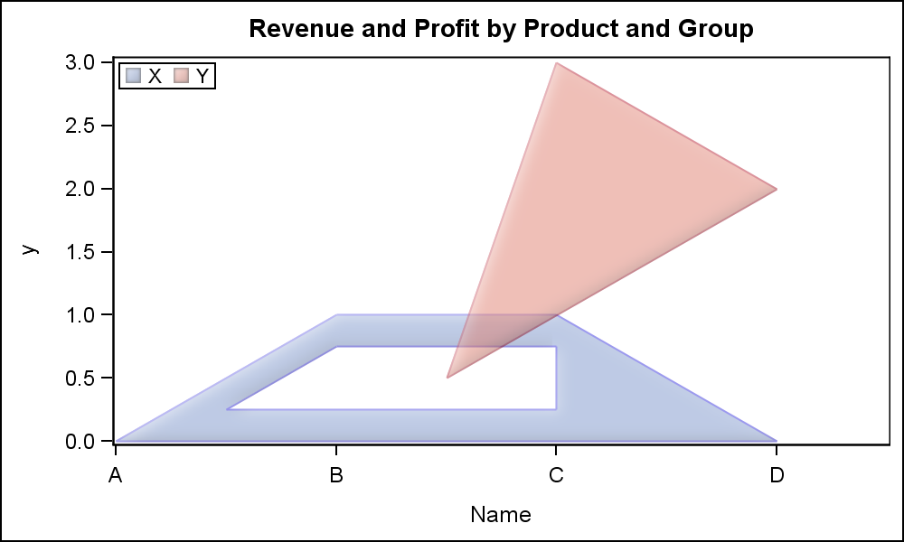
Here is the resulting graph. Note, the X variable is Name and is discrete and the Y variable is Y and is numeric. Data values that are discrete can have discrete offset for each obs, both in X and/or Y. This is like DiscreteOffset, but for each individual vertex. Note the lower vertex of the pink polygon is half way between B and C on the X axis. This can be a very useful feature. Click on the graph to see a higher resolution image.
Here is the SAS 9.4M1 code:
proc sgplot data=poly; polygon id=id x=name y=y / xoffset=offset group=id fill outline dataSkin=matte fillattrs=(transparency=0.5); keylegend / location=inside position=topleft; run; |
As you probably realize, this plot statement can be used in many, many creative ways to build your graph. In this article, we will examine how you can build an Area Bar Chart, where the X and Y axis are both numeric, and each bar width is proportional to a response variable. Of course, we have to do a little bit of work to create the polygons as needed.
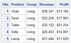
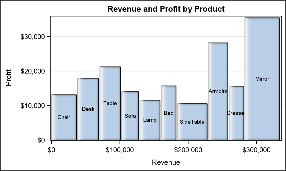
Here is some data on Revenues and Profits by Product. This is just made up data. Here is what the data set looks like:
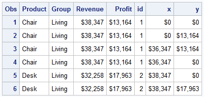
 From this data, we build a polygonal bar for each observation. The width of each bar is the Revenue for the observation, and the bar is placed to the right of the previous one on the X axis. The height of each bar is the Profit on the Y axis. See code in program to build this data set. Once done for all obs, the X dimension will represent the sum of all the revenue values.
Here is the graph created using this data and the Polygon plot using the SGPLOT procedure. Click on the graph for a higher resolution image.

SAS 9.4 M1 SGPLOT code:
proc sgplot data=areabar; title 'Revenue and Profit by Product'; polygon id=id x=x y=y / fill outline; yaxis offsetmin=0 grid label='Profit'; xaxis label='Revenue'; run; |
Polygons can have labels, and the labels can be drawn in many different locations, positions and orientation. Here are some examples. Code for all cases is shown in the attached file.

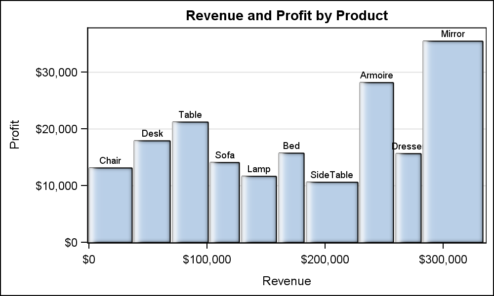
SAS 9.4 M1 SGPLOT code:
proc sgplot data=areabar; title 'Revenue and Profit by Product'; polygon id=id x=x y=y / fill outline dataskin=gloss label=product labelpos=ymax rotatelabel=vertical; yaxis offsetmin=0 grid label='Profit'; xaxis label='Revenue'; run; |
Here are some key features of this plot statement:
- A polygon is defined just like a SERIES plot, with a sequence of observations having the same ID.
- Each vertex can have numeric or discrete axis values.
- Each discrete value for a vertex can have an X and/or Y discrete offset.
- Polygons can have holes, indicated by missing X and Y values.
- Polygons can have label which is displayed at the bounding box center of polygon by default.
- Labels can be positioned inside the polygon, outside the polygon bounding box, or outside the axes.
- Labels can be horizontal or vertical.
- Each polygon can be rotated around its bounding box center.
- For rotated polygon, label can only be at center, but is also rotated.
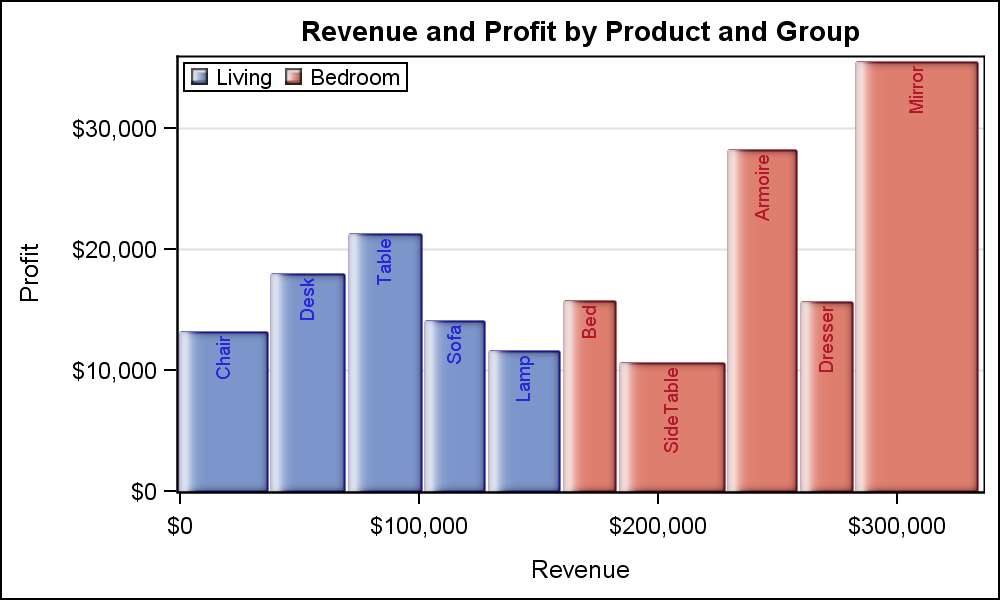
Here is the same graph grouped by the Product Group. Note by default, the polygon labels use the contrast color attribute of the fill color. But, you can override this to use a fixed color. Legends are generated automatically as for other plots. In the graph below, we are still using rotated labels at the top of each polygon.
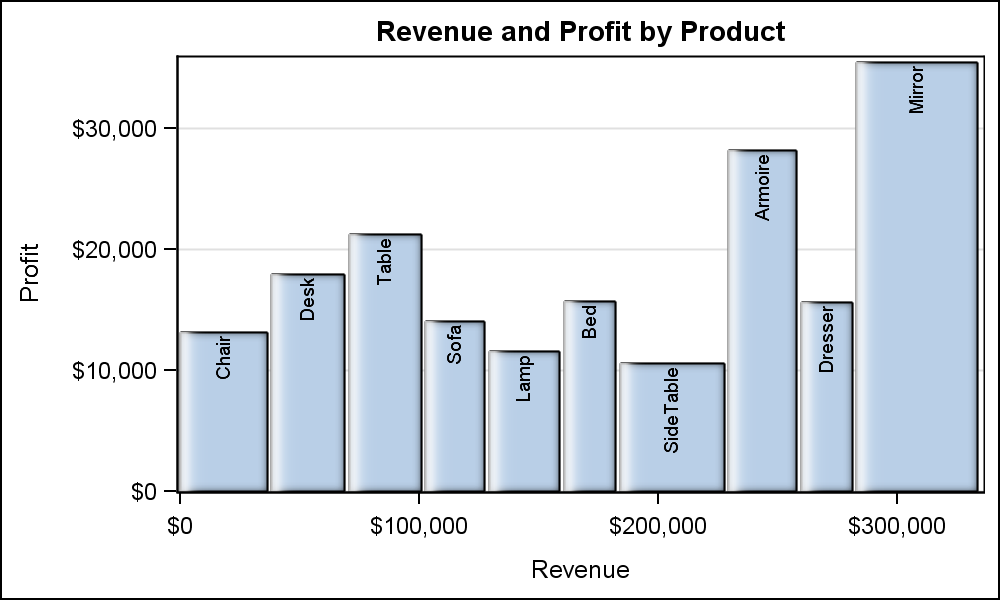
Here the label is a compound string made up of the product and its revenue. The label is shown at the top of the bar, using the default Split character.

As you can see, the POLYGON plot is a very versatile statement that will allow you to really customize your graph. Yes, you will need to generate the polygon vertices. The overlay axes recognize the data extents, and will union them with values from other plot statements. Legends are automatically generated. The plot will support both discrete and range attribute maps. The possibilities are endless.
Clearly, you can create maps using this statement. I will describe that use cases in a subsequent article. In the meantime, see if you can use the data from the MAPS library with this statement to create simple maps.
Full SAS 9.4 M1 Code: Polygon


6 Comments
I know the point of the post is to illustrate the versatility of the polygon statement, but I found myself far more interested in the pseudo mosaic plot you've created (it isn't quite a pseudo double-decker plot as the products are not common to each group).
Is there a straightforward way when presenting a continuous outcome as a function of a categorical one (e.g., a bar chart), to make a given category's bar width be a function of its proportion of the categorical variable? (e.g., if Category A is 30% of the data then it's vertical bar occupies 30% of the plots width).
You are absolutely right, James. Instead of showing a totally hypothetical example, I created a BarChart showing a continuous response by category, in this case Revenue as bar width in addition to retaining the traditional response as bar height. I intentionally did not go for a Mosaic plot example as such a plot statement is available in GTL (SAS 9.3M2), called MOSAICPLOTPARM. Look for MOSAICPLOTPARM under "Plot Statements".
The MOSAICPLOTPARM plot displays the frequency distribution across multiple categorical variables listed in the CATEGORY=(list) parameter. The COUNT parameter can be frequency, or whatever you decide to represent. It can support up to 3 categorical variables. It is a "PARM" statement, so the actual response values have to be pre-computed using PROC FREQ or SUMMARY or your own data step.
Here, my intention is to describe the new POLYGON plot, and how it can help you overcome features not fully supported in GTL or SG. Normally, a plot statement operates at a higher level, creating polygons from more abstract data for BarChart or BubblePlot. The new POLYGON plot statement operates at a lower level, rendering polygons provided by you the user. This is like Annotate, except that Annotate operates as a post process, and the graph creating system does know about the graphical objectes rendered by Annotate. Polygon plot operates like a "Plot" statement, so the graphing system is fully aware of the data, and incorporates the polygon data into the X and Y axis computations, creation of legends, and interfacing with Discrete and Range attribute maps. Polygon plot also renders the graphics in the correct plot order.
Sanjay, I am aware of mosaicplotparm (though I can't actually use it since I only have SAS 9.3M1 and this won't change any time soon), but I'm not sure it would actually do what I want, i.e., let the spine of y axis present continuous values instead of categorical proportion (in the context of mosaic plots, the axes are usually referred to as spines and an alternate name for mosaic plots is spine plots - generally used when proportion from 0 to 1 are labeled tick values).
That's why in my previous post I called it a pseudo-mosaic plot; I'm really asking for a bar chart where category / group proportion are valid values for the barwidth and the clusterwidth options - as this is what you've effectively done in your polygon example (given the way my organization rolls out sas releases,it may be years until I have access to 9.4 - not your fault, of course, it's just the nature of how sas updates work, i.e., effectively being entirely new versions that require completely new installations. Again, none of this is to say I don't appreciate learning about new features.
I understand there is a delay in adopting new releases for many users. This is primarily an indicator of on going development. Cheers!
Pingback: Broken Axis - Graphically Speaking
Pingback: Create a map with PROC SGPLOT - The DO Loop