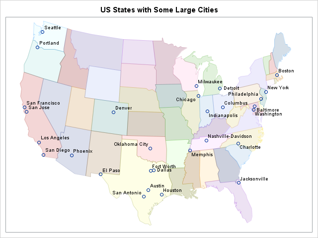
Did you know that you can use the POLYGON statement in PROC SGPLOT to draw a map? The graph at the left shows the 48 contiguous states of the US, overlaid with markers that indicate the locations of major cities. The plot was created by using the POLYGON statement, which was introduced in SAS 9.4m1.
The POLYGON statement is a versatile and powerful statement. My colleague Sanjay Matange has shown how to use the POLYGON statement to create custom plots such as a variable-width bar chart. He has also shown how to use the POLYGONPLOT statement in the Graph Template Language (GTL) to create panels of maps, and he mentioned that the POLYGON statement in PROC SGPLOT acts similarly.
Identifying polygons
You need to look carefully at Sanjay's program to see how he constructs an ID variable that identifies each polygon. For map data, it is common for regions to be defined in a nested hierarchical manner. For example, the MAPS.US data set that is distributed with SAS/GRAPH software has two variables (STATE and SEGMENT) that together define the polygons that make up the map of US states. (For example, Michigan has two segments that correspond to Lower Peninsula and the Upper Peninsula.) Sanjay uses a standard trick that concatenate multiple variable values into a single ID variable, and uses the concatenated values to identify each polygon.
Because the MAPS.US data set is sorted by the STATE and SEGMENT, you can generate an ID variable without using concatenation. Instead, you can use BY-group processing to generate an ID variable for each polygonal segment. The following DATA step defines the PolyID variable and increments its value every time a new segment is encountered. The PolyID variable is specified on the ID= variable in the POLYGON statement in order to create a graph of the regions in the data set:
data US; set maps.US; where StateCode NOT IN ("AK", "HI", "PR"); by State Segment; if first.Segment then PolyID+1; /* create ID variable for polygons */ run; ods graphics / antialiasmax=1500 labelmax=1500; /* enable anti-aliasing and labels */ title "Outline of 48 US States"; proc sgplot data=US; polygon x=x y=y ID=PolyID / fill outline; run; |
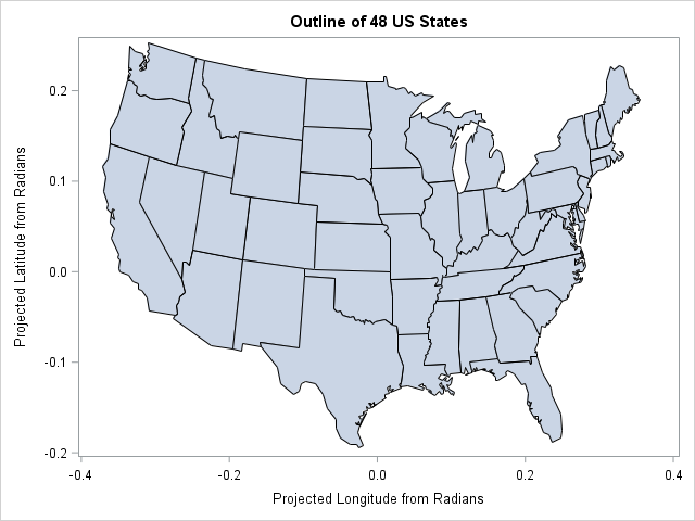
Notice that the MAPS.US data set uses projected radians as the coordinates for the state boundaries. You can multiply these values by 180/π to convert to degrees. You can use the GPROJECT procedure in SAS/GRAPH software to project data sets that provide longitude and latitude variables.
Overlays on polygon plots
You can overlay data on a polygon plot. In particular, you can use the BUBBLE, TEXT, SCATTER, and VECTOR statements, as well as additional POLYGON statements to overlay additional spatial information on a map. The following DATA step reads the coordinates of a few large cities from the MAPS.USCITY data set and concatenates that information with the state-boundary data. The SCATTER statement overlays the cities and labels them.
data All; set maps.uscity(where=(statecode NOT IN ("AK" "HI" "PR") & pop > 5e5) rename=(x=cityX y=cityY)) US; run; title "US States with Some Large Cities"; proc sgplot data=All noautolegend; polygon x=x y=y ID=PolyID / fill outline transparency=0.75 group=StateCode; scatter x=cityX y=cityY / datalabel=city; xaxis display=none; yaxis display=none; run; |
The graph is shown at the top of this article. Notice that the GROUP= option in the POLYGON statement is used to color each state.
With additional work, you can use the GROUP= option to create a choropleth map. You can use the DATTRMAP= option on the PROC SGPLOT statement to specify colors for the various group values. Alternatively, you can use the STYLEATTRS statement to assign colors for groups.
The SGPLOT procedure does not replicate the functionality of the SAS/GRAPH software. The mapping procedures in SAS/GRAPH software (which includes GREDUCE, GPROJECT, GMAP, and MAPIMPORT) enable you to manipulate and visualize map data in more complex ways. However, the POLYGON statement in PROC SGPLOT enables you to create some simple maps that visualize countries, states, and counties, and to overlay graphical elements by using other SGPLOT statements.

7 Comments
Hi Rick,
Interesting post.
I've been producing a few choropleth maps recently using Proc GMap and wanted to know why you've opted for the SGPlot procedure? Is it just to explore alternative ways of working or is this a less resource intense task compared to GMap? Your code certainly seems to have fewer steps than mine!
Keep up the great work.
Jamie
I've been a fan of PROC SGPLOT for a while and use it in most of my work. The POLYGON statement was added recently, so I wanted to explore what it could do.
Pingback: Determine whether a SAS product is licensed - The DO Loop
Pingback: Size matters: Preserving the aspect ratio of the data in ODS graphics - The DO Loop
You can use the ASPECT option on the procedure statement, or use LAYOUT OVERLAYEQUATED in GTL to get the right aspect ratio for the map.
Pingback: Animate snowfall in SAS - The DO Loop
Pingback: Control the fill and outline colors of scatter plot markers in SAS - The DO Loop