In my previous post I described the new Polygon plot statement that is included with the SAS 9.4M1 release. So, a valid question is - what is my motivation for discussing the new features in SAS 9.4M1 when most users are at SAS 9.3 or SAS 9.2 versions? Here are a few reasons:
- Some of you will get the new release early and this information may be valuable to you.
- It is an indicator of ongoing work to enhance the graphics features in SAS.
- This will create a repository of examples you can access as you start using the new release.
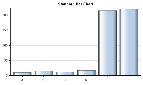
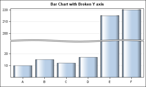
In this article, I want to address a new feature added at your request - "Broken Axis". Here are two graphs showing the same data without and with broken axis.
SAS 9.4M1 GTL code:
proc template; define statgraph BrokenAxis; begingraph; entrytitle 'Bar Chart with Broken Y axis'; layout overlay / xaxisopts=(display=(ticks tickvalues)) yaxisopts=(display=(ticks tickvalues) griddisplay=on linearopts=(includeranges=(0-30 195-220))); barchart category=x response=y / dataskin=gloss; endlayout; endgraph; end; run; |
Note the new option INCLUDERANGES in the LINEAROPTS bundle where you can provide the ranges that are to be included on the axis. You can have more than two ranges. Only the data ranges provided in the ranges are retained. The range intervals are used to proportion the segments.
I had addressed other possible solutions to such use cases in a previous article on Broken Axes using techniques available in SAS 9.2 and SAS 9.3.
Broken axis can be specified for any one axis (X or Y or X2 or Y2) at a time. Linear and Time axis are supported. There are a few other restrictions. The intention is to put the basic feature out there and then see if further action is needed based on your feedback.
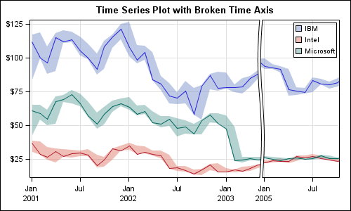
Here is an example of a broken X axis with two time ranges.
Full SAS 9.4M1 Program: BrokenAxis


21 Comments
Sanjay,
I've taken a position that I don't want to spend my time learning GTL, given limited amount of time and other resources at my disposal, even thought I know, at least, rudimentary knowledge of it would be helpful. However, judging from your Proc template code example, that's all needed to draw the second bar chart with a broken y axis without running anything else. Is this correct? No need to go to sgplot or others. I'd appreciate your straighten me out. Thanks.
Akira Kondo
Thanks for you comment Akira. Yes, SGPLOT is simpler for the single-cell graph use case. Broken axis is also available with SGPLOT, however, I discovered a bug in the code while writing up the example. That is why I posted the GTL version. With SGPLOT, all you would need is a new RANGES option in the XAXIS or YAXIS statement specifying the same ranges as done in the INCLUDERANGES option in GTL. The SGPLOT code would work for TIME axis, like in the 2nd example. The code fails for the first case. We will fix that bug in the M2 release.
The GTL code for a single-cell graph is relatively easy, and the only additional option you need for broken axis is to use the INCLUDERANGES option on the X or Y axis in the LINEAROPTS or TIMEOPTS bundle.
Sanjay,
I just would like to mention that the GTL code is easy enough to follow and increase my working knowledge of GTL without getting into too much depth. I also remember that, when I had trouble with a title including a variable name with underscore which was not acceptable to an editorial standard for a journal, your technical support person told me how to get into GTL to customize the title. Thank you for your GTL example.
Akira
Are there options to control the properties of the break line? e.g., What if I wanted a straight line instead of a squiggle? or wanted to assign the line a distinct color? or wanted to increase the size of the gap? or add a fill color to the gap?
In this first release, we only added the basic feature to assess its usefulness. We did not add the aesthetic options you have mentioned. We did not do the straight line (actually simpler) as it could look like two adjacent cells. We really want feedback like you have provided on both aesthetic and functional aspects of this feature so we can improve it in subsequent releases.
For example, we deliberately did not support breaks on both X & Y axis at the same time. While this is doable, it will need a lot more work. The resulting graph tends to become confusing. So, it is not clear if there would be enough demand for this from users to justify the extra effort.
Personally, I'm not a fan of breaking the axis for dealing with data that fall under very ranges - especially when it comes to bar charts as it actively distorts the intended magnitude comparison. In other words, I'm not really the best person to ask as I don't recommend using them. My two cents would be that rather than developing a whole new statement and accompanying options, it would be simpler to increase the flexibility of the refline statement.
I am hoping to hear comments from a wide range of users across different domains and industries.
I like it!! I'm an epidemiologist, mostly doing injury surveillance reports, and there is a strong need for being able to do something like this. For example, when looking at trends in various disease or injury morbidity and mortality and the ICD codes changed (especially changes that occur from ICD-9 to ICD-10 and from ICD-9-CM to ICD-10-CM) for many causes the definition is not really comparable in ICD-9 to ICD-10. Although in an "ideal" world, one should not be comparing trends from the two different codes... the political reality is, most of the time the powers that be won't accept that and your boss says... you've got to show trends anyway.Having the ability to put a break line in like that would allow us to at least include information in footnotes reminding the viewer about that. -Jean
Thanks Jean, for your comment. While it is good to know this will help you, your use case is not clear to me. Is the break in the numeric axis because the number of injuries are very different from ICD-9 to ICD-10? That may be a good use case for this. These breaks are only for the numeric axis. Can you attach a (non-confidential) graph with such breaks so I can better understand your case?
Breaks in trends can be caused by including a missing value in a series plot. Would that work for you too? Check the doc for more details.
The need to break the access would be because definition of what would categorize various causes of death or injury is different. Sorry but I don't have an example of what I am going to want to do with it, but the data is all numeric (either as numbers or rates).
However there is an older CDC report on this subject, and they illustrate their point in Figure 1 of this report:
http://www.cdc.gov/nchs/data/statab/Document%20for%20the%20States.pdf
I think if you look at the figure you'll see my point. `-Jean
Hi, I've just used this feature for a first time and it's really useful, but then wanted to control the properties of the line break (as James mentions above), actually remove the lines and place a note at the break, so this would definitely be a great new feature. It would also be great if you could do this while using x/x2 axis statements.
SAS 9.40M3 allows you to create an axis break that shows the break symbol only on the axis, and not the "full" break. Yes, you can break X / X2 or Y / Y2, but only one at a time. Breaks on multiple axes get very complicated.
With SAS 9.4, I have posted a macro to alter the visual of the break:
http://blogs.sas.com/content/graphicallyspeaking/2014/11/18/axis-break-appearance-macro/
Your blog was recommended (a couple of times) at SESUG2015. I wanted to break an axis, and came straight here. Glad I did. Great write up, great example. Thanks for the simplicity! I see why your name was dropped multiple times at the conference.
Hi,
Is it also possible to break the y-axis when this axis has a log-type? The function "includeranges" is only applicable for linear axis.
Thanks in advance for your help.
Broken axis is supported only for LINEAR axis. Breaking a Log axis would need much more work. Also, log axis likely does not waste too much white space when the data has gaps.
I've done a multipanel plot using PROC SGPANEL, what are the options available to break the x- axis (both categorical/numerical variable on x-axis)?
RANGE option (for axis breaks) is NOT available on the SGPANEL procedure.
Dear Sanjay, do you know how to remove the break symbol in the axistable?
layout overlay /border=false walldisplay=none xaxisopts=(display=none linearopts=(includeranges=(0-13 19-21 31-32)) );
axistable x=weeks value=number /display=(label values) valueattrs=(color=black size=10) class=&ivarcol. title='#subjects';
endlayout;
Juanjaun, try setting the AXISBREAKTYPE on the BEGINGRAPH statement to be AXIS instead of FULL and see if that helps you.
Is it possible to control the widths of the break sections? I would them to be 50-50 for each section.
The way to do that would be to find the center of your data range and set an axis break range such that the center value is in the center of your break range.