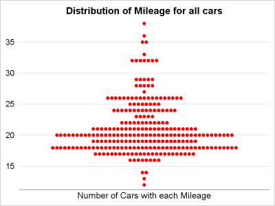
Author

Sanjay Matange
RSS
Director, R&D

Sanjay Matange is R&D Director in the Data Visualization Division responsible for the development and support of the ODS Graphics system, including the Graph Template Language (GTL), Statistical Graphics (SG) procedures, ODS Graphics Designer and related software. Sanjay has co-authored a book on SG Procedures with SAS/PRESS.

Data Visualization
Sanjay Matange 0
Report from MWSUG 2012

A week ago I had the pleasure of attending MWSUG 2012 in Minneapolis.  There were many presentations on Data Visualization in various tracks including the following: Using SAS ODS Graphics - Chuck Kincaid Get the best out of SAS ODS Graphics... - LeRoy Bessler Program Assisted Patient Narratives - Faye

Data Visualization
Sanjay Matange 0
Report from WUSS 2012

A week ago, SAS "wusses" got together in Long Beach, California for another successful WUSS conference.  Personally, I really enjoy all SAS user conferences as it gives me an opportunity to see the creative ways in which SAS users are exploiting our software. One such case was the paper "Power

Data Visualization
Sanjay Matange 0
Doing more with nbsp

A few weeks ago I wrote an article on using the non breaking space character to prevent stripping of leading and trailing blanks in a string.   Since then, I have discovered a few more instances where the nbsp can be a useful tool for creating graphs. One such instance came up last week

Data Visualization
Sanjay Matange 0
How about some pie?

Pie charts have been the subject of some criticism when they are used to compare measures across multiple categories.  It is generally accepted that comparison of magnitudes represented as angular measures from varying baselines is not effective. However here are some use cases where a pie chart does quite well. When it comes

Data Visualization
Sanjay Matange 0
Compact Scatter Plot Matrix

The Scatter Plot Matrix is a great tool that provides a quick visual of potential associations between variables.  This may provide the analyst some hints on how to proceed with the analysis. Matrix of lab values for liver function tests are commonly used in clinical research.  The SGSCATTER procedure provides an easy way

Data Visualization
Sanjay Matange 0
Non-breaking space

Forest plots come in many flavors.   An example of a Forest plot using GTL is available on the SAS support web site.  Simple forest plots can also be created using SGPLOT procedure by using the SCATTER statement with MARKERCHAR to display data aligned with the plot by study names. One issue

Data Visualization
Sanjay Matange 0
Extended Bands

In the Clinical Research domain, there is often the need to display lab values by treatment or test and it is often useful to view this data along with reference lines showing the normal ranges.  The obvious way is to use reference lines to denote the normal ranges. SGPLOT Code: proc sgplot data=band; scatter x=x y=y

Data Visualization
Sanjay Matange 0
Butterfly plots

When comparing results by category and group,  putting the items to be compared close together usually leads to a graph that is easier to decode.  Take the case of the data (simulated) shown below. Here we have population by age group and sex.  To compare the population by sex, it is

Data Visualization
Sanjay Matange 0
Spark lines made easy

Spark lines, made popular by Edward Tufte, provide a way to visualize trends in a concise space, often inline with the rest of the narrative or data. Previously, I posted an article on Spark Plots in which I created different plot types, some of which included multiple graphs and data in each row.  For such

Data Visualization
Sanjay Matange 0
LFT Panels

CTSPedia.org is a website of Knowledge Base for Clinical and Translational Research.  On this site you can find sample graphs for statistical analysis of safety data for Clinical Research.  Graphs included in this resource have been submitted by contributors, and include a graph for Liver Function for different tests by treatment.

Data Visualization
Sanjay Matange 0
Bar chart with response sort

A graph in a recent article in Fortune magazine caught my eye.  The graph shows the cost of hosting the Summer Olympics over the past eight events.  Here is what I termed the "Medal" graph. Now, practitioners of the art of Effective Graphics would likely find some shortcomings in the graph.  Clearly

Data Visualization
Sanjay Matange 0
Broken Y-Axis with SAS 9.2

In the previous post on Broken Y-Axis, I reviewed different ways to display data as a Bar Chart, where the response values for some categories are many orders of magnitude larger than the other values.  These tall bars force  the display of other values to be squeezed down thus making it harder to compare

Data Visualization
Sanjay Matange 0
Broken Y-Axis

Often we want to display data as a bar chart where a few observations have large values compared to the rest.  Comparison between the smaller values becomes hard as the small bars are squeezed by the tall bars.  Here is an example data, and a bar chart showing the data. The large values

Data Visualization
Sanjay Matange 0
PharmaSUG 2012 update

PharmaSUG 2012 conference drew to a close today, concluding two and a half days packed with papers, presentations, posters, hands-on demos and super demos by SAS staff.  While the weather outside was a bit chilly from time to time, the conference what hopping with many user papers on how to

Data Visualization
Sanjay Matange 0
Axis values and hint

Getting the axis values just right generally requires some work, and the values you want can change from case to case.  One such example was discussed by Dan Heath in his post on custom axis values.  Here Dan shows the usage of non uniform axis values using the VALUES option on

Data Visualization
Sanjay Matange 0
Just a legend, please

Recently, an interesting question was posed on the previous article on this blog by a reader.  Can we use the new DiscreteAttrMap feature to create just a legend with specific entries, with no graph.  The question was intriguing enough that I did not wait to ask - "Why?".  I just got

Data Visualization
Sanjay Matange 0
Bar chart on interval axis

Recently, a user asked about creating a Bar Chart of Value by Date, where the dates are displayed on a scaled interval axis.   Consider this simulated data set of value by date and treatment shown below.  This data set only has one value for each date and treatment combination. We can use the VBAR statement

SAS Events
Sanjay Matange 0
Graphs are easy with SAS 9.3

ODS Graphics have matured.  With SAS 9.2, GTL and SG procedures were a new direction for creating analytical graphs in SAS. The motivation and design of the GTL framework and the SG procedures was driven primarily by the needs of the procedure writers within SAS to enable the automatic creation

Data Visualization
Sanjay Matange 0
Simpler is better

A recent article in the SAS and R blog was about current winter temperatures in Albany, NY.  The temperature data for the recent winter (Dec 2011 - Mar 2012) was plotted on a polar graph. Robert Allison posted an article on displaying the same data as a Polar Graph using SAS/GRAPH .  Here is his

Data Visualization
Sanjay Matange 0
Bar-Line graph

A user recently posted a question in the SAS communities forum about  how to best display two measures by one classifier using a Bar-Line graph, where the scale of the two measures is vastly different.  This got me thinking about various different ways to represent such data.  Here are some of my thoughts,

1 7 8 9 10