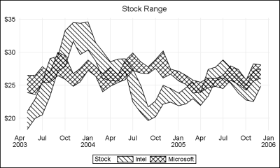
Author

Sanjay Matange
RSS
Director, R&D

Sanjay Matange is R&D Director in the Data Visualization Division responsible for the development and support of the ODS Graphics system, including the Graph Template Language (GTL), Statistical Graphics (SG) procedures, ODS Graphics Designer and related software. Sanjay has co-authored a book on SG Procedures with SAS/PRESS.

Data Visualization
Sanjay Matange 0
Animation using SGPLOT

Often we want to visualize the relationship between variables over time.  The understanding of such data can be improved by viewing the animated graph over time.  With SAS 9.4, you can create animated graphs using the new animation options on the OPTIONS statement and the PRINTER destination. A popular example an

Data Visualization
Sanjay Matange 0
Report from PharmaSUG 2013

The PharmaSUG 2013 conference in Chicago this week was awesome.  From the perspective of graphics, there was great interest in using SG Procedures, Designer and GTL for building clinical graphs.  It was nice to see many papers by users on how they are using these tools for creating graphs on a daily

Data Visualization
Sanjay Matange 0
Clark Error Grid Graph

The SAS Global Forum conference last week was awesome.  From the perspective of graphics, there were more papers from uses on graphics and ODS graphics then in recent times.  I will post a summary shortly. One of the interesting papers was "#113-2013 - Creating Clark Error Grid using SAS/GRAPH and Annotate..."

Data Visualization
Sanjay Matange 0
Attributes Map - 2

Last week I wrote about how you can use the Discrete Attributes Map to ensure that group values with specific names are represented in the graph with specific colors or other visual  attributes such as marker symbol or line pattern. This attributes map also supports a special keyword "OTHER" which can be used to

Data Visualization
Sanjay Matange 0
Attribute Maps - 1

You created a graph of Response over Time by Severity where Severity has three levels, "Severe", "Moderate' and "Mild".  How do you ensure that "Severe" is always red in your graph, regardless of the data order? Normally, when creating any graph with a GROUP role, the distinct group values are assigned the style

Data Visualization
Sanjay Matange 0
Custom Box Plots

A frequent question we get from users is how to create a box plot with custom whiskers lengths.  Some want to plot the 10th and 90th percentile, while other want the 5th and 95th percentiles.  The VBOX statement in the SGPLOT  procedure does not provide for custom whiskers.  Also, unlike GTL,

Data Visualization
Sanjay Matange 0
Box with Scatter Overlay

A common request we have been often hearing is for display of the distribution of data as a box plot, along with some detailed information overlaid.  For example, one may have ratings data of all the hospitals in a region by different specialty, and you want to view this distribution

Data Visualization
Sanjay Matange 0
Parametric Bar Charts

A parametric bar chart in SG Procedure and GTL parlance is a simplified version of the regular bar chart, where the data is assumed to be summarized prior to its usage inside the SG procedures or GTL.  So, multiple occurrences of the same category and / or group combination is

Data Visualization
Sanjay Matange 0
GTL Layouts

The Graph Template Language (GTL) provides you the ability to create complex graphical layouts. We have seen how to create a regular grid of cells based on one or more classification variables using the SGPANEL procedure.   Each cell contains the same type of plot.  This topic was covered in Dan's article on

Data Visualization
Sanjay Matange 0
Percent VBar

Recently a reader chimed in with a question on the Do Loop article by Rick Wicklin on how to create a bar chart with percent statistics.  Rick used SAS 9.3  and the reader wanted to do the same with SAS 9.2. For the basic (non-grouped) bar chart, the process is the

Data Visualization
Sanjay Matange 0
AE Timeline by Name

In my previous article on Adverse Event Timeline Graph, I wrote about how to create the AE timeline using SAS 9.2 code, using VECTOR plot and the MARKERCHAR option in SCATTER plot.  I  described a better way to place the labels at the lower end of the vectors. SAS 9.3 provides an easier way

Data Visualization
Sanjay Matange 0
Unicode Tick Values using GTL

Often it is desirable to use special Unicode characters for the tick value names on the axes.  However, SG procedures and GTL do not support Unicode strings in SAS data sets. With SAS 9.3, the SGPLOT procedure supports annotation which does support Unicode strings.  You can create an annotation data set

Data Visualization
Sanjay Matange 0
Naomi's Graph Makeover Contest

Naomi Robbins has posted a contest, part 1 of which is to submit alternative representations for the following graph: Clearly, usage of two pie charts to represent the share of the B2B and B2C referrals will invite many responses.  To create the graph, I took the data shown in the Pie Charts themselves, so we are using percent

Data Visualization
Sanjay Matange 0
Report from SCSUG 2012

Last week I attended my first SCSUG conference, this one in Houston.  Houston, the fourth most populous city in USA, is the world's capitol of the Oil and Gas industry.  So it was no surprise I met many attendees from local oil and gas related companies.  But, I also met many

Data Visualization
Sanjay Matange 0
Density Strip Plot

In the previous post on Violin Plots, we discussed the process to create custom density plots.  This work was done in collaboration with SAS user James Marcus.  This is the second installment on the same topic - Creating Density Strip Plots.  We will use the same data and process to compute

Data Visualization
Sanjay Matange 0
Violin Plots

Over the past month or more, I have been in a conversation with SAS user James Marcus, on creation of some new displays for visual communication of uncertainty.  These include display of densities using a "Violin" plot, "Density Strips" and more.   With his permission, I can share some of the

Data Visualization
Sanjay Matange 0
A Better AE Timeline

Back in February, I posted an article on creating Adverse Event Timeline Graph.  In the SAS 9.2 version (first one), one item that was less than ideal was the way to position the AE names to the left of the event.  The AE names are displayed using the scatter plot statement

Data Visualization
Sanjay Matange 0
Report from SESUG 2012

This SESUG conference was a very energetic and rewarding experience, with many user presentations on graphics using SAS/GRAPH and ODS Graphics. One standout presentation for me was on "Data Merging and Exploration to Identify Associations Between Environmental Factors and Disease Outbreaks" by Neeta Shenvi, et. al.  The key part of

Data Visualization
Sanjay Matange 0
Forest Plot with Subgroups

During SAS Global Forum 2012, I had conversations with many SAS users who wanted to create Forest Plots.  However, there was one new twist.  The study names were subgrouped by categories like 'Age', 'Sex', etc., with multiple entries under each subgroup.  The name of each study within the subgrouped was indented

1 6 7 8 9 10