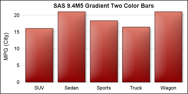
Author

Sanjay Matange
RSS
Director, R&D

Sanjay Matange is R&D Director in the Data Visualization Division responsible for the development and support of the ODS Graphics system, including the Graph Template Language (GTL), Statistical Graphics (SG) procedures, ODS Graphics Designer and related software. Sanjay has co-authored a book on SG Procedures with SAS/PRESS.

Data Visualization
Sanjay Matange 0
Cluster groups

The topic of cluster groups comes up often.  By cluster group I am referring to the feature in bar charts where the group values are displayed side by side. With SAS 9.3, SG Procedures support stack or cluster grouping for Bar Charts and overlay or cluster grouping for all other

Data Visualization
Sanjay Matange 0
Let them eat pie

ODS Graphics system was initially motivated by the need for high quality graphs for SAS Base, STAT, and other analytical procedures.  Use of SG Procedures, ODS Graphics Designer and GTL by users too has initially focused on analytical graphs.  But just like wheels on carryon bags that started for the specific needs of flight

Data Visualization
Sanjay Matange 0
High resolution graphs

Creating a graph that looks nice, with readable, high resolution fonts is important and should be easy to do.  With SG procedures and GTL, this is easy to do with a simple option, but not the default. Creating a high resolution (image) for a graph consumes higher system resources.  When working on a graph,

Data Visualization
Sanjay Matange 0
Graphs with class

When the data is classified by multiple class variables, you can certainly create graphs using BY variables.  This results in separate graphs, one for each level of the BY variable crossings.  Each graph is scaled by its own data subset, and comparisons across BY levels is harder. When comparisons need to be

Data Visualization
Sanjay Matange 0
Dashboard graphs revisited

Here is the promised follow up on the Dashboard graph.  In the previous article, I posted the code to create a panel of bullet KPIs displaying three different metrics.  For each KPI, I used 5 columns of data which resulted in a wide and inconvenient structure. A more convenient data structure is

Data Visualization
Sanjay Matange 0
Dashboard graphs

In this blog we have been discussing graphs useful for analysis of data for many domains such as clinical research, forecasting and more.  SG Procedures and GTL are particularly suited for these use cases.  So, when I came upon a dashboard image from Steven Few's Visual Business Intelligence blog, showing the

Data Visualization
Sanjay Matange 0
Beer, diapers and heat map

The parable of beer and diapers is often related when teaching data mining techniques.  Whether fact or fiction, a Heat Map is useful to view the claimed associations.  A co-worker recently enquired about possible ways to display associations or dependency between variables.  One option is to show the dependency as a node

Data Visualization
Sanjay Matange 0
Comparative density plots

Recently a user posted a question on the SAS/GRAPH and ODS Graphics Communities page on how to plot the normal density curves for two classification levels in the same graph. We have often seen examples of a  distribution plot of one variable using a histogram with normal and kernel density curves.  Here is a simple example: Code Snippet:

Data Visualization
Sanjay Matange 0
Nested graphs

Here are a couple of bar charts showing the city mileage of cars by Type and Origin using the SGPLOT procedure from the sashelp.cars dataset. title 'Vehicle Mileage by Type'; proc sgplot data=cars; format mpg_city 4.1; vbar type / response=mpg_city stat=mean datalabel; xaxis display=(nolabel); run; title 'Counts by Country'; proc sgplot

Data Visualization
Sanjay Matange 0
Timeseries plots with regimes

Recently we discussed the features of the Shiller Graph, showing long term housing values in the USA.  To understand the features necesary in the SGPLOT procedure to create such graph easily, it was useful to see how far we can go using GTL as released with SAS 9.2(M3). I got the data Shiller Housing index data

Data Visualization
Sanjay Matange 0
The more the merrier

Often it is useful to view multiple responses by a common independent variable all in the same plot.  SGPLOT procedure and GTL support the ability to view two responses, one each on the Y and Y2 axes by one independent variable (X) in one graph.  Yes, you can also have X

Data Visualization
Sanjay Matange 0
Custom confidence intervals

Recently a user posted a question on the SAS/GRAPH and ODS Graphics Forum about drawing a plot with custom confidence intervals .  The user has a simple data set with category, response (mean) and custom lower and upper confidence intervals.  The data looks like this: Robert Allison provided the code (proc gplot +

Data Visualization
Sanjay Matange 0
In good company

A recent post on the SAS website shows the SAS Annual Revenue History.  It would be interesting to see how we could create such a graph using SG procedures, and how we could add more information and interest in the presentation.  So, I started with the basic informaiton on the annual revenues provided,

Data Visualization
Sanjay Matange 0
Simply useful

Let us ring in the new year with something simple and useful. A recent question by a user over the holidays motivated this article on what is likely a commonly used graph.  We want to compare the preformance of two categories along with a third measure.  This could be something like "How

Data Visualization
Sanjay Matange 0
Map overlays

In Simple maps can go a long way, we discussed some techniques to create simple outline maps from map datasets in the MAPS library using GTL.  Now, let us take this a step further to do something more useful with this feature. For some graphs, the map information is an essential part of the

Data Visualization
Sanjay Matange 0
Adding a spark to your data

When viewing time series data, often we only want to see the trend in the data over time and we are not so concerned about the actual data values.  With multiple time series plots, forecasting software can find clusters to help us view series with similar trends. Recently I saw a graph showing the trend of unemployment

Data Visualization
Sanjay Matange 0
SGPLOT procedure - the basics

In this blog we will discuss many aspects of the SG Procedures.  This article will cover some basic features and workings of the SGPLOT procedure to establish a baseline. The single-cell graph is the work horse for data visualization.  From the simple bar chart to the complex patient profiles for clinical

Data Visualization
Sanjay Matange 0
It pays to be discrete

Often we have the need to display multiple columns of data in a graph, and we want to introduce some separation into their placement in the graph. Or, we want to display a bar chart of multiple response variables, and place the values side-by-side, like in a grouped bar chart. For both

Data Visualization
Sanjay Matange 0
Hello, World

Welcome to this new blog on data visualization at SAS. Our goal is to engage with you on a discussion about analytical and business graphics for reporting and interactive applications. Our primary focus will be on ODS Graphics and related topics, but we look forward to a lively discussion on all things

1 8 9 10