Recently my boss came across a graph where a time series plot was modified to include a "thickness" response. We wondered if this would be a good addition to the GTL / SG Series plot statement. What would the result look like, and what are the pros and cons?
So, I took up the task of simulating the same graph using the GTL Band plot statement. The plan was to display the closing price from the SASHELP.STOCKS over time as a series, and make the series thickness proportional to the Volume data.
To do this, the idea was to find the volume range over time, normalize it, then using the closing price as the upper edge of the band and compute a lower edge value in terms of the Y axis. The math is shown in the attached program. A few things came to light.
Here is what I call the "Conditioned" Series plot, showing the closing price by date (top edge), and the width of the line represents the volume (click on graph for higher resolution image):
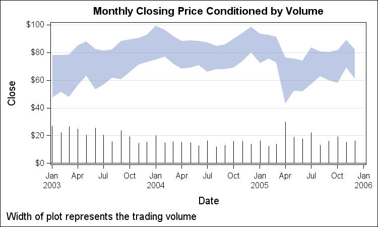
In this graph, I have plotted the volume on the Y2 axis, but suppressed the Y2 axis display. This is just to see if we are getting the right behavior, and the band width is correctly conditioned by volume. Here is the SGPLOT program. The data computation is included in the attached program file.
SGPLOT code:
proc sgplot data=ibm2 noautolegend; title 'Monthly Closing Price Conditioned by Volume Change'; band x=date upper=close lower=lower / fill transparency=0.5; needle x=date y=volume / y2axis; yaxis min=0 grid; y2axis display=(noticks novalues nolabel) offsetmax=0.7; run; |
One problem with this view jumps out immediately. If the volume data is not displayed, the eye is fooled to think the volume is significantly small in March 2005. This is because the eye sees the smallest band width as the minimum distance between the lines, not the minimum VERTICAL distance.
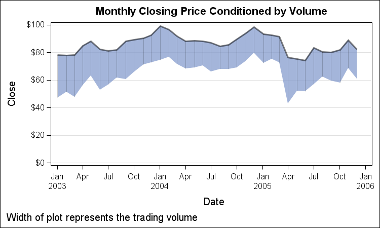
To avoid this perception, we need to provide some hints to the eye that the volume is the vertical distance, and not the minimum distance. We do this by adding vertical pin stripes inside the band using the HighLow plot. I also added emphasis to the top edge:
SGPLOT code:
proc sgplot data=ibm2 noautolegend; title 'Monthly Closing Price Conditioned by Volume Change'; band x=date upper=close lower=lower / fill transparency=0.3; series x=date y=close / lineattrs=(thickness=2) transparency=0.5; highlow x=date high=close low=lower / transparency=0.8; yaxis min=0 grid; y2axis display=(noticks novalues nolabel); run; |
Here, the needle plot is now removed, and the pin stripes reinforce the idea that the volume is the vertical distance, not minimum distance. Here I have removed the needle plot.
The question now is, how is this graph superior to the graph below, where the volume data was clearly displayed in the same graph without any ambiguity?
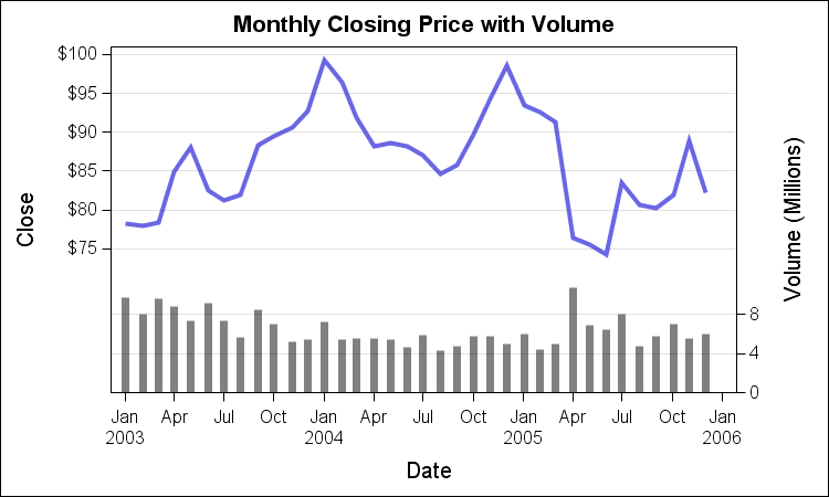
Personally, I would say series + needle graph is superior, as there is no ambiguity about the volume numbers. I cannot come up with any arguments (as yet) that suggest the conditioned series plot is more effective than overlay plot of series and needle.
There is one other case however, where the conditioned series may be useful. What if we want to view a grouped series, with 2 or 3 group values, each showing both price and volume? Here is that plot:
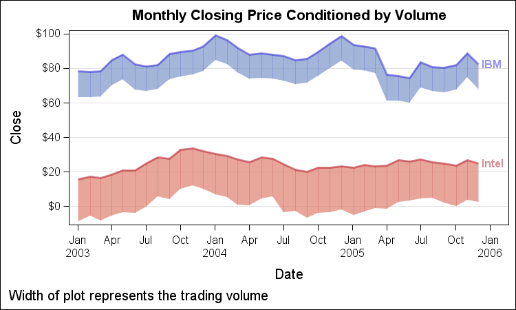
Here we have plotted the monthly closing price by stock where each plot is conditioned by the volume. Now, the grouped needle plot of volume can be avoided to reduce. While the actual volume numbers are not clear, the proportion can be seen.
What is your opinion on this plot?
Could this be useful?
How would your improve it?
Full SAS 9.3 program: ConditionedSeriesPlot


12 Comments
Great post! I'm working on a paper that seeks to understand what factors impact trade volume of new agricultural commodity futures contracts. The ability to compare old vs. new contracts and illustrate how various factors may affect volume. However, I agree with you that when there's no need for a comparison, the series+needle is much cleaner.
Thanks for your opinion, Anton. I hope to get more comments (pro and con) so we can evaluate the benefits of this visual.
Hi Sanjay
I don't like the idea of using distance between two lines to represent volume. This is a hard graphic to perceive. If you wanted to plot comparative volume and price information for two stocks, why not plot the ratio of each?
For more than two (but not a lot more) you could make two lines for each stock, one for volume, one for price, each based on some base value (either price/volume at day 1, or average).
Peter
Excellent comment, Peter. I completely agree with you about the "distance between two lines" issue. The problem is that in a graph, the distance is often the "Vertical" distance between the lines. But the eye sees distance as the "Minimum" distance between the lines. This has been well illustrated in Naomi Robbins' book as an issue to avoid.
But often we get requests from various sources asking "Can our software do this?". Then, it is incumbent upon us to evaluate the real and perceived benefits of the new proposal.
Yeah, you have to keep the customers happy..... But sometimes "are you *sure* that's what you want?" may make them even happier!
Hi Sanjay,
Another approach to take would be to have the X axis for Closing to range from $0 to max Closing and the X2 axis for volume to range from 0 to max volume. Both axes would be fully expanded. Then plot Closing and Volume as series plots. This way you will get two lines that cross each other at various times. By seeing how and when lines cross and when they remain separated the relationship between Closing and Volume can be expressed. I also think this method of comparison would work with raw data where entities have different units of measurement (dollars vs # trades on the stock exchange).
Perry
Yet more idea:
Use another method for volume: Color (more saturated = higher volume) or line thickness. Perhaps thickness should use log(volume).
That is something to consider to indicate magnitude qualitatively. However, color saturation or intensity is not a good quantative representation for magnitude, as shown in the graph from "Sensation and Perception" by Bruce Goldstein. See Fig 7 in "Make a Good Graph" - http://support.sas.com/rnd/datavisualization/papers/sgf2013/361-2013.pdf
Like @Peter, I dislike co-opting the vertical scale to stand for two different quantities at once. Either use two plots or overlay two series plots, one for price and one for volum.
If the important factor is the RELATIONSHIP between price and volume, then the correct plot is a scatter plot of the price verus volume (use a GROUP= option if you want to compare these quantities for several companies). With the scatter plot, you lose the time component, but gain more precision on the quantities that matter. Some people might suggest connecting the scatter plot markers (by using an unsorted series plot), but that gets messy for long series.
I agree series+needle looks superior to me. Without a y2axis label, I find the "conditioned series plot" confusing. Can see the benefit of the vertical pin stripes, to help the eye. But then to my eye, it starts to look like one of those pseudo 3-d plots that plot two dimensions in three. I think the spike in volume in April 2005 is much easier to detect with the needle plot. Even for comparing two stocks, two colored lines at the top for closing price, and two colored needle plots at the bottom for volume would make me happy.
Hi Sanjay,
Like the other commentators, I think it completely inappropriate to represent trading volume as a band surrounding price. My first inclination when viewing such a graph would be to assume that the band represented a measure of the daily variability in the price. In fact, volume often does serve as a proxy for a stock's bid/ask spread (the difference in the price to sell and buy a stock), and that would be useful metric to include as band around the stock price.
If you're going to include volume and price together, then volume belongs in a separate secondary panel beneath price as placing it in the same panel and using two separate axes needlessly truncates the scale of price, the primary variable of interest. If it were the case that you were comparing two stock prices and also wanted to compare their volumes, then the representation of volume would simply switch from a bar to a line.
As for including vertical markers, you are correct that they are effective in reducing our tendency to latch onto the smallest (diagonal) distance, rather than the correct vertical one. The problem with doing so here is that they are not aligned on a common scale, making comparisons between volumes difficult - just another reason not to combine price and volume.
Thanks for your response. Maybe I chose a bad data example for this experiment. My goal is not explicitly to view volume and price, but to use this technique to map a second response variable to the series plot. Maybe there is some other domain where this makes more sense. Maybe this makes more sense if the two responses were similar in nature, such as Actual and Predicted revenues, or even revenues and change.