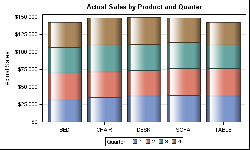
Creating bar charts with group classification is very easy using the SG procedures. When using a group variable, the group values for each category are stacked by default. Using the sashelp.prdsale data set and default STAT of SUM, here is the graph and the code.
SGPLOT code:
proc sgplot data=sashelp.prdsale; title 'Actual Sales by Product and Quarter'; vbar product / response=actual group=quarter dataskin=gloss; xaxis display=(nolabel); yaxis grid; run; |
With SAS 9.3, the SGPLOT procedure introduced the option to place the group values side by side. This is a very popular option, where we want to compare category and group values from a common baseline. This is also very commonly used for clinical graphs to view the response by visit and treatment. Here is the graph and the code:
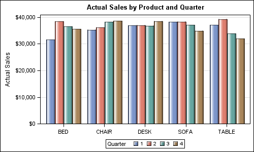
proc sgplot data=sashelp.prdsale; title 'Actual Sales by Product and Quarter'; vbar product / response=actual group=quarter groupdisplay=cluster dataskin=gloss; xaxis display=(nolabel); yaxis grid; run; |
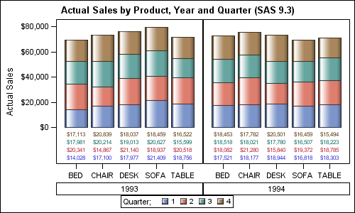
But what if you want to get a graph with Cluster and Stacked groups. So, we have three levels of categorization variables, one for category, one for cluster and one for stacks and one response variable. When we introduced the GROUPDISPLAY option, we had an extensive discussion on whether it was important to directly support this feature like in the GCHART procedure. Adding this feature would introduce much more complications in the code. Looking at the use cases, we decided to keep it simple, and support only Stacked OR Clustered groups but not both at the same time.
The reason to do this was that the frequency of use of a bar chart with Stacked AND Cluster groups was low, and there actually exists an easy way to do this using the SGPANEL procedure. Here is the graph and the code.
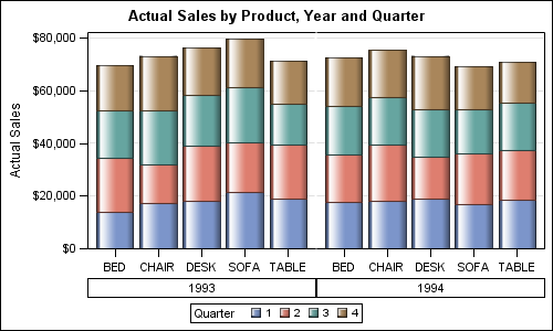
SGPANEL code:
proc sgpanel data=sashelp.prdsale; title 'Actual Sales by Product, Year and Quarter'; panelby year / layout=columnlattice novarname noborder colheaderpos=bottom; vbar product / response=actual group=quarter dataskin=gloss; colaxis display=(nolabel); rowaxis grid; run; |
The additional benefit of using SGPANEL in such cases is when the graph gets too wide. In that case, the SGPANEL procedures knows how to break up the adjacent groups across multiple rows and multiple pages.
Here we want to group Actual revenues placed side by side by Product, stacked by Quarter with Year as the Category.
- We use the SGPANEL procedure and use Year as the Class variable
- We have used layout of ColumnLattice.
- We have used Product as the Category variable.
- We have used Quarter as the Group variable.
- Column headers are moved to the bottom, and the cell borders are suppressed.
- Default group display for the VBGAR is Stack.
- Default statistic is Sum.
Adding a bar label for each bar in the graph is easily done by using the DATALABEL option. A single summarized value is shown at the top of each bar as shown below.
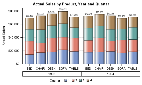
SGPANEL Code:
proc sgpanel data=sashelp.prdsale; format actual dollar7.0; title 'Actual Sales by Product, Year and Quarter'; panelby year / layout=columnlattice novarname noborder colheaderpos=bottom; vbar product / response=actual group=quarter stat=sum dataskin=gloss datalabel; colaxis display=(nolabel); rowaxis grid; run; |
All this is relatively straight forward. One last (infrequent) use case is where you want to display the response value for each of the stacked segment separately. In the interest of reducing clutter, this is not supported.
However, as can be expected, there is always that one user who absolutely needs such a graph. Such a request recently came in to our Tech Support group, and Lelia contacted me to see how we can create such a graph. This is where SG procedures hit their limits, but GTL can come to the rescue. Here is the graph. GTL code follows.
This graph needs some special coding using the LAYOUT DATALATTICE with the BARCHART statement. To draw the stack of value labels below, we have to use the SCATTERPLOT statement with the MarkerCharacter option. This all would work just fine if the data set contained only one value per combination or Year + Quarter + Product. But, the sashelp.prdsale data set contains more classifiers, and so has multiple observations for each entry. If used directly, we will get a graph all right, but each data value will have multiple impressions on it, making a mess.
So, what we have to do here is summarize the data before hand using the MEANS procedure with three class variables. Now, we will have only one value per combination of Year + Quarter + Product, and the label displayed will be fine. Here is the proc MEANS and GTL code:
/*--Summarize Actual by product, year and quarter--*/ proc means data=sashelp.prdsale; class year product quarter; var actual; output out=prdsale(where=(_type_ = 7) keep=year product quarter ActualSum _type_) sum=ActualSum; run; /*--Template for stacked grouped plot with data labels for all stacked values--*/ proc template; define statgraph StackedClusterBarStat; begingraph; entrytitle 'Actual Sales by Product, Year and Quarter (SAS 9.3)'; layout gridded; layout datalattice columnvar=year / headerlabeldisplay=value columnheaders=bottom border=false rowaxisopts=(offsetmin=0.25 display=(ticks tickvalues label)) row2axisopts=(offsetmax=0.8 display=none) columnaxisopts=(display=(ticks tickvalues)); layout prototype / ; barchart x=product y=actualsum / group=quarter stat=sum dataskin=gloss name='a'; scatterplot x=product y=quarter / markercharacter=actualsum group=quarter yaxis=y2; endlayout; endlayout; discretelegend 'a' / title='Quarter;'; endlayout; endgraph; end; run; /*--Render the graph--*/ proc sgrender data=prdsale template=StackedClusterBarStat; format actualsum dollar7.0; run; |
SAS 9.4 adds support for a new statement called AXISTABLE. This statement is able to display stacked data values by class and can summarize the values before display. So, with SAS 9.4, the summarization step can be skipped.
Full SAS 9.3 Program: StackedClusterGroupedVBar


20 Comments
Pingback: Stacked Bar Chart with Segment Labels - Graphically Speaking
I want to know in above graph can we have 2013 & 2014 bars next to each other like clusters in SAS 9.3? Can we get stacked clustered bars in SAS 9.3?
Not sure what you're asking, S.C. The above does produce stacked clustered bars, organized the way Sanjay chose to organize them. If you switch year and product, you would get stacked/clustered where 1993/1994 were adjacent for Bed, then 1993/1994 were adjacent for Chair, etc., with quarter up the bar.
You can't do stack+cluster directly in SGPLOT from a VBAR statement, if that's what you're asking; you either need to do this, or use some of the techniques in http://blogs.sas.com/content/graphicallyspeaking/2014/04/06/g100-with-sgplot/ to produce a stacked+clustered plot (High-Low to do the stacked, with groupdisplay=cluster to do the cluster).
Is there a way to control the proportion of space used by the y-axis labels and the graph? My labels are coming out right-justified and the graph is small in comparison. (Labels are survey questions and the stacked bar chart shows the percentage of each response scale.) Is there a way to make the labels wrap and take up less space?
I would like to know if it is possilble to have an elbow graphic for a cluster analysis using the SAS code. Thanks in advance.
It would help if you attach a link to such a graph on the web. I don't know what you mean by "Elbow Graphic".
I created a stacked bar chart using SGPLOT and vbar statement. SAS assigns colors to each level of the group variable. How can I change the groups to have no color and replace with a pattern? Graph will be in black and white only publication. Thanks!
Use the JOURNAL2 or JOURNAL3 style.
Hello Sanjay Sir,
I have a question regarding one of my Waterfall plot where I need to break Rowaxis values (Yaxis) in SGPANEL Procedure. I have tried to find any reference but no luck. Please suggest.
Please do let me know, if you need further Details.
Thanks,
Hi,
Can any one help us to create Vbars graph with multiple colours and inside chart percentage.thanks,
Dear Sanjay,
Thank you for the code. I'm using the "proc template version" since I added 2 axistables with other variables at the bottom. My bar variable is categorical (2 values), the bar length is the % of each category. I'd like to display counts (BARLABEL=true) and not the % at the top of each bar. How could I do this ? Thank you in advance,
Best,
Reza
To do this, you can precompute the bar statistics and use BARCHARTPARM to display them. This will give you the chance to assign the DATALABEL option to the COUNT variable instead of the percentage variable. Hope this helps!
Hi Dan, thank you. Unfortunately it doesn't run. It is specified for datalabel : "If the GROUP= option is in effect and there are multiple input observations per bar for the GROUP= column, then the value for the DATALABEL= column should be the same for each observation that is on the same bar." I set a new_var with the same count for 2 groups within each bar, and DATALABEL=new-var (and DATALABELTYPE=new_var), but still the % is displayed on the top and within segments if I use SEGMENTLABELTYPE=auto...
Thank you for your help,
Reza
Ah, that is correct. So, instead of using the DATALABEL option, add a TEXTPLOT using the POSITION option. The Y variable should be the same variable used for the bar height:
textplot x=xvar y=pctvar text=countvar / position=top;
Let me know if that works for you.
Hi Dan; yes this option works, tahnk you. Last question, how can I change thesize of the label for the product (BED, CHAIR, ...) inside the template ?
Thank you for your help, really appreciate.
Best,
Reza
Take a look at the TICKVALUEATTRS option on the ROWAXISOPTS. You should be able to adjust the size there.
Hi Dan, I have a new request regarding this plot for a publication. I have 4 groups of patients, 2 of whiwh received drugs A and B and the 2 other ones received B and C (Figure : https://www.urotoday.com/conference-highlights/esmo-2020/kidney-cancer/124676-esmo-virtual-congress-2020-results-from-the-phase-2-biomarker-driven-trial-with-nivolumab-and-ipilimumab-or-vegfr-tyrosine-kinase-inhibitor-in-naive-metastatic-kidney-cancer-patients-the-bionikk-trial.html).
You can see we present the results in 4 panels. The unformated 3 drugs (Nivo, Nivo+Ipi, TKI) are respectively coded 1,3,1 so that the "missing" drug is not displayed on only 2 bars in each panel. Nivo+Ipi is coded 3 to appears last. My issue is that I had to tupe the drug names "manually" since I'm unable to affect to value 3 either the format "Nivo" in 2 first panels or "TKI" in 2 last ones. Don't know if I'm clear ?!
How could I assign 2 different formats to a singke value according to panels ?
Thank you so much for your assistance.
Best,
Reza
If I understand your request correctly, it sounds like you need to use the UNISCALE=ROW option on the PANELBY statement. This will allow the column axes to vary tick values in each cell depending on the incoming data. That change should allow you to remove the format encoding you're doing now. Let me know if this helps.
Hi Dan, thank you. Your option relates I guess to the SGPANEL option. But I'm using the GTL code for template. How could I use it inside the template ? Or more generally, is it possible to format a variable according to the value of another variable ? That could be the external solution.
Thank you for your help
Reza
For a GTL template, you will want to set COLUMNDATARANGE=UNION on the LAYOUT DATAPANEL or DATALATTICE statement. See if that is enough to deal with your "zero bar" issue.