Yesterday I read a Christina's blog article on the winners of the Best Presentations honor at MWSUG 2013. Two papers caught my (graphical) eye, both by Perry Watts. Perry has done a marvelous job describing how creatively use GTL to make graphs that may not be obvious at first glance.
In her paper Building a Better Bar Chart with SAS Graph Template Language, Perry has provided an excellent coverage of the features of the GTL Bar Chart, and provided some ways to combine the Bar Chart statement creatively to produce interesting graphs. This is a must read for anyone using GTL or SG Procedures, for the techniques may apply equally to both cases.
Here is an interesting graph from her paper.
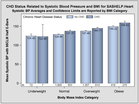
If needed, axis tick marks can be suppressed using axis options. With SAS 9.4, tick marks can be placed in between the midpoint values on the axes. Also, as mentioned by Perry, to maximize space for the plots in the graphs in Figure 5 and 6, the X axis label could be suppressed as that information is already included in the title.
Perry has also won an award for her Poster describing ways to create Histograms with color grouping and color coded Violin Plots. Once again, she has used creative combinations of different plot types to achieve the goal.
Congratulations, Perry!


1 Comment
Perry's SGF papers are amazing, too!
http://lexjansen.com/cgi-bin/xsl_transform.php?x=awx&s=sugi_a&c=sugi#perratts