It is always a pleasure to attend SAS user conferences, regional conferences and in-house events. In addition to presenting papers, seminars and super demos to the attendees myself, my favorite activity is to attend presentations by users that include graphical data visualization. These include using SG procedures, GTL, Designer or SAS/GRAPH. This year WUSS had a rich supply of such papers and workshops.
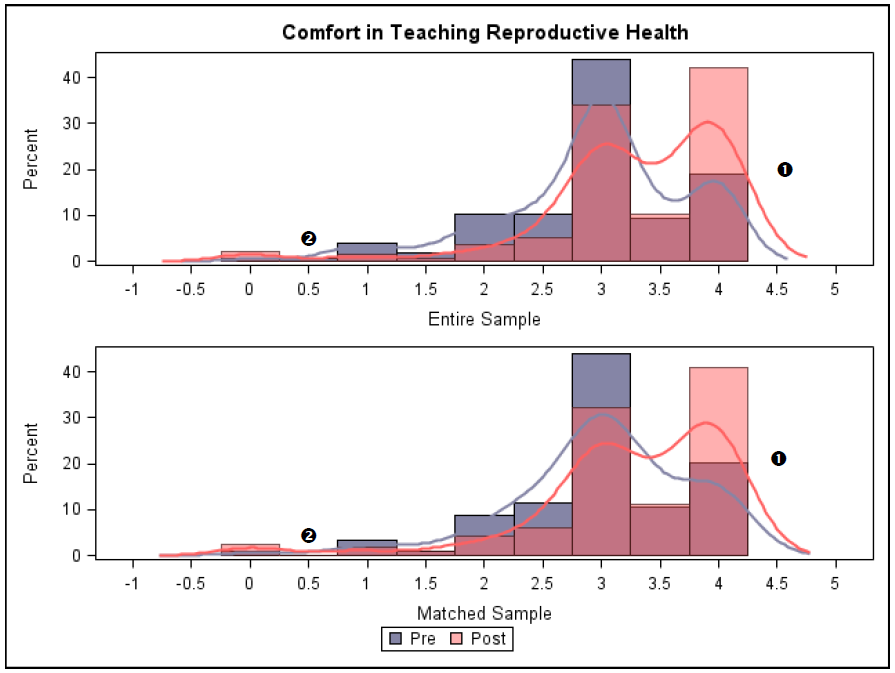
One such paper was A Graphical Approaches to Advise an Appropriate Statistical Analysis by Bret Moulton and Robin Jeffries, University of Southern California. The authors use SGPANEL and GTL graphs to demonstrate graphical techniques to assist in the analytical process. Here is an example of comparative overlaid histograms and density plots for entire sample and matched subsample. Click on the graph for high resolution image.
Another interesting paper was Automated and Customized Reports as a Single Image File using GTL by Monarch Shah, Ginny Lai and Eric Elkin of ICON Research. In this paper Monarch Shah presented ways in which they use GTL Lattice Layout to create a paneled graph showing multiple graphs by individual site and overall registry along with a table of data created using the plot statements as shown below. Click on the graph for high resolution image.
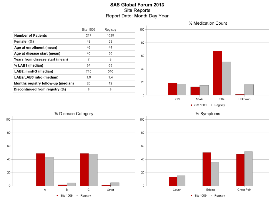
The authors describe systematically how to create the panel of graphs, and the code used to create the table in the top left. The bar chart uses the DiscreteOffset option to place the two response values side by side.
Annotation is available for SGPLOT procedure with SAS 9.3. This allows you to draw custom graphical elements on the graph that are otherwise hard to do. This was described in the paper Creating Custom Graphic Output using the SG Annotate Data Set by Doug Lassman, Quintiles. Doug did a great job describing the annotation functions and the process of creating the annotation data set needed to describe the annotations. He then used it to draw the LLN-ULN rectangle on the graph using annotation as shown in this graph.
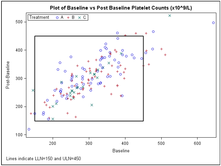
Note, with SAS 9.3, you can use reference lines to draw the LLN and ULN levels, but there is obvious statement to create this kind of a rectangle. So, this is a great example of using annotation for such custom usage. Now, I believe it is possible to do this using the series plot. So, that would be a good exercise.
Additionally, with SAS 9.4M1 (to be released soon), you will have access to a new plot statement called POLYGON. This statement is a hybrid between plot and annotation and allows you to create custom shapes in the graph directly using a plot statement. The benefit of this is that data in a polygon statement will be treated as part of the axis data, and the statement can be layered along with the other plot statements.
There were certainly many more interesting presentations which I will include in a follow up, "Part 2" of the report soon.


3 Comments
Hi Sanjay.
Does this new Polygon statement mean that we will be able - in a short while - to create maps using SGPLOT ? Is it in your plans to offer alternatives to the GMAP procedure using SG procedures ?
Best regards.
We have long been debating how to best include support for Mapping in GTL. Our mapping experts are trying to come up with a syntax structure that can support all kinds of maps in a consistent manner. In the meantime, we thought it would be useful to be able to render arbitrary polygons. So, yes, this new polygon statement will create polygons with many unique features and will also handle basic polygon maps. Now, it is already possible to do simple outline maps using the SERIES plot statement with overlays, as presented earlier in this article on Mapping.
Pingback: Graphs at WUSS – Part 2 - Graphically Speaking