Last week I covered some of the interesting graph-related papers presented at WUSS. There were quite a few, so I broke up the report into two parts. Here is the second installment.
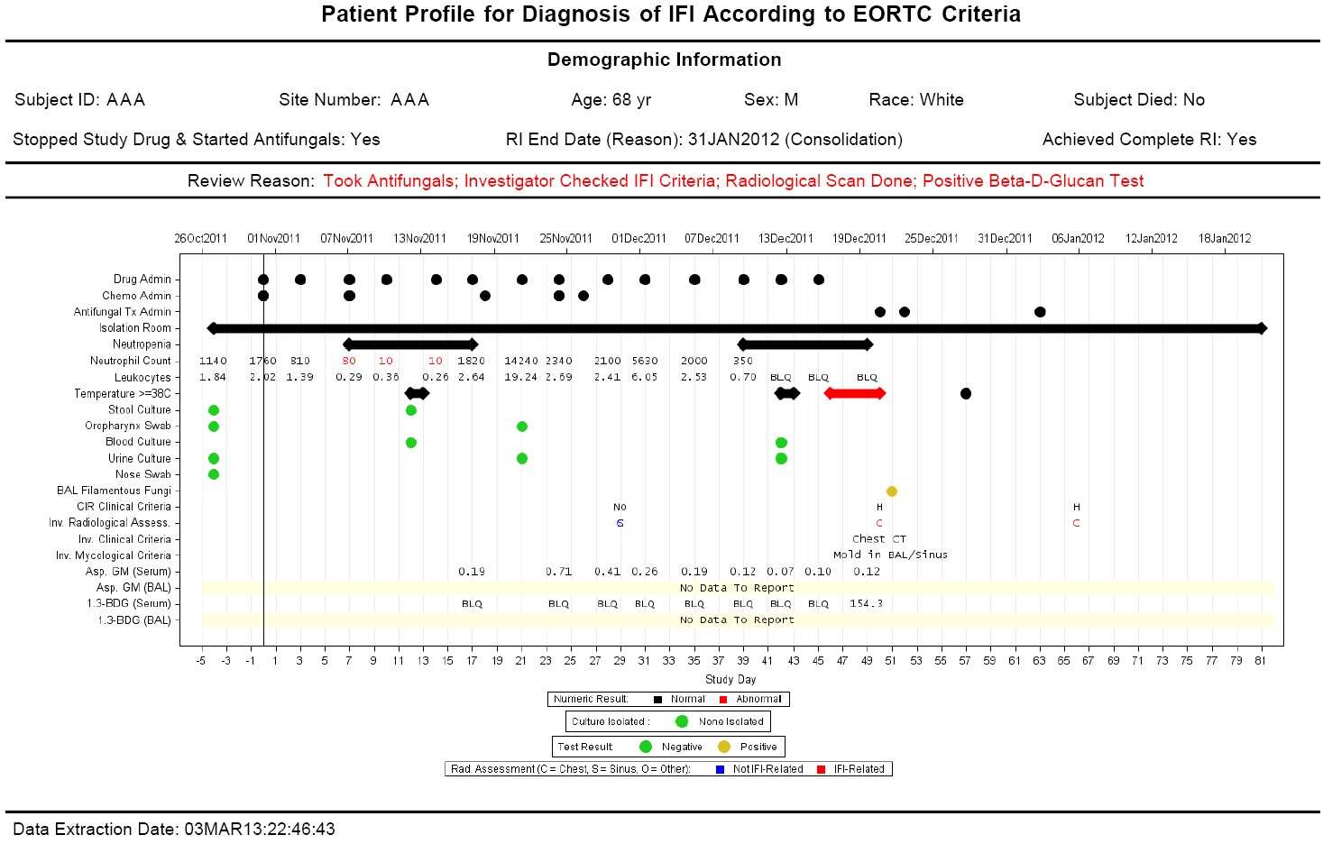
In the paper Creating Graphical Patient Profiles using SAS by William Garner of Gilead Sciences, the author describes how to create patient profiles for a specific application. The graph contains a wealth of information, arranged by study day and dates. The graph displays patient demographic information followed by a graph including drug administered, adverse events, lab results, vital statistics all in one graph. I was personally gratified as William has used some of the techniques I have described in this blog on creating Patient Profiles and taken the next step to make it into a real world graph. This graph is used in a Gilead Sciences study for antifungal therapy. Click on the graph to see the high resolution graph.
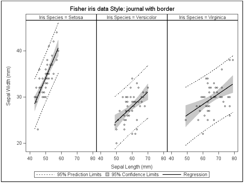
Chuck Kincaid of Experis presented a hands-on workshop on Using SAS ODS Graphics that teaches the audience how to use SG procedures. Chuck describes the features of the SGPLOT and SGPANEL procedures showing us how to create many graphs commonly used in the industry using these procedures. Here is an example of a paneled graph from his presentation.
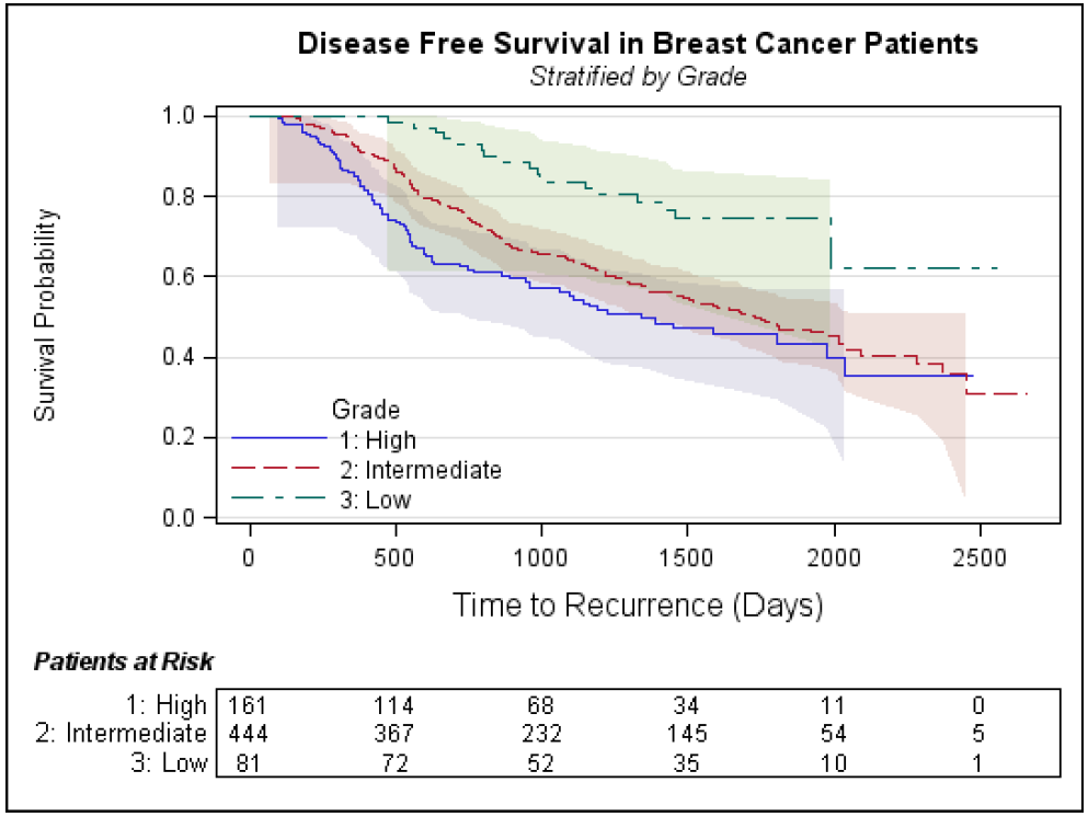
Leanne Goldstein and Rebecca Ottesen, both of City of Hope presented an excellent hands-on workshop titled Survival 101 - Just Learning to Survive. This presentation was chock full of information on the techniques for analysis of survival data using the LIFETEST procedure and the Kaplan-Meier Methods. Rebecca also demonstrated the use of the ODS Graphics Designer for building Survival Plots. Here is one of the graphs.
I presented my paper from SAS Global Forum 2013 called Make a Good Graph. This paper was a late entry into the presentation schedule, replacing a paper that was dropped late in the game. So, the presentation was included in the "Tutorials" section, and I feared no one would show up. I was relieved to see a decent sized audience. The paper describes the science behind the standard industry practices for creation of effective graphs. I presented many examples describing the preferred ways to represent classifications and facilitate accurate magnitude comparison.
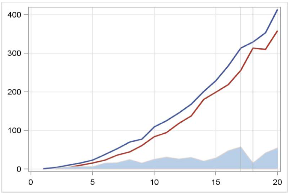
The example above, shows how magnitude difference between lines are perceived by viewers. The difference between two lines are often perceived as the nearest distance, and not the vertical distance, as is intended here. To overcome this, differences should be plotted directly, and not left to the inference by viewer. In the above graph, the actual vertical distance between the two plot lines is represented in the band plot at the bottom. The drop in the difference between the two lines on the right side at the two reference lines is not very obvious in the line plots, but is more obvious in the band plot at the bottom.
It is indeed gratifying to see SAS users adopting SG Procedures and GTL to create graphs from the simple to the intricate, and presenting their findings and the techniques they have developed to create these graphs.


