In reference to a previous article on Violin Plots, a reader asked about creating comparative mirrored histograms to compare propensity scores. While I had my own understanding of "Mirrored Histograms", I also looked this up on the web. Google showed many cases of two histograms back to back, either horizontally or vertically. Given these examples, this needed more than a simple reply. This deserved an article by itself.
I created two graphs, one for each case, assuming the data has two columns. I used the sashelp.cars and sashelp.heart data sets. Click on the graphs for higher resolution images.
Horizontal Mirrored Histogram:
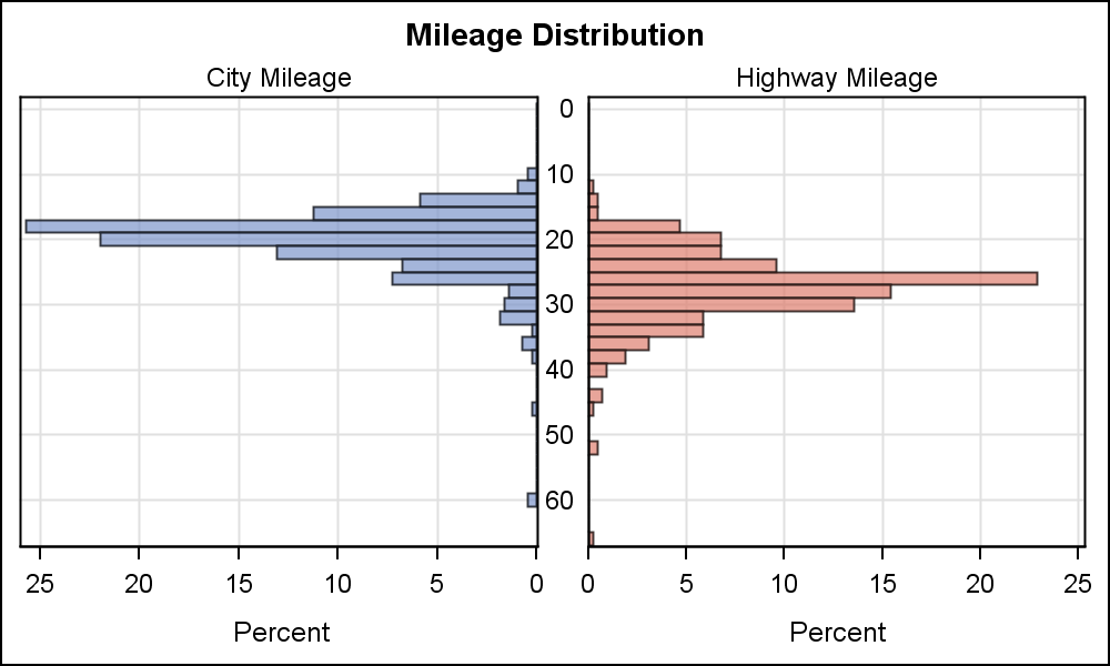
To create this graph, we use GTL to create a 2-cell graph using LAYOUT LATTICE. Full code is included in the attached file. The key steps are as follows:
- Use LAYOUT LATTICE to define a 2-column lattice. Use ORDER=ColumnMajor.
- Add a LAYOUT OVERLAY to define a histogram in each cell with horizontal orientation.
- Reverse the X axis for the plot in the first cell.
- Tick values and axis ranges are equalized for easier comparison of bin heights.
- A CELL statement block is added around each Layout Overlay to add the cell headers. This is to place the City and Highway labels inside each cell. This can also be done using simple ENTRY statements as done for the vertically mirrored case.
Vertical Mirrored Histogram:
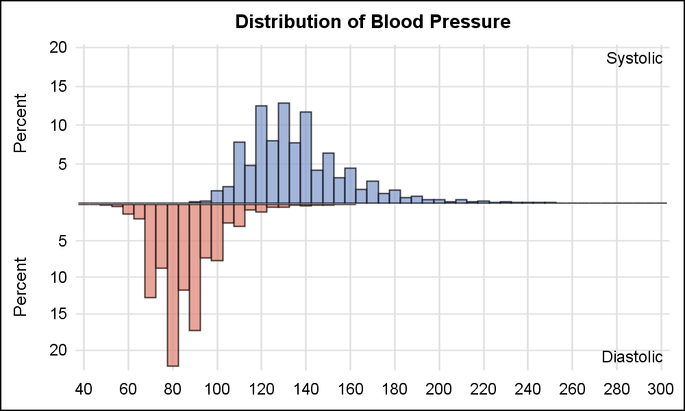
This graph is also created using GTL LAYOUT LATTICE, with two rows. As mentioned above, one Layout Overlay is added to each cell, and the Y axis for the 2nd cell is reversed. Other options are set to create the histogram above.
In both these cases, the mirrored layout creates an interesting graph, but it is really not very easy to compare the heights of the bins as they are on reverse sides of the mirror. Also, only two variables can be compared this way.
Maybe a better way is to use overlaid histograms. Here are some examples:
Overlaid Histograms:
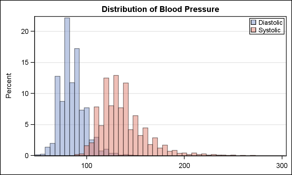
This is a single-cell graph and can be created using the SGPLOT procedure. Note, the two histograms are made partially transparent to allow visibility of both. The bin start and intervals are equalized.
SGPLOT Code:
proc sgplot data=sashelp.heart; title 'Distribution of Blood Pressure'; histogram diastolic / binstart=50 binwidth=5 transparency=0.5; histogram systolic / binstart=50 binwidth=5 transparency=0.5; xaxis display=(nolabel); yaxis grid; keylegend / location=inside position=topright across=1; run; |
In my opinion, comparison of the two histograms is much easier in this case, the shapes can be seen clearly, and the heights of the bins can be easily compared. Also, the code is very simple.
Another benefit is that this technique can easily be extended to multiple variables. In the example below I created a data set with three variables for comparison. Kernel density plots are added. Click on graph for high resolution image.
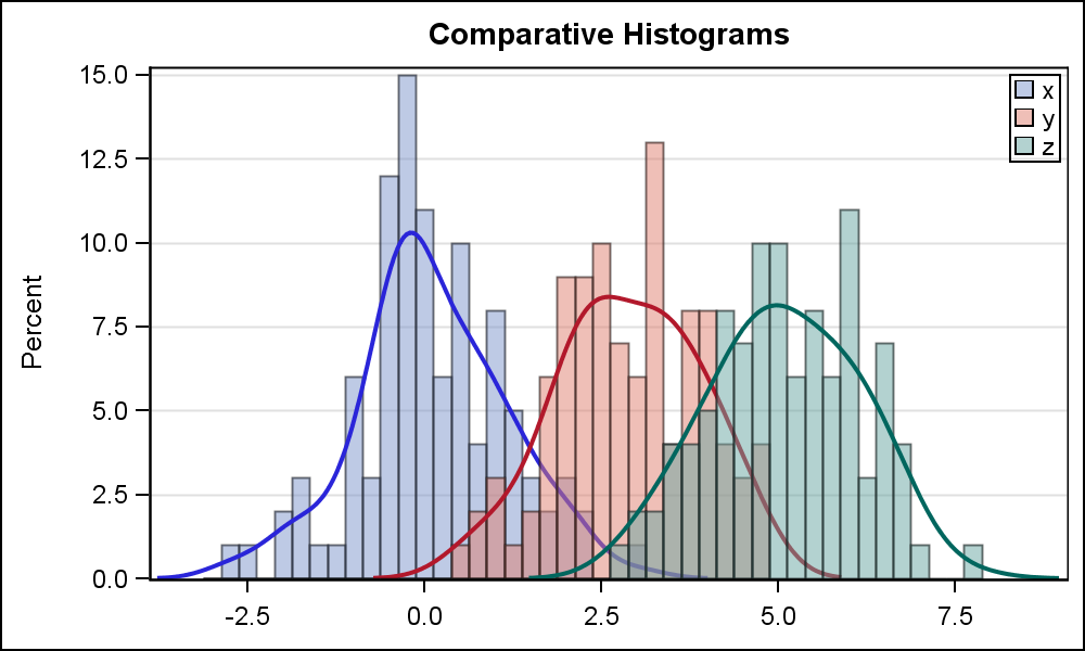
Here is a link to a previous article on Comparative Density Plots.
Full SAS 9.3 Code: ComparativeHistograms


8 Comments
I think this is a good opportunity to bring up the lack of a Group= option in the Histogram and Density statements (from a GTL perspective, I suppose they are to some extent the same statement as the GTL density statement must be accompanied by an unplotted histogram statement).
The omission of this feature makes it very difficult to combine histograms / density plot elements with those plot statements that require the data to be in univariate (long) form. It can be done, but you have to create a weird hybrid dataset for solely that purpose. In general, most SAS procedures require data to be in univariate form (certainly enough that this is the form that statisticians / data analysts use by default), so it is imperative that the plots support that (if we need to present results in multivariate form, there is always proc tabulate and proc report for creating a table).
Interesting timing, as I was just discussing supporting grouped Histograms and Density plot with the developers today. Hopefully, we can address this in one of the upcoming releases.
Pingback: R U Graphing with SAS? - Graphically Speaking
Pingback: Graphs at WUSS – Part 1 - Graphically Speaking
Pingback: R Make Vertical Mirrored Histogram & Add Title to Figure in ggplot2
Pingback: New Graphics Features in SAS 9.4M2 – Part 1 - Graphically Speaking
I'm trying to do something like your vertical mirrored histograms, but with the overlays with 2 plots each. No matter what I try, I can't get the x-axes to be on the same line; there is always a gap.
Can you tell me what I'm doing wrong?
This is the template I wrote:
Pingback: Comparative histograms: Panel and overlay histograms in SAS - The DO Loop