In recent conversations with many SAS users at NESUG, SESUG and WUSS, a pattern emerges on the question of creating graphs with SAS or R. Many SAS users are aware of the new graph features in SAS that create high quality graphs with minimum fuss. But, many have not actually used these new features.
The SG Procedures provide a simple way to create commonly used graphs, and GTL provides a structured approach to build complex, intricate graphs. Many such graphs have been presented in this blog.
Many SAS users continue to use R to create graphs, and there is nothing wrong with that at all. Users should use the tools that make their task easier. However, I figured it could only help for me to gain some hands-on insight into R graphics using the popular GGPLOT2 package.
Here I present some graphs I made using GGPLOT2, and similar graphs using SAS. The default settings for both systems are different, so they each produce good graphs with minimal code in their own style. Here I went the extra mile to make the SAS graphs look like the R graphs for ease of comparison. This adds a little more code.
I created a Style called Styles.R, which mimics some of the R settings. Then, I used built-in data sets both in R (Diamonds) and in SAS (sashelp.cars and sashelp.heart). In both cases, I wrote CSV files, and imported the data into the other system. I made the SAS graphs use the same colors as GGPLOT2 because it was easier for me. I am sure we can easily go the other way too.
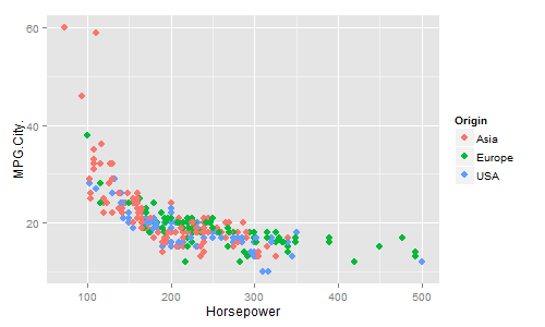
GGPLOT2 scatter plot using sashelp.cars:
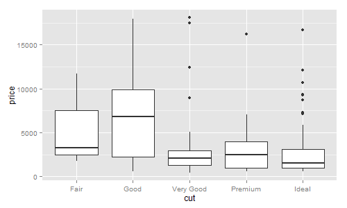
SGPLOT scatter plot using sashelp.cars:
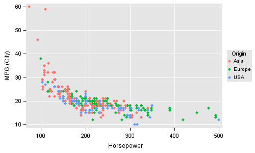
SGPLOT code:
proc sgplot data=sashelp.cars; styleattrs datacontrastcolors=(%rgbhex(248,118,109) %rgbhex(0, 186, 56) %rgbhex(97, 156, 255)); scatter x=horsepower y=mpg_city / group=origin markerattrs=(symbol=diamondfilled); xaxis grid display=(noline); yaxis grid display=(noline); keylegend / title='Origin' position=right across=1 noborder; run; |
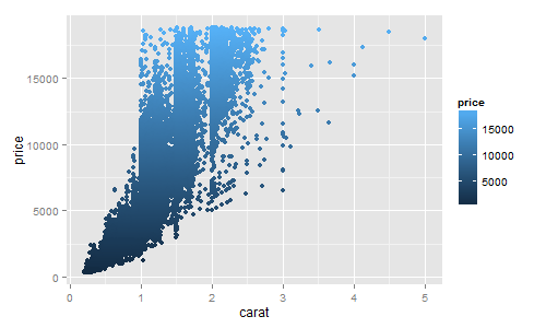
In the above code, I set the three colors to match the colors from GGPLOT2 using the SAS 9.4 STYLEATTRS statement. You can also do this in the style itself. Scatter markers can also be colored using a gradient ramp. In the following example, I used the Diamonds data set from R.
GGPLOT2 Gradient Scatter Plot:
GTL Gradient Scatter Plot:
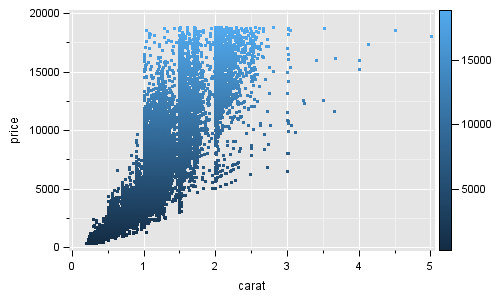
The SGPLOT procedure does not support the MarkerColorGradient feature. So, in this case, I used GTL. I also went the extra mile to turn on the minor grids, and change the minor gridline color to match R. The full code is attached in the file below.
GTL code for graph:
proc template; define statgraph diamonds; begingraph; layout overlay / xaxisopts=(display=(ticks tickvalues label)) yaxisopts=(display=(ticks tickvalues label)); scatterplot x=carat y=price / markerattrs=(symbol=circlefilled size=3) markercolorgradient=price name='a' colormodel=(%rgbhex(19,43,67) %rgbhex(82,169,237)); continuouslegend 'a' / halign=right; endlayout; endgraph; end; run; |
In this example, I have used the %RGBHEX macro supplied by Perry Watts in her paper "Defining colors with Precision in your SAS/GRAPH Application"
The Box Plot examples shown below use a subset of the Diamonds data set:
GGPlot2 Box Plot:
SGPLOT Box Plot:
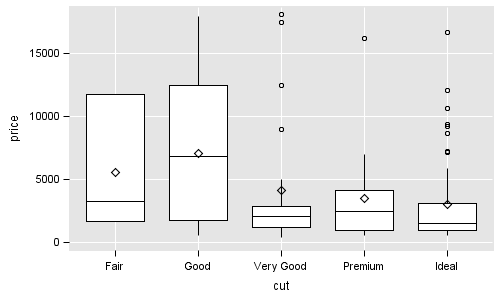 Note some differences in the computation of Q1 and Q3 when number of observations for a category are small. GGPLOT2 does not show the mean marker by default.
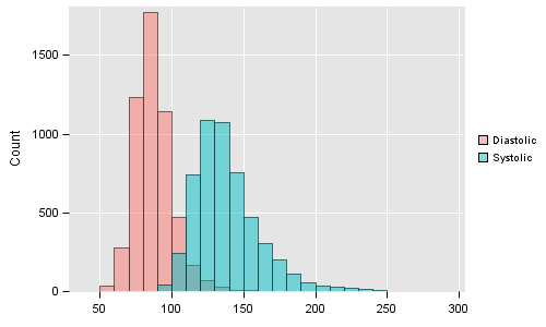
A few weeks back I wrote an article on Comparative Histograms where I discussed mirrored or overlaid histograms. Here are similar graphs using R and SAS. With GGPLOT2, you can display histograms with group as shown here. Histograms from multiple columns can also be overlaid, though I had some trouble getting the legend to draw in this case. At this time, SAS does not support grouped histograms, but you can reshape the data into multi column (one for each group value) and use histogram overlays to create the same graph. We will add support for grouped case in a future release.
GGPLOT2 Grouped Histogram:
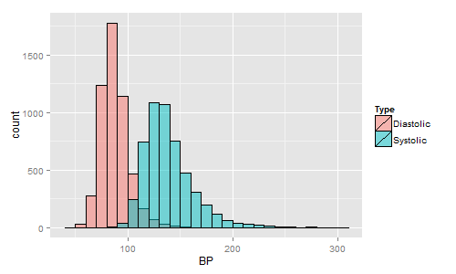 SGPLOT Histogram Overlays:
SGPLOT code for Histogram Overlays:
proc sgplot data=sashelp.heart; histogram diastolic / binstart=35 binwidth=10 transparency=0.5 fillattrs=(color=%rgbhex(248,118,109)) scale=count; histogram systolic / binstart=35 binwidth=10 transparency=0.5 fillattrs=(color=%rgbhex(0,191,196)) scale=count; xaxis grid display=(noline nolabel); yaxis grid display=(noline); keylegend / position=right noborder noopaque; run; |
Note, some extra options are used to mimic the GGPLOT2 look and feel. Also for the R graph, I have enabled the bin outlines. Colors and attributes can be set in a style, or you can use the SAS 9.4 STYLEATTRS statement for convenience.
I have only just started learning GGPLOT2. However, it appears that GGPLOT2, SGPLOT and GTL all philosophically use similar layered approach to build complex graphs. Simple graphs are easy, and complex graphs are possible. GGPLOT2 syntax leans towards brevity while the SGPLOT and GTL syntax is more structured and verbose. Each have their advantages.
If you have a favourite graphs created using GGPLOT2 that you would like to create using SG procedure or GTL, please feel free to share the graph and (preferably) the data so we can give it a go.
Full SAS Code: R_Graphs


9 Comments
Could you post or add the R code to this blog. It would be interesting to see how much/little R code you need in comparison to the SAS code to create the graphs shown in the blog, ignoring the 'style' you created in SAS to replicate GGPLOT2.
Here is the minimal code for box plots for each. Other than the individual programming style of each system, there is very little significant difference.
SGPLOT:
proc sgplot data=r.dsmall;
vbox price / category=cut;
run;
GGPLOT2:
qplot(cut, price, data=dsmall, geom="boxplot")
Sanjay, this is an interesting comparison as I have just started using R/GGPLOT2 more often. And this is mainly for "computed" plots (such as the histograms) in layouts of type DATAPANEL or DATALATTICE (in SAS terminology), which is obviously not possible with SAS GTL, but quite easy with GGPLOT2. Will we see this with the next SAS version?
This is also quite easy with the SGPANEL procedure. There are many articles in this blog on this topic. Here is one example. You are right that GTL DATAPANEL and DATALATTICE statements only support non-computed plots. However, the SGPANEL procedure can create "Faceted" graphs including computed plots like Box, Histogram, etc. with very simple syntax.
We will write a followup on paneled graphs using SGPANEL or R (GGPLOT2 or Lattice) package. Now, conditioning for an interval variable is one item we have not directly addressed as yet.
Yes, I saw that with SGPANEL. However, many of my graphs require layout elements that I cannot find in SGPANEL, so I almost always use the GTL. One other feature of GTL which I use often are the dynamic variables. I think the GTL should be more powerful than the SG procedures, which it usually is - except for the faceted computed graphs.
I expect each system to have its strengths. You should feel free to use what ever software that works for you. I would love to hear about the additional features you feel you need in SGPANEL. We can certainly look into it as others may also benefit from it. You can also call these into Tech Support for a formal feature request.
Hi Sanjay, I was too busy for a while to follow up on that. Two features that I would just need in a series of plots: The KEYLEGEND statement in SGPANEL does obviously not allow to make the background transparent or define its color, while there are the OPAQUE and BACKGROUNDCOLOR options in the GTL. Same for the cell headers in the panel.
Sorry, for the cell headers in the panel I meant not the same, but I cannot find a way to remove the line around them or change its color. This is less important, however.
If you have 1000 obsevations in one group and 2000 observations in the other group how do you reshape the data in SAS ? Just stick the columns together with missing values?
How can you easily change the scale to log scale with Histograms too ? I tried building some graphs I had just done in GGPLOT2, but quickly have given up as it's just too difficult and no easily example syntax like ggplot.