Recently a user posted a question on the SAS/GRAPH and ODS Graphics Communities page on how to plot the normal density curves for two classification levels in the same graph.
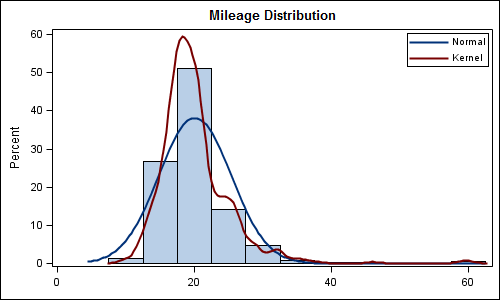
We have often seen examples of a distribution plot of one variable using a histogram with normal and kernel density curves. Here is a simple example:
Code Snippet:
title 'Mileage Distribution'; proc sgplot data=sashelp.cars; histogram mpg_city; density mpg_city / type=normal legendlabel='Normal' lineattrs=(pattern=solid); density mpg_city / type=kernel legendlabel='Kernel' lineattrs=(pattern=solid); keylegend / location=inside position=topright across=1; xaxis display=(nolabel); run; |
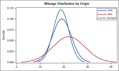
To compare the distribution by a classifier in the same graph, you can do something similar as long as the classified data is transformed into a multi-column format. Now, you can overlay two (or more) density curves of different variables in the same way.
In the example below, we have transformed the data for sashelp.cars into a multi-column format using the code suggested by Rick Wicklin in his article Reshape data so that each category becomes a variable. The values of MPG_CITY for the three levels of the Origin variable are transformed into three indepenent columns. Then, we have used three density statements to plot the data in one graph. Here is the graph and the code snippet. Full program is included at the bottom.
Code snippet:
title 'Mileage Distribution by Origin'; proc sgplot data=multiVar; density mpg_usa / legendlabel='USA' lineattrs=(pattern=solid); density mpg_asia / legendlabel='Asia' lineattrs=(pattern=solid); density mpg_eur / legendlabel='Europe' lineattrs=(pattern=solid); keylegend / location=inside position=topright across=1; xaxis display=(nolabel); run; |
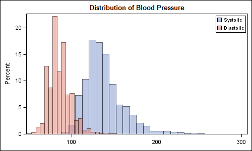
We can take this idea further, and create a plot to see the distribution of multiple variables on the same graph using histograms and / or density plots. Here is an example of systolic and diastolic blood pressure from sashelp.heart. We have set a transparency level for each plot to be able to see the data:
Code snippet:
title 'Distribution of Blood Pressure'; proc sgplot data=sashelp.heart; histogram systolic / fillattrs=graphdata1 name='s' legendlabel='Systolic' transparency=0.5; histogram diastolic / fillattrs=graphdata2 name='d' legendlabel='Diastolic' transparency=0.5; keylegend 's' 'd' / location=inside position=topright across=1; xaxis display=(nolabel); run; |
Full SAS 9.2 Program: Full SAS Code
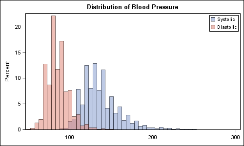
SAS 9.3: With SAS 9.3, you can set the binwidth for the histograms to get a better comparative graph:
SGPlot code:
title 'Distribution of Blood Pressure'; proc sgplot data=sashelp.heart; histogram systolic / fillattrs=graphdata1 name='s' legendlabel='Systolic' transparency=0.5 binwidth=5; histogram diastolic / fillattrs=graphdata2 name='d' legendlabel='Diastolic' transparency=0.5 binwidth=5; keylegend 's' 'd' / location=inside position=topright across=1; xaxis display=(nolabel); run; |
Ful SAS 9.3 code: Full SAS Code 93


4 Comments
I also blogged a few weeks ago about an alternate approach that uses SAS statistical procedures.
For the histogram overlay, it is easier to compare the distributions (especialy the overlapping area) when the bin widths of the two histograms are the same. In SAS 9.3, you can set the bin widths in PROC SGPLOT by using the BINWIDTH= option. In SAS 9.2, you need to use GTL to write a template the overlays the histograms.
Dear Sanjay,
How could I plot mirrored histograms to compare propensity score distributions. Thank you for your assistance.
You can do that using GTL with Layout Lattice. Assuming these are histograms of two (or more) columns in the data, overlaid Histogram can work well too because you can compare shapes and relative densities. See new blog article on Comparative Histograms.
Dear Sanjay,
While I was looking for calculating the overlapping area, I ran into this post. How can we calculate the area in the overlapping section?