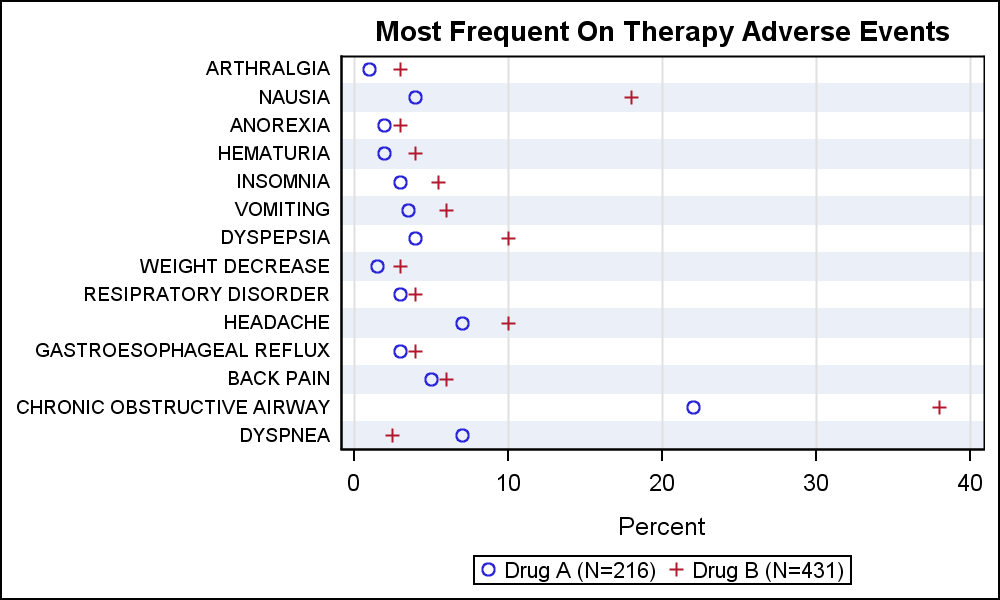
A large variety of graphs fall in the category of what I call a "Single-Cell" graph. This type of graph consists of a single data region along with titles, footnotes, legends and other ancillary objects. Legends and text entries can be included in the data area. The data itself is displayed in a single rectangular region bounded by a set of X and Y axes. Here is an example of such a graph popular in the Clinical Research domain. Click on the graph for a higher resolution view:
SGPLOT code:
Title 'Most Frequent On Therapy Adverse Events'; proc sgplot data= MostFrequentAESort nocycleattrs; scatter y=ae x=a / name='a' legendlabel='Drug A (N=216)' markerattrs=graphdata1; scatter y=ae x=b / name='b' legendlabel='Drug B (N=431)' markerattrs=graphdata2; keylegend 'a' 'b'; yaxis display=(nolabel noticks) valueattrs=(size=7) fitpolicy=none colorbands=odd colorbandsattrs=(transparency=0.5); xaxis label='Percent' labelpos=datacenter grid; run; |
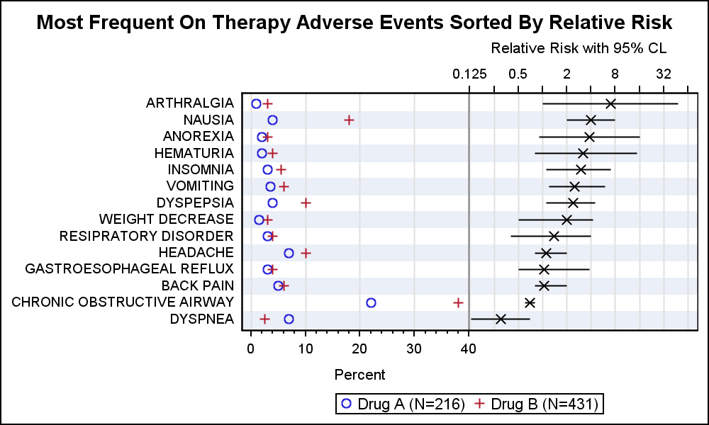
The SGPLOT procedure is ideally suited to create such graphs. But in many cases it is useful or necessary to add a second display of data in the same graph. In this case, we would like to add a display of the relative risk values to the graph, and sort the data by descending risk. Such a graph can be created using a two cell graph using GTL as described in Most Frequent Adverse Events sorted by Relative Risk. This graph uses the LAYOUT LATTICE to create a two cell graph, and then each cell is populated with the appropriate plots.
However, it is also possible to create what appears to be a 2-cell graph using SGPLOT using the "axis-splitting" technique I have described earlier. The graph still has only one cell. But, each cell can have up to four independent axes (X, Y, X2 and Y2). Each plot statement placed in the cell can be associated with one pair of x and y axes. Also, each axis can be restricted to use portion of the graph width or height by using the axis offsets. We can use a combination of these to create two independent graphs in the same cell.
Here is such a graph created using SAS 9.2 SGPLOT procedure. This graph appears to have two cells, one for the percent values on left and one for the relative risk on the right. But, it is really only one cell, divided into two parts as described below.

SAS 9.2 SGPLOT Code:
Title 'Most Frequent On Therapy Adverse Events Sorted By Relative Risk'; proc sgplot data= MostFrequentAESort nocycleattrs; refline refae / lineattrs=(thickness=12) transparency=0.8; scatter y=ae x=a / name='a' legendlabel='Drug A (N=216)' markerattrs=graphdata1; scatter y=ae x=b / name='b' legendlabel='Drug B (N=431)' markerattrs=graphdata2; scatter y=ae x=mean / xerrorlower=low xerrorupper=high x2axis markerattrs=graphdatadefault(symbol=x) errorbarattrs=(pattern=solid); refline 40 / axis=x; keylegend 'a' 'b'; yaxis display=(nolabel noticks); xaxis offsetmax=0.5 grid labelattrs=(size=8) label='Percent '; x2axis offsetmin=0.5 type=log logbase=2 logstyle=logexpand grid max=64 labelattrs=(size=8) label=' Relative Risk with 95% CL'; run; |
Note the following features of this graph and code:
- We have used two scatter plots to draw the percent occurrences for each adverse event. These two scatter plots are associated with the default X and Y axes.
- We have set the X axis OffsetMax to 0.5, so the X axis data is drawn only in the left half of the cell region.
- We have used another scatter plot with error bars to display the relative risk values. This scatter plot is associated with the X2 and Y axis. The Y axis is common between the two, so the data are correctly aligned vertically.
- We have set the X2 axis OffsetMin to 0.5, so the X2 axis data is drawn only in the right half of the cell region.
- The X2 axis type is set to log.
- A vertical reference line is drawn at the max value of X which appears like a cell divider.
- Alternate wide reference lines are used to simulate alternate horizontal bands.
- Note, the X and X2 axis labels will still try to draw in the center of the full axis. That is why we have to use extra trailing or leading blanks for the labels. This issue is addressed in the SAS 9.4 version shown below.
- Y axis tick values will be suppressed if they run into each other vertically. So, we have to reduce the font to make sure they fit in a derived style.
Some of the issues mentioned above are addressed in in SAS 9.3 version as shown below. Here, the Y axis tick value fit policy is set to none, thus allowing the values to crowd together if needed.
SAS9.3 Graph:

SAS 9.3 SGPLOT code:
Title 'Most Frequent On Therapy Adverse Events Sorted By Relative Risk'; proc sgplot data= MostFrequentAESort nocycleattrs; refline refae / lineattrs=(thickness=12) transparency=0.8; scatter y=ae x=a / name='a' legendlabel='Drug A (N=216)' markerattrs=graphdata1; scatter y=ae x=b / name='b' legendlabel='Drug B (N=431)' markerattrs=graphdata2; highlow y=ae low=low high=high / x2axis; scatter y=ae x=mean / x2axis markerattrs=(symbol=x); refline 40 / axis=x; keylegend 'a' 'b'; yaxis display=(nolabel noticks) valueattrs=(size=7) fitpolicy=none; xaxis offsetmax=0.5 grid labelattrs=(size=8) valueattrs=(size=7) label='Percent '; x2axis offsetmin=0.5 type=log logbase=2 logstyle=logexpand grid max=64 labelattrs=(size=8) valueattrs=(size=7) label=' Relative Risk with 95% CL'; run; |
With SAS 9.3, the X and Y axis tick value size can be set in the syntax, and also the Y axis fit policy is set to none. Now, tick values can get closer to each other without being suppressed. Note, the error bars are drawn using the highlow plot to avoid the bar caps.
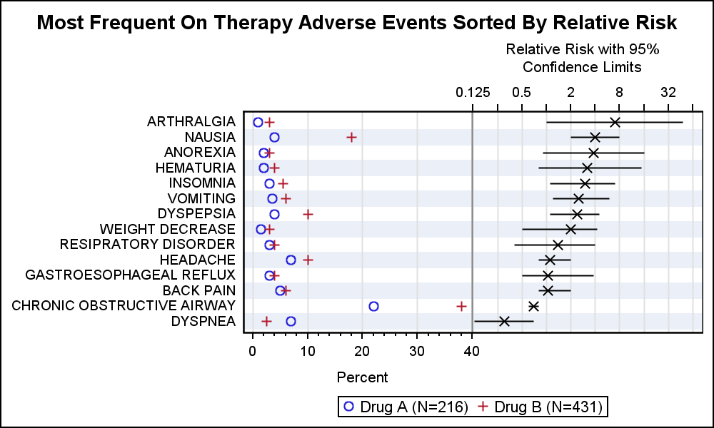
With SAS 9.4, additional features are available to improve this graph.
SAS9.4 Graph:
SAS 9.4 SGPLOT code:
Title 'Most Frequent On Therapy Adverse Events Sorted By Relative Risk'; proc sgplot data= MostFrequentAESort nocycleattrs; scatter y=ae x=a / name='a' legendlabel='Drug A (N=216)' markerattrs=graphdata1; scatter y=ae x=b / name='b' legendlabel='Drug B (N=431)' markerattrs=graphdata2; scatter y=ae x=mean / xerrorlower=low xerrorupper=high x2axis markerattrs=(symbol=x) noerrorcaps; refline 40 / axis=x; keylegend 'a' 'b'; yaxis display=(nolabel noticks) valueattrs=(size=7) fitpolicy=none colorbands=odd colorbandsattrs=(transparency=0.5); xaxis offsetmax=0.5 grid labelattrs=(size=8) valueattrs=(size=7) label='Percent' labelpos=datacenter minor; x2axis offsetmin=0.5 type=log logbase=2 logstyle=logexpand grid max=64 labelattrs=(size=8) valueattrs=(size=7) labelpos=datacenter label='Relative Risk with 95% CL'; run; |
Now, the label position for X and X2 axis are set as "DataCenter". This means the label is automatically drawn in the data space of the axis, not the center of the whole axis width. Now, we no longer have to pad the axis label with leading or trailing blanks.
We have gone back to using the scatter plot for the relative risk bars and used the NOERRORCAPS option. Also, we have used COLORBANDS option on the Y axis to create the alternate horizontal bands. We no longer have to add a reference line to do this which requires guessing at the width of the line.
SAS 9.4 also allows wrapping of the axis labels as shown here:
Note the X2 axis label is fully spelled out, and has wrapped within the data space for the axis. This will work for all axes. Minor ticks are also displayed for the x axis.
Full SAS program. Note, some program will need SAS 9.4 features: Two-In-One


9 Comments
Thanks Sanjay. This is a very neat alternative to a lattice plot via GTL. I don't suppose there is any hope of you developing a SGLattice procedure in the future or modifying SGPanel so that the panelby statement has an alternative statement.
Yes, we have discussed developing the SGLattice procedure. SGPLOT assumes one layout overlay, and can thus simplify the code. Same for SGPANEL, with one DataLattice or one DataPanel. SGLattice would have to handle creating ad-hoc layouts and then populate each cell with different (but compatible) plots. We will need options for each axis of each cell including common axes. This could eventually get as complex as LAYOUT LATTICE in GTL. If we can decide where to draw the line to provide enough functionality with reduced complexity, then it may be worth a shot. We have not found this yet.
SGSCATTER does some of this with scatter plots. Designer is another alternative to make simple lattice layouts using an interactive process.
Nice to share such a great post about sas graph.really i am very lucky to see this type of examples on sas graph.
Is there a way to create a bar chart - which shows changes in values by year - where the last bar (2014) would be a different color or shade. So bars representing 2009, 2010, 2011, 2012, 2013 would have a dark blue color and then the bar representing 2014 would have a light blue color.
Visually this creates emphasis on the most current period or bar.
Use another column 'A' with two values. One value for all the bars, and another for 2014. Then, use the GROUP=A option.
Pingback: Adverse Events Graph with NNT - Graphically Speaking
I would like to make a graph in SAS like the one on the right side of your lattice. Simply the categories on the Y axis, with the scatter points (based on one variable) and error bars (based on columns for UCL and LCL). I am unsure with the scatter statement of SGPlot how to get the y axis to be categorical and labeled with category names. Do you have another blog you could point to that might outline this? Thank you.
Hi Sanjay,
I have been struggling in the past two days to create a forest plot but soon ran into a problem that I have not bee able to solve:
When I use the scatter statement, the point estimates appear on the graph but when I followup with a highlow statement, only the horizontal lines for the confidence intervals are shown, NOT both point estimate and CI. If I comment out the highlow statement, the point estimates show up. Would you know if there is something I am doing wrong that prevents both statement from working in synergy? Below is my code:
Thanks much in advance
ods graphics on / width=10in;
ods graphics on / height=20in;
proc sgplot data=forest1 dattrmap=attrmap noautolegend noborder;
/*styleattrs datasymbols=(circlefilled diamondfilled trianglefilled squarefilled)
datacontrastcolors=(red green blue maroon);*/
scatter y=record x=beta_estimate / group=subgroup filledoutlinedmarkers markerattrs=(size=12) xerrorlower=low ;
highlow y=record low=low high=high / group=subgroup lineattrs=(thickness=3 pattern=solid) groupdisplay=cluster clusterwidth=0.5;
*--- adding yaxis table at left ---;
yaxistable subgroup /
location=inside
position=left
textgroup=level
textgroupid=text
indentweight=indentWt
;
*--- adding a second yaxis table at right ---;
yaxistable P_value /
location=inside
position=right
;
*--- primary axes ---;
yaxis
reverse
display=none
offsetmin=.01
colorbands=odd colorbandsattrs=(transparency=0.5)
values=(1 to 100 by 5)
;
*--draw reference line in the graph--*;
refline 0 / axis=x lineattrs=(pattern=shortdash) transparency=0.5;
xaxis offsetmax=.01;
keylegend 'Beta estimate' / location=inside position=bottom;
run;
I found the answer to my question. Sorry to have bother you with this. The problem was that my point estimate variable was character instead of numeric.