I am happy to report that my new book "Getting Started with the Graph Template Language in SAS" is now shipping. A colleague suggest it would be useful to post some articles with the same theme of "Getting started". I thought that was a great idea, and decided to start a new thread of articles to help the reader who is new to GTL or SG Procedures get started with these topics.
Here is the first installment of the getting started articles with GTL. For the first article, Let us start with the simplest of graphs that you can create using GTL, a single-cell scatter plot. Before we get started, let us look at the minimal code structure you need to create a graph using GTL.
First of all, you need to know that creating a graph with GTL is a two-step process.
Step 1: Define the structure of the graph using GTL in the TEMPLATE procedure. In this step the template is compiled and saved, but no graph is created.
Step 2: Associate compatible data with template using the SGRENDER procedure to create the graph.
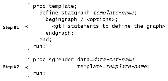 In the illustration above, the GTL syntax used to define the structure of the graph goes inside the BEGINGRAPH and ENDGRAPH block. The template is assigned a name in the proc TEMPLATE step which is used in the proc SGRENDER step to create the graph.
The real strength of GTL lies in its ability to allow the building of complex and intricate graphs using a structured approach. Simple graphs can be created too, but then one has to use the structured approach. Let us look at a simple example.
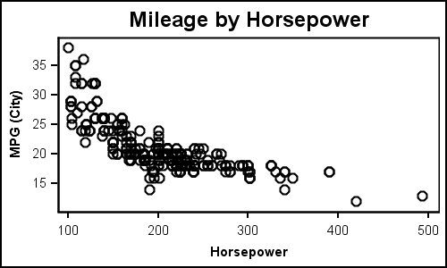
Simple Scatter Plot:
GTL Code:
/*--Define the template--*/ proc template; define statgraph scatter; begingraph; entrytitle 'Mileage by Horsepower'; layout overlay; scatterplot x=horsepower y=mpg_city; endlayout; endgraph; end; run; /*--Render the Graph--*/ proc sgrender data=sedans template=scatter; run; |
While the code seems more than what one would expect for a simple scatter plot, most of the code is "boiler-plate". The key part of the code in the template above is the following:
layout overlay;
  scatterplot x=horsepower y=mpg_city;
endlayout; |
Here we use the LAYOUT OVERLAY container which is the most basic container used to create all single-cell graphs. All plot statements must go inside a layout container. In this case, we are using just one single SCATTERPLOT statement, with no optional features at all. Note the data set "Sedans" includes only the sedans from sashelp.cars data set.
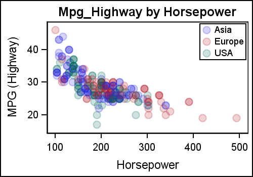
Scatter Plot with Groups using Dynamics:
Extending the above to create a graph with group classification is straightforward. We use the GROUP option to get the following graph. But we also made some other changes that will demonstrate the strengths of GTL.
GTL Template code with Dynamics:
/*--Dynamic Scatter Plot--*/ proc template; define statgraph dyn_scatter; dynamic _x _y _grp _valign; begingraph; entrytitle _y ' by ' _x; layout overlay; scatterplot x=_x y=_y / group=_grp datatransparency=0.8 name='a' markerattrs=(symbol=circlefilled size=10); if (exists(_grp)) discretelegend 'a' / location=inside valign=_valign halign=right across=1; endif; endlayout; endgraph; end; run; |
Note, in the template (name=dyn_scatter) above, we have not only added the GROUP option for the SCATTERPLOT, but we have also used dynamics to make the template more flexible. Here are the details:
- We have defined 4 dynamic variables _x, _y, _grp and _valign.
- As good coding practice, I use "_" prefixes for all dynamics.
- Now, we have used dynamic variables for the X, Y, GROUP roles.
- We also used a dynamic to set the legend alignment.
- The values for the dynamics are specified in the DYNAMIC statement in the SGRENDER procedure step.
- We have used a filled circle marker symbol with a transparency of 80%.
- Alignment of the interior legend can be changed using the _valign option.
Now, using dynamics, we can use the same template to create different types of graphs as follows.
Code to create graph:
proc sgrender data=sedans template=dyn_scatter; dynamic _x='Horsepower' _y='Mpg_Highway' _grp='Origin' _valign='Top'; run; |
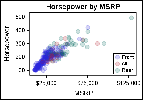
In the next example, we use the same template (dyn_scatter) to create a graph of Horsepower by MSRP with Drivetrain as group classifier. In this graph it is better to place the interior legend at the bottom, so we have done that using the "_valign" option.
Scatter Plot of Horsepower by MSRP by Drivetrain:
Code to create graph:
proc sgrender data=sedans template=dyn_scatter; dynamic _x='MSRP' _y='Horsepower' _grp='Drivetrain' _valign='Bottom'; run; |
The examples above show you the power of GTL, where you can create simple graphs with ease, and also make them very robust and flexible using dynamics and conditional logic. That's right, we also used conditional logic to draw the DISCRETELEGEND only when the "_grp" dynamic is defined. Note, the title is also changed appropriately using the dynamic values.
This same template can also render the first scatter plot shown in this article, one without any groups. Just leave _grp undefined, and you will get the first graph as shown in the last step in the attached program.
Full SAS 9.3 Code: GS_GTL_1_ScatterPlots


4 Comments
I know it's beside the point, but for these graphs, you'd be better off switching to a log scale; right now now the data is occupying only about a quarter of the plot and it's quite difficult to see what's going on in the range where most of the data is present (introducing transparency only gets you so for). For example plot Horsepower in log-base2 from 6.5 to 9 in .5 increments (i.e., 90, 128, 181, 256, 362, 515), with primary in axis in log units and the secondary in original units (or vice versa); and similarly for mpg, go from 2 to 6 in log-base2 units, i.e., 4 to 64 (your mileage may vary on the exact units - pun intended).
Pedagogically, I'm not sure it's a good idea to introduce both dynamics and modifying the example for groups simultaneously (it's akin to modifying data step code to add additional features and introducing macro variables at the same time). Splitting it into two examples would have made it clearer which elements were necessary for each, i.e., 1) here is how we modify the GTL code for groups; 2) if we would like to make the template more flexible, here is how we introduce dynamic variables.
I'd also have spent more time on the conditional logic structure: if (exists(var)) .... ; endif; doesn't resemble traditional data step conditioning at all.
Thanks for your observations. My goal is to expose the features of GTL, with some indication of why you would use GTL in place of SGPLOT. I started with the idea of keeping the article simple, with no dynamics or conditionals or functions. But, it made more sense to expose this (gently) to show how GTL is different from SG. Sure, you can use log axes. That will be a topic for a future article.
By the same token, it would have been useful to contrast the gtl scatter plot by groups code with its sgplot equivalent:
proc sgplot data = sedans;
scatter x = horsepower y = mpg_city / group = origin markerattrs=(symbol=circlefilled size=10) transparency=.8;
KEYLEGEND / location=inside across = 1 POSITION=TOPRIGHT;
title 'Mileage by Horsepower' ;
run;
title;
I don't imagine many people go to gtl without trying sgplot first and it's useful to point out the where (somewhat arbitrary) differences in syntax occur: e.g.,
transparency vs. datatransparency;
KEYLEGEND vs. discretelegend ;
POSITION=TOPRIGHT vs. valign=top and halign=right across=1;
This sort of cognitive interference can be very frustrating, especially when one is switching to gtl because the sg* procedure can't quite do what you want, e.g., playing with switching to log scales, I end up with:
proc sgplot data = sedans;
scatter x = horsepower y = mpg_city / group = origin markerattrs=(symbol=circlefilled size=10) transparency=.8;
KEYLEGEND / location=inside across = 1 POSITION=TOPRIGHT;
title 'Mileage by Horsepower' ;
xaxis TYPE=LOG LOGSTYLE=LINEAR LOGBASE= 2 refticks;
yaxis values=(10 to 40 by 5) refticks;
run;
title;
It's not quite what I describe in my first post because many of the axis options aren't compatible with a log scale and presumably gtl might grant more control (I am aware that transforming the raw data is an alternative, but the goal is to minimize complexity).
Pingback: Getting Started with GTL – 2 – Scatter Plots with Labels - Graphically Speaking