In the first article on Getting Started with GTL, we discussed the basics on how to create a graph using the Graph Template Language. This involved the creation of a "statgraph" template using the TEMPLATE procedure, and then associating data with the template to create the graph using the SGRENDER procedure. In this article, we discussed creating a simple scatter plot, using various options. We also discussed how the template can be made flexible by use of dynamics and conditionals.
While I too can't wait to get to the interesting details of layering and layouts, a key feature of GTL, let us examine some interesting features of the Scatter Plot in this article. In addition to the features covered in article # 1, the scatter plot also supports two ways to display textual values in the plot. These use the DATALABEL and MARKERCHARACTER options
Data Labels: A data label can be displayed at each observation in the scatter plot by assigning a data column to the DATALABEL option. The value from the column is displayed near the (x, y) location of the marker. By default, the label is displayed at the upper right of the marker. A data label placement algorithm is in use by default. If a data label cannot be accommodated in the default location, it is placed at one of the eight locations around the marker, as shown in the graph below.
Scatter Plot with Data Labels:
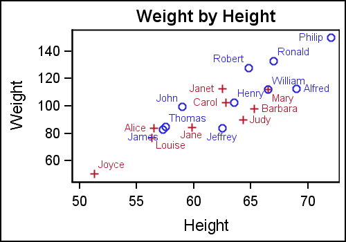
The GTL template for this graph is shown below. Note the use of the DATALABEL option.
proc template; define statgraph ClassScatterLabel; begingraph; entrytitle 'Weight by Height'; layout overlay; scatterplot x=height y=weight / datalabel=name group=sex; endlayout; endgraph; end; run; |
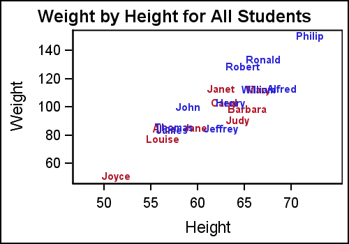
This works well when there are a few observations, but the graph can quickly become unreadable if there are too many labels. If we were to create a scatter plot with labels using the sashelp.cars data set, the graph will not be effective. In such cases, it is better to restrict the labels to only the ones we want to see. If the observation in the label column is missing, a label is not drawn. We can use this to thin down the number of labels as shown in the graph below.

Here, we have retained only the model name for the "luxury" cars, with an MSRP > $70,000. We have also used the GROUP option so all the labels have the same color as the marker itself. This can help in associating a marker with its label. All the jumble of cars with value < $70,000 have missing labels, so no labels are drawn.
The data label position is determined by the label placement algorithm which tries to avoid label collision with other labels or the markers. However, you can also fix the label position to one of the eight positions around the marker.
Marker Character: Another way to display text values in the scatter plot is by assigning a data column to the MARKERCHARACTER option. When this option is used, the marker normally drawn in the (x, y) location is replaced by the corresponding textual value from the column. This can either by a text string or the formatted numeric value as shown in the graph below.
In this graph, the string from the NAME column is displayed at the (x, y) location for each observation. Note, the center of the text string is positioned at the (x, y) location.
Another way to use this option is to display these text values as a column. In the graph below, the scatter plot is drawn as usual, but another scatter plot is used to place the textual values at the right end of the data area. This is done by placing all labels at a value > the max value for the HEIGHT variable. Note, we have done this by layering two scatter plots.
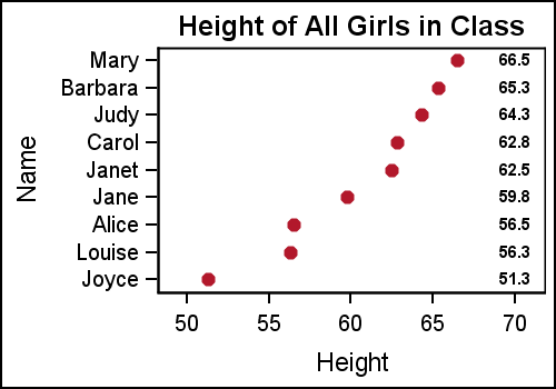
GTL template for the graph:
proc template; define statgraph ClassTable; begingraph; entrytitle 'Height of All Girls in Class'; layout overlay; scatterplot x=height y=name / markerattrs=graphdata2(symbol=circlefilled); scatterplot x=ht_Loc y=name / markercharacter=height markercharacterattrs=(weight=bold); endlayout; endgraph; end; run; |
Using the same Y variable on both scatter plots assures that the text strings are correctly aligned with the markers along the Y axis. In a situation like this, where the graph is wide with many rows of data, it becomes hard for the eye to read across the graph to line up the text values with the axis. To aid the eye in decoding this graph, alternate horizontal bands can help, as shown below.
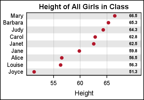
In this case, we have used a thick reference line at alternate Y axis values. This was done by replicating the variable used for the Y axis for every alternate value, leaving the other ones missing. Then a reference line is drawn using this new variable with a thickness=15 and 80% transparency. With SAS 9.4, this effect can be achieved by just using the COLORBANDS option.
GTL code for graph:
proc template; define statgraph ClassTableAxis; begingraph; entrytitle 'Height of All Girls in Class'; layout overlay / xaxisopts=(griddisplay=on) yaxisopts=(display=(tickvalues) offsetmin=0.05 offsetmax=0.05); referenceline y=refname / lineattrs=(thickness=15) datatransparency=0.8; scatterplot x=height y=name / markerattrs=graphdata2(symbol=circlefilled); scatterplot x=ht_Loc y=name / markercharacter=height markercharacterattrs=(weight=bold); endlayout; endgraph; end; run; |
Note, x axis grid lines are enabled, and Y axis ticks and label are suppressed. This is done using the XAXISOPTS and YAXISOPTS option bundles on the LAYOUT OVERLAY statement. The layout overlay statement defines a cell, and each cell can contain multiple compatible plot statements. So, the X and Y axis do not belong to any one plot statement, but belong to the container. Hence, these options are on the LAYOUT OVERLAY statement. We will discuss more on layering and layouts in subsequent articles.
Full program: GS_GTL_2_ScatterPlots


