A Bar Line graph is commonly used in many domains. The SGPLOT procedure makes it easy to create bar line graphs where the user can customize it in many different ways. This post is prompted by a recent question on the communities page on creating such a graph, with one bar and multiple line plots.
Bar Line with Multi Column Data:
This graph is easily done using the SGPLOT procedure when the data set has the response columns by category, one for the bar and one for each line as shown below:
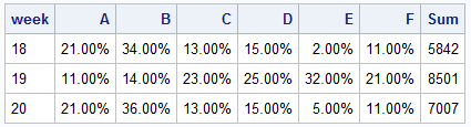
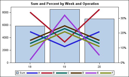
Here is a basic bar line graph with the Sum represented as the bar on the left Y axis, and all the percent values on the right Y2 axis.
SGPLOT code:
proc sgplot data=testcols; title 'Sum and Percent by Week and Operation'; vbar week / response=sum fillattrs=graphdatadefault nostatlabel; vline week / response=A lineattrs=(thickness=5 pattern=solid) nostatlabel y2axis; vline week / response=B lineattrs=(thickness=5 pattern=solid) nostatlabel y2axis; vline week / response=C lineattrs=(thickness=5 pattern=solid) nostatlabel y2axis; vline week / response=D lineattrs=(thickness=5 pattern=solid) nostatlabel y2axis; vline week / response=E lineattrs=(thickness=5 pattern=solid) nostatlabel y2axis; vline week / response=F lineattrs=(thickness=5 pattern=solid) nostatlabel y2axis; xaxis display=(nolabel); yaxis offsetmin=0 display=(nolabel) ; y2axis offsetmin=0 display=(nolabel); run; |
Note the following:
- We have used a VBAR statement to display sum x week.
- We have used multiple VLINE statements to display each % by week.
- We have set offsetmin=0 for both Y and Y2 axis. This ensures the bars start from the x axis.
- NOSTATLABEL prevents the addition of the statistics to the labels and legends.
- The Y and Y2 axis ticks are not aligned, so it is hard to draw grid lines.
To add Y axis grid lines, it is important to align the tick values on both axes. These can be aligned by setting the tick values on each axis by setting the VALUES option. Here is the resulting graph:
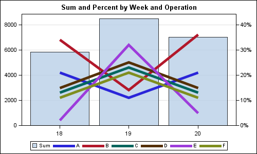
Here we have used the VALUES option on both Y and Y2 axis to get equal number of ticks on each axis. Now we can enable GRID on the Y axis. The bar is made a bit transparent so the grid lines show through.
Bar Line with Grouped Data:
If the data is in grouped format, we can create a similar graph except that it is necessary that both the VBAR and VLINE statements have the same combination of CATEGORY and GROUP variables. Since VLINE are grouped by operation, we also have to use the same group variable for VBAR. To ensure we only get one bar, provide only one non-missing value per category. Here is the data for the grouped case:
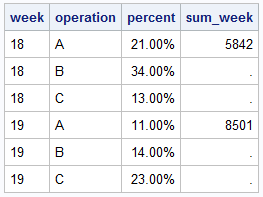 Only 3 values of operation are shown to save space. Note that only the first operation has a non-missing value for sum, and all others have missing value.
Here is the graph and the SGPLOT code. Note, in this graph, we have used a data skin, and curve labels. Curve labels often improve the readability of the graph, and no legend is required.
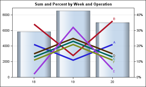
SGPLOT code:
proc sgplot data=test noautolegend; title 'Sum and Percent by Week and Operation'; vbar week / group=operation response=sum_week fillattrs=graphdatadefault nostatlabel transparency=0.2 dataskin=gloss; vline week / group=operation response=percent y2axis lineattrs=(thickness=5 pattern=solid) nostatlabel curvelabel; xaxis display=(nolabel); yaxis offsetmin=0 offsetmax=0.1 values=(0 to 8000 by 2000) display=(nolabel) grid; y2axis offsetmin=0 offsetmax=0.1 values=(0 to 0.4 by 0.1) display=(nolabel); run; |
Full SAS 9.3 SGPLOT code: BarLine


