Recently, I needed to view the list of products with the highest number of defects. I have a data set of defects reported against various products. The data set has over 30 products, and each observation contains the product name, name of the primary support person, and other relevant details of the defect. My goal is to produce an uncluttered graph showing only the most significant information, and to also insert additional information (such as "Support" name) in the graph.
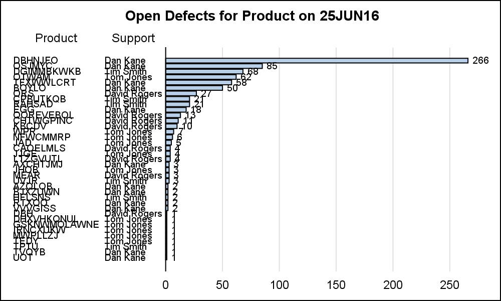 Here is a bar chart of the defects by product. The graph on the right shows the number of defects by all the products in the data set as a horizontal bar chart, showing also the primary support person for the product. Click on the graph for a higher resolution image. The entire detailed data set is provided to the procedure, and the computation of the frequencies is done by the HBAR statement itself.
While we have achieved one goal (inserting additional information into the graph), there are too many bars with small defect counts cluttering up the graph.
Here is the SGPLOT code for the graph:
title "Open Defects for Product on &sysdate";
proc sgplot data=blog.product noborder;
hbar product / datalabel categoryorder=respdesc datalabelfitpolicy=none;
yaxistable product support / position=left location=inside;
xaxis display=(nolabel noline noticks) grid;
yaxis display=none valueattrs=(size=6) fitpolicy=none;
run;
Note the bars are displayed by descending defect counts. As we can see, most of the defects are in the first few products, and there are too many other product names in the graph with very few defects that I do not need to see. This also makes the graph harder to read.
In the code above, I have used the HBAR statement with the CATEGORYORDER=RESPDESC which creates this graph with the descending order of the bars. I have also used the YAXISTABLE to display both the product name and the primary support person.
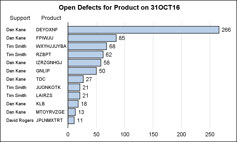 The full detailed data is provided to the procedure and the HBAR is computing the number of defects by product and arranging them by descending statistic (frequency). So, there is no way for me to specify to the graph that I want to see only the products with more than 10 defects, as shown in the graph on the right. This would be a nice feature to add to the procedure at some point.
To create the graph shown on the right, I have to first compute the defect count for each product using PROC MEANS. But, I also need to carry through the "Support" column for plotting. Note the use of the ID variable in the code below. This allows me to get the name of the primary support person along with the product name in the output data set. I sort the data set by the count, and then I can display the graph. I can either show only the first 10 observations, or I could show only the bars with count > N.
My data has no numeric variables. The MEANS procedure apparently did not like this. So, I added a constant column "X" (=10). This seems to have overcome the problem. I also need to use "IDMIN" option to get the smallest value for ID variable to be consistent with SGPLOT.
/*--Add a dummy analysis variable--*/
data product;
set blog.product;
x=10;
run;
/*--Compute frequencies by component, keep the primary support id--*/
proc means data=product noprint idmin;
class product;
id support;
var x;
output out=freq(where=(_type_ > 0))
N=N;
run;
/*--Sort data by descending frequency--*/
proc sort data=freq;
by descending n;
run;
/*--Draw graph using HBARPARM with summarized data--*/
title "Open Defects for Product on &sysdate";
proc sgplot data=freq(where=(n>10)) noborder;
hbarparm category=product response=n / datalabel ;
yaxistable product support / position=left location=inside;
xaxis display=(nolabel noline noticks) grid;
yaxis display=none fitpolicy=none;
run;
Full SAS 9.40 SGPLOT code: Bar_Chart


6 Comments
You can also use PROC FREQ instead of PROC MEANS to obtain a bar chart that shows the top N categories. Another useful visualization is not to drop the smaller categories but to group them into an "Others" category that shows the aggregated frequencies for the small categories.
Thanks for the feedback. I wanted to "carry along" the "Support" column. Hence the use of the "ID" variable. I will clarify that in the article.
Thanks for sharing the example code and output - very helpful!
1) Where could I find the "product" data to reproduce the graph?
2) (not directly related to this particular graph) Are there any blog posts on PROC SGPLOT-generated line graphs using summarized data (e.g., average healthcare expenses and confidence intervals by calendar year)?
This graph uses a data I generated from proprietary data. However, the data set is simple, with only three columns, Product, Support and Counts (N). You can use any data with this structure for such a graph. I used proc means to do this, as shown in the article.
Sanjay,
How come that in your first attempt Dan Kane does support for the top product, while in your unclutterded version that is David Rogers?
Good catch, Louis. I had missed this result. Turns out the MEANS procedure reports the "largest" value for the ID variable if the variable has multiple different values in the raw data. In this case, Product 'DEYOXNF' has two names in Support - 'Dan' and 'David'. Lexicographically, 'David' is larger, so is carried through. SGPLOT carries through the "First" value. That created the difference. I used IDMIN to solve the issue in my case, but that too is not correct. I updated the article.