Sometimes a categorical variable has many levels, but you are only interested in displaying the levels that occur most frequently. For example, if you are interested in the number of times that a song was purchased on iTunes during the past week, you probably don't want a bar chart with thousands of songs. Instead, you probably want a "Top 40" or "Top 20" chart that shows the number of purchases for the most popular songs.
These kinds of charts arise frequently, and you can create them in SAS by using PROC FREQ to compute the counts for the categories, followed by a call to PROC SGPLOT to display the bar chart for the top categories.
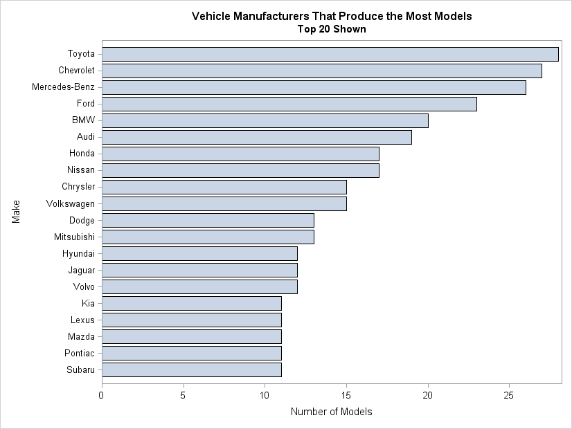
As an example, suppose that you are interested in plotting the number of different models of vehicles that are manufactured by each car company. The Sashelp.Cars data set has a Make variable, which identifies the company, and there is one observation for each different vehicle that a company manufactures. The following call to PROC FREQ counts the number of models that each company makes, sorts the counts in decreasing order, and writes the counts to a SAS data set:
proc freq data=sashelp.cars ORDER=FREQ noprint; tables make / out=FreqOut; run; |
The key syntax is the ORDER= option, which sorts the counts so that the first observation in the FreqOut data set is the company that makes the most vehicles, the second observation is the company that makes the second most, and so on. The FreqOut data set also has a Count variable that contains the number of vehicles for each manufacturer.
Because the observations are sorted by the Count variable, you can easily use the OBS= data set option to restrict the observations that appear in a plot:
%let NumCats = 20; /* limit number of categories in bar chart */ proc sgplot data=FreqOut(OBS=&NumCats); /* restrict to top companies */ Title "Vehicle Manufacturers That Produce the Most Models"; Title2 "Top &NumCats Shown"; hbar make / freq=Count; /* bar lengths given by Count */ yaxis discreteorder=data; /* order of bars same as data set order */ xaxis label = "Number of Models"; run; |
If, instead, you were interested in showing all companies that manufacture at least 12 vehicles, you could use a WHERE clause:
where count >= 12; |
That was pretty easy. However, there is a second kind of bar chart that is also useful, but is more difficult to create. It requires aggregating all of the smaller categories into an "Other" category, and creating a bar whose length represents the sum of the counts for the smaller categories. I'll show how to create that kind of a bar chart in my next post.

1 Comment
Pingback: Create a bar chart with an “Others” category - The DO Loop