Often we see bar charts showing revenues or other related measures by a classifier using a visual of a stack of coins. Such visuals are not strictly for the purposes of accurate magnitude comparisons, but more for providing an interesting visual to attract the attention of the reader. In other words - Infographics.
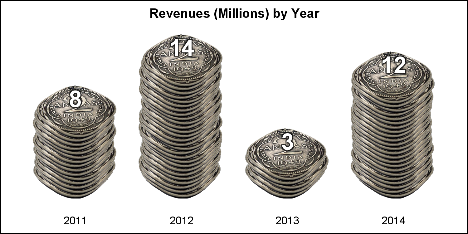 I thought this would be a good exercise to see how we can do this using the SGPLOT procedure. One such result is shown on the right. Click on the graph for a higher resolution image.
I searched the web for some appropriate images of coins, anything with a perspective image of a coin that can be used to create a stack. Then, I found a beautiful image of an antique "2-Annas" coin from British India. The image of the coin has beautiful shine, good resolution, unusual shape and clear details that makes for nice stacks of coins as shown above.
 The default Bar Chart would look like the graph on the right. While it accurately conveys the information clearly, in some instances it is a bit boring compared to the graph above.
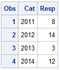
The data for the graph is very simple as show on the right below the graph, and the program is shown below.
SGPLOT code for Bar Chart:
 title 'Revenues (Millions) by Year';
proc sgplot data=Bar noborder noautolegend;
vbar cat / response=resp fillattrs=graphdata1 dataskin=pressed
datalabel datalabelattrs=(size=12 weight=bold);
xaxis display=(noticks noline nolabel) integer ;
yaxis display=(nolabel noticks noline) min=0 integer grid;
run;
Now, to create the graph of the pile of coins, we need to render each coin in the stack individually, using a SCATTER plot where the marker symbol is built from the image of the coin. 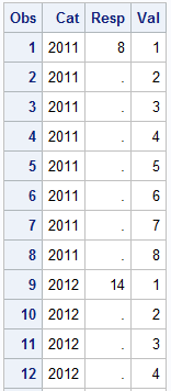 We process the original data set, and generate an observation for each coin with increasing y value in the data. Then, the default rendering order (which is data), the later (higher) coins will be drawn over the earlier coins, thus creating a stack.
The data generated for the coin stack is shown on the right. Note, the response value is kept only once for each category value.
We use the SYMBOLIMAGE statement to define the symbol. One must use a "transparent" image, where the pixels outside the coin part are transparent. We also use the JITTER option so each coin is shifted along the x-axis a bit to simulate a "real" stack. Else, the stack will be too straight. This jitter option works best when the x-axis values are numeric.
SGPLOT code for Coin Stack Graph:
title 'Revenues (Millions) by Year';
proc sgplot data=coins noborder noautolegend;
symbolimage name=Coin image="&Coin";
scatter x=cat y=val / markerattrs=(symbol=Coin size=70) jitter jitterwidth=0.03;
text x=cat y=resp text=resp / textattrs=(size=14 weight=bold color=white)
strip position=top backlight=0.75;
xaxis display=(noticks noline nolabel) integer offsetmin=0.15 offsetmax=0.15;
yaxis display=none offsetmin=0.2 offsetmax=0.2;
run;
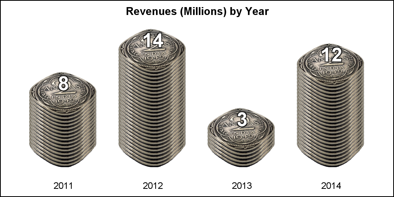 The value of the stack is displayed on the top of the coins. Note use of "Backlight" option to generate a darker outline around the text, so it is visible on top of the light colored coins. Any nice image of a coin can be used. The number of coins drawn should depend on the "thickness" of the coin in the image. The 2-Annas coin is thin, so we need more coins. The graph on the right is without jitter, which creates even stacks.
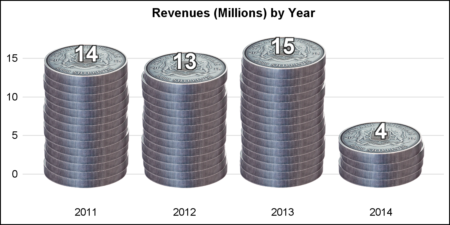 The Somalian Silver coin is "thicker", so we need less numbers as shown on the right.
Full SAS9.40M3 code: CoinGraph


