Image backgrounds revisited

You can use SG annotation to display graphs inside of other graphs.
You can use SG annotation to display graphs inside of other graphs.
Have you ever wanted to see examples of all of the output styles that SAS provides? You can run a program and look at the resulting file, styles.html. This post explains more about the styles that you will see including a discussion of attribute priority.
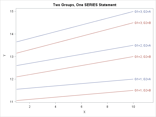
The SGPLOT procedure in SAS makes it easy to create graphs that overlay various groups in the data. Many statements support the GROUP= option, which specifies that the graph should overlay group information. For example, you can create side-by-side bar charts and box plots, and you can overlay multiple scatter

At SAS, we love data. Data is central to our corporate vision: to transform a world of data into a world of intelligence. We're also famous for enjoying M&Ms, but to us they are more than a sweet snack. They're also another source of data. My colleague Pete Privitera, with

WARNING: This blog post references Avengers: Infinity War and contains story spoilers. But it also contains useful information about random number generators (RNGs) -- tempting! If you haven't yet seen the movie, you should make peace with this inner conflict before reading on. Throughout the movie, Thanos makes it clear
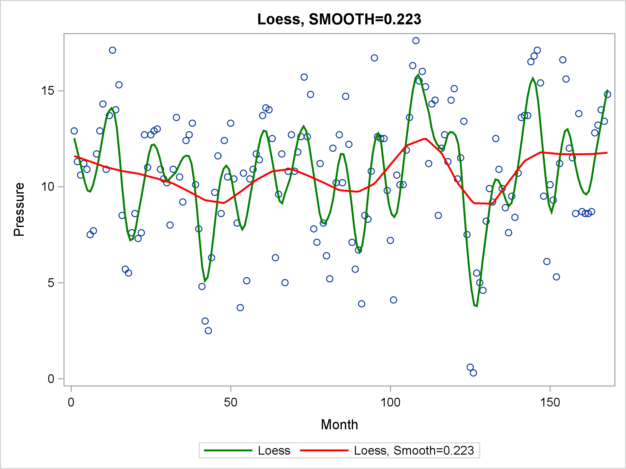
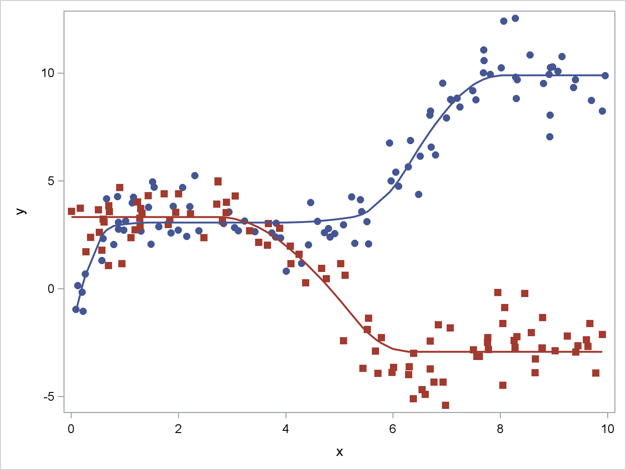
The LOESS statement in PROC SGPLOT finds a fit function while making no assumptions about the parametric form of the regression function.
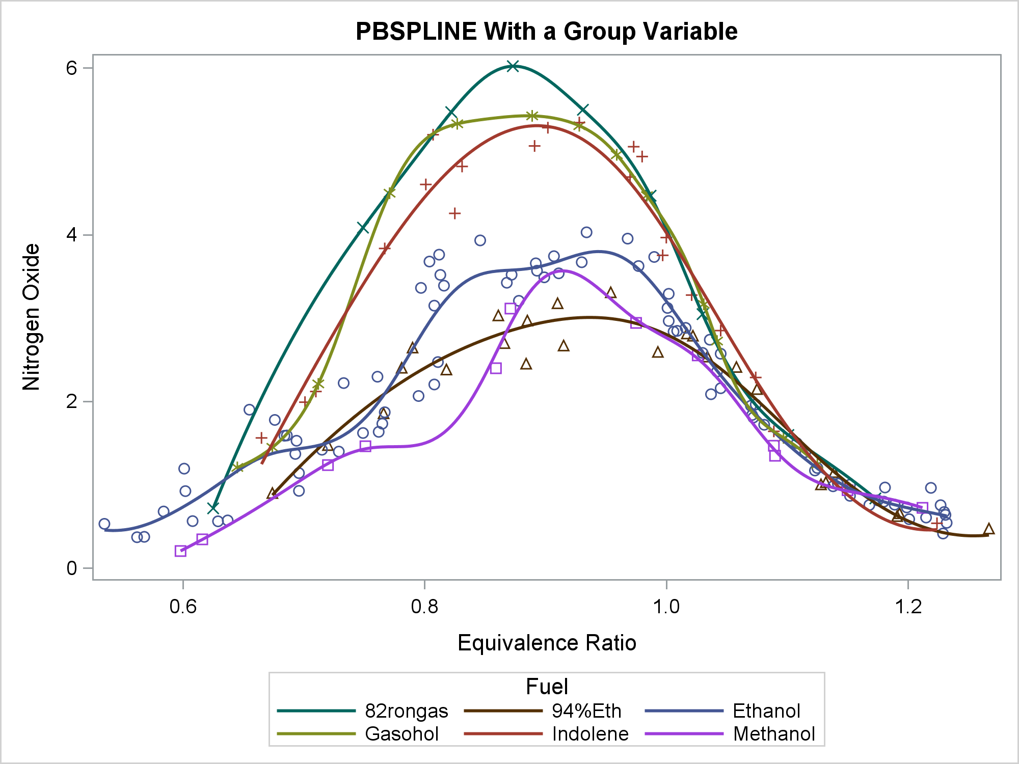
You can use penalized B-splines display a smooth curve through a set of data. The PBSPLINE statement fits spline models, displays the fit function(s), and optionally displays the data values.
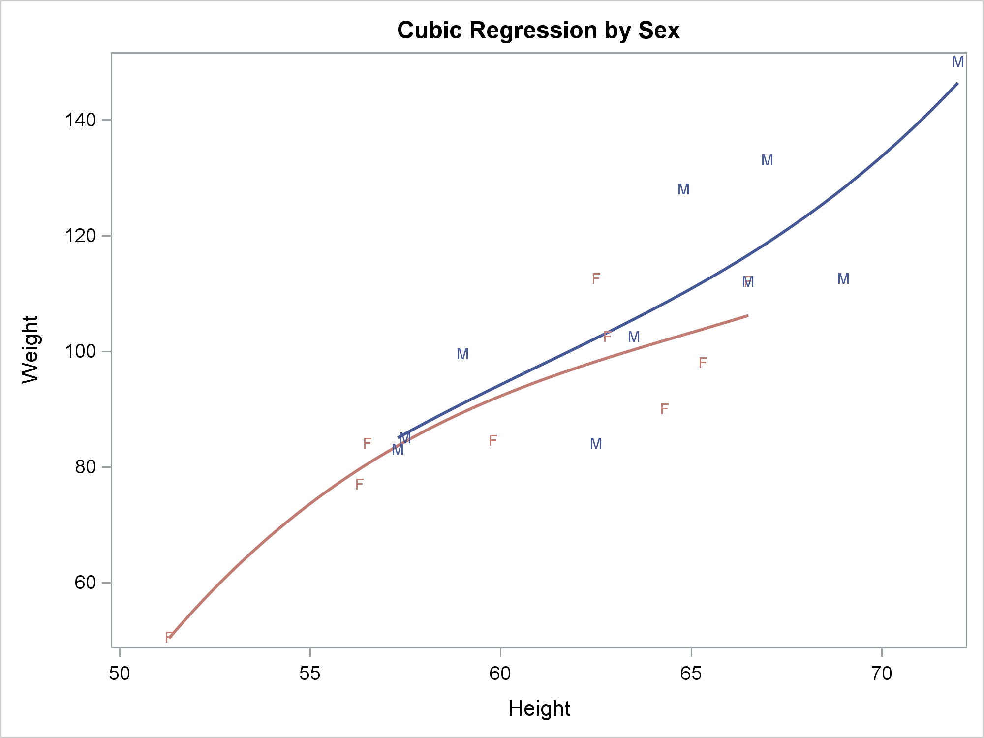
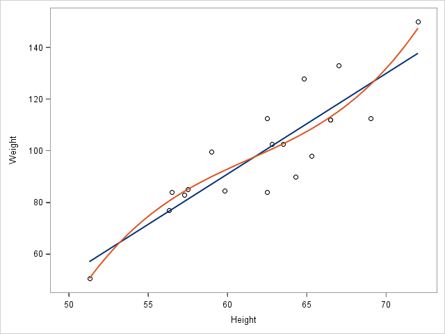
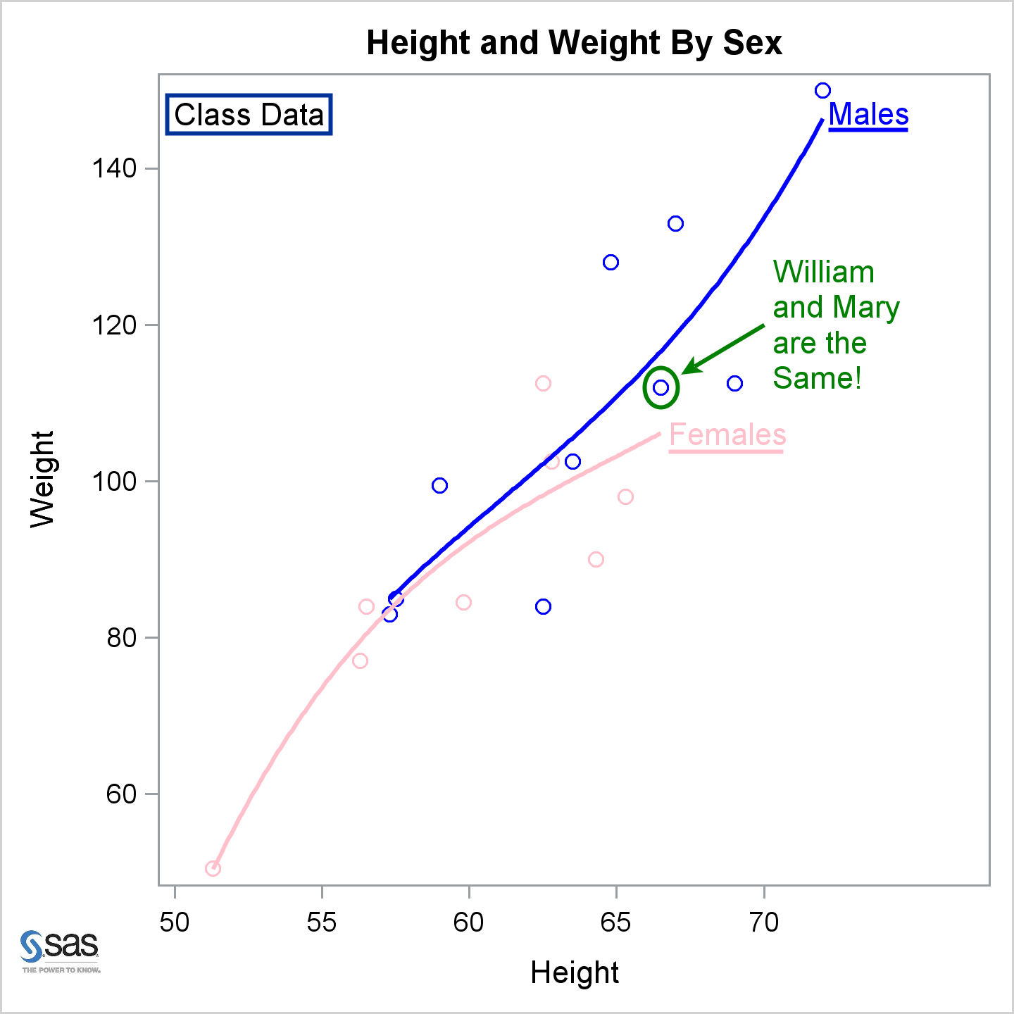
The REG statement fits linear regression models, displays the fit functions, and optionally displays the data values. You can fit a line or a polynomial curve. You can fit a single function or when you have a group variable, fit multiple functions.
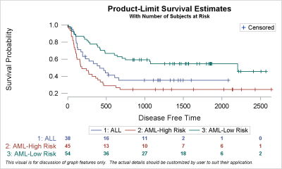
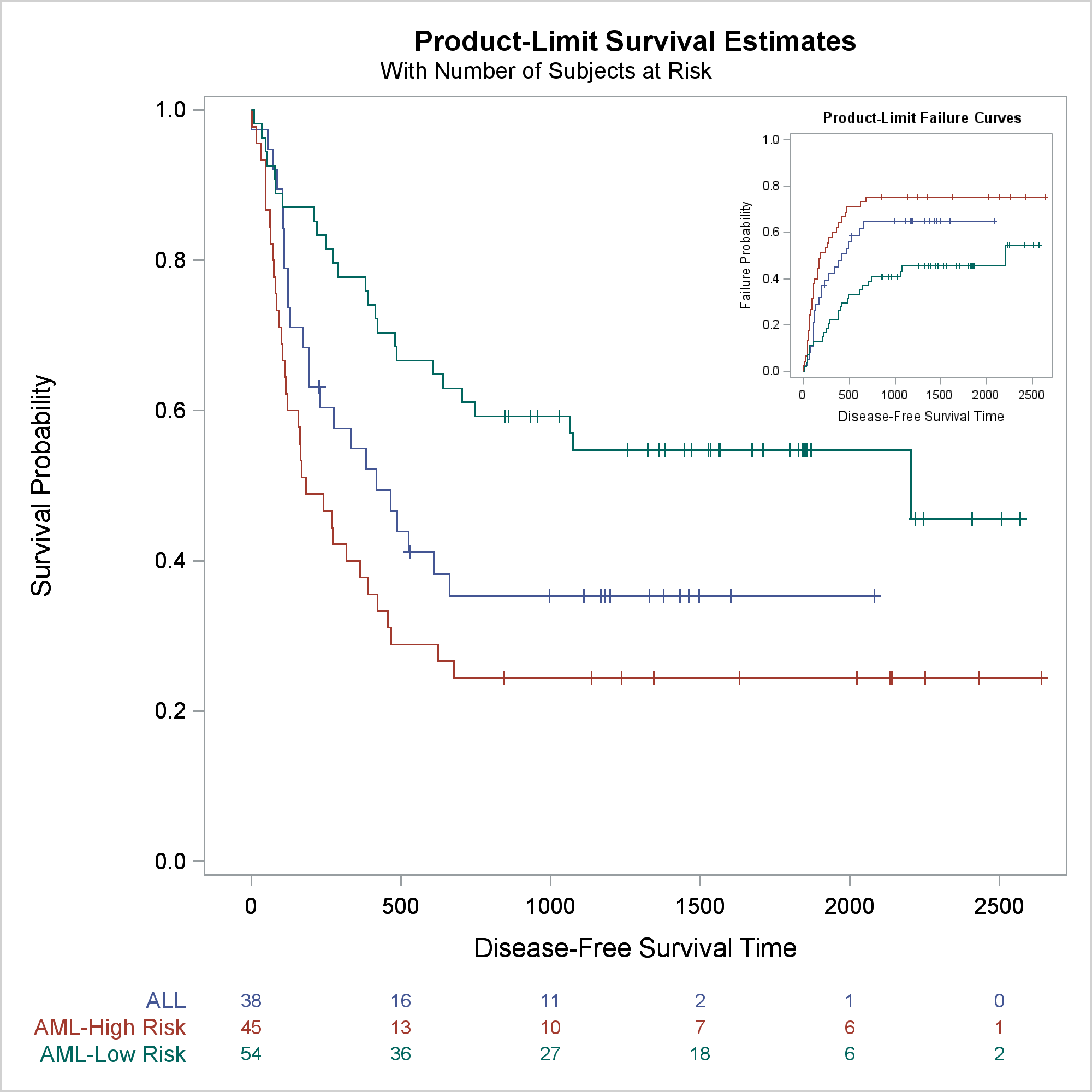
Survival plots are automatically created by the LIFETEST procedure. These graphs are most often customized to fit the needs of SAS users. One way to create the customized survival plot is to save the generated data from the LIFETEST procedure, and then use the SGPLOT procedure to create your custom
This post provides examples of DRAW statement syntax and links to the documentation.
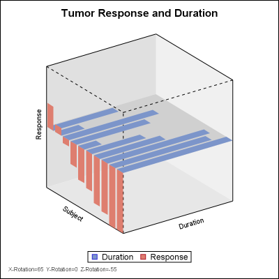
A few months ago, a user inquired about a chart that showed tumor response and treatment duration for each subject on 2 different planes of a 3D view. The data was really 2D, with one independent variable (the subject id) and two or more response values. I had provided an
PROC SGPLOT looks at the PROC statements, it looks at the data, and it writes a template that might depend on the data. If you want to understand how the graph is created, you need to look at the PROC SGPLOT code, the graph template and data objects that it constructs, and the final graph.
Usually, you use axis tables when there is a clear link between the rows of the axis table and the graph. I'll show how to use an axis table to create a table that is independent of the graph. This post also uses discrete attribute maps.
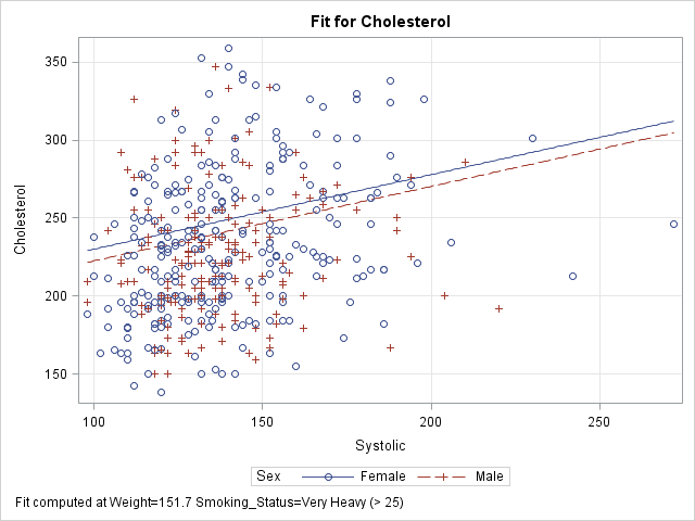
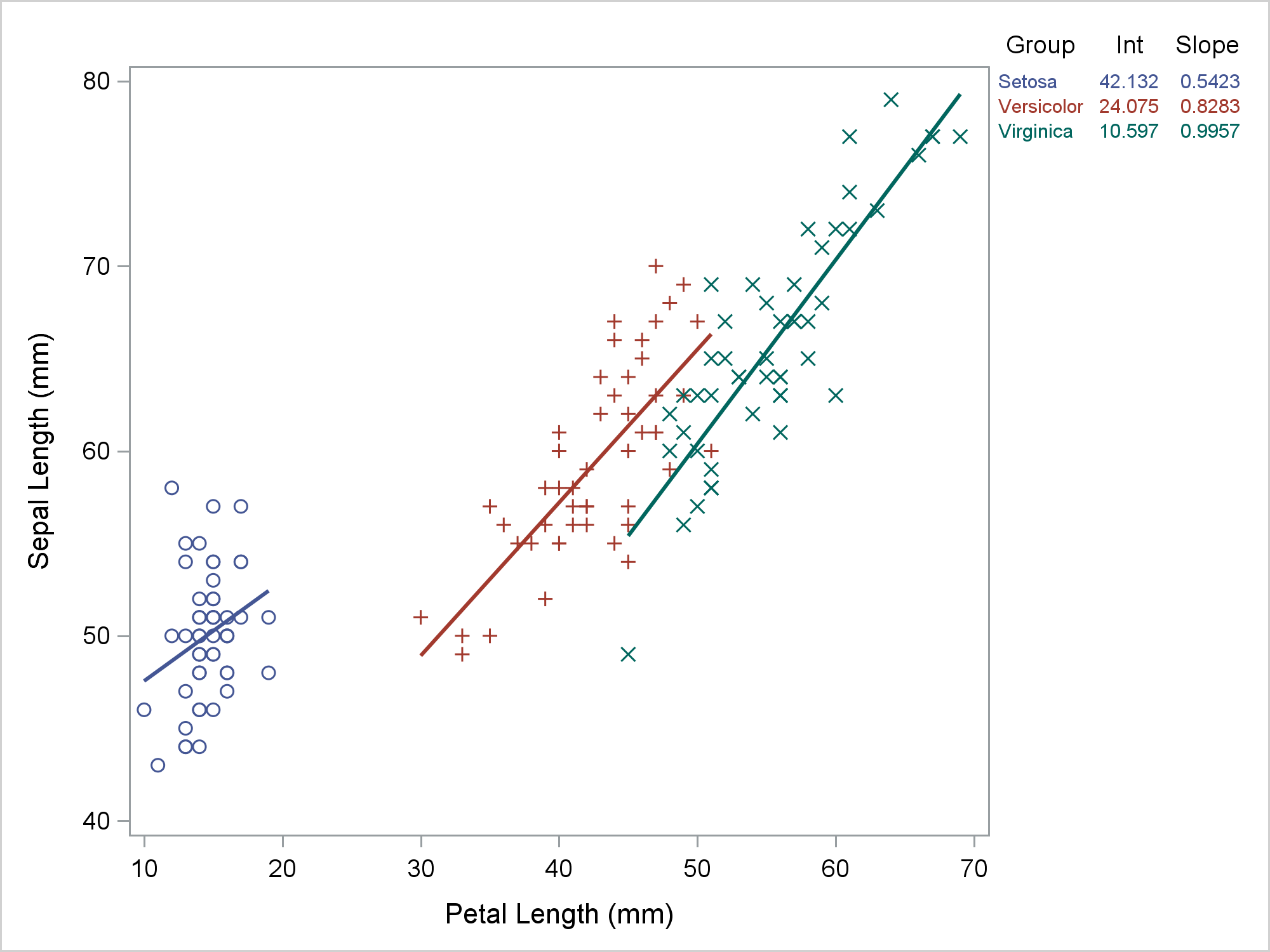
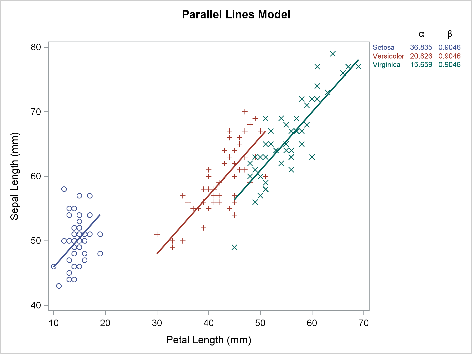
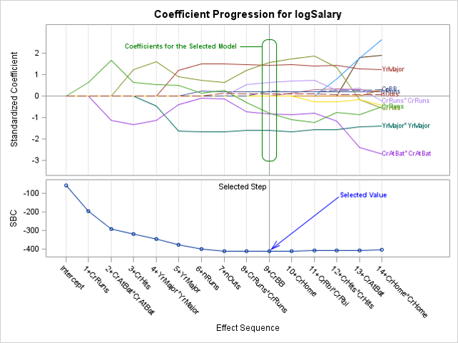
Slice, slice, baby! You've got to slice, slice, baby! When you fit a regression model that has multiple explanatory variables, it is a challenge to effectively visualize the predicted values. This article describes how to visualize the regression model by slicing the explanatory variables. In SAS, you can use the
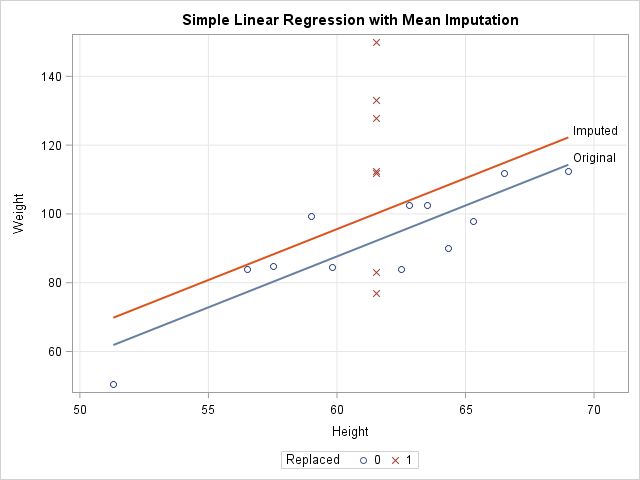
In a previous article, I showed how to use SAS to perform mean imputation. However, there are three problems with using mean-imputed variables in statistical analyses: Mean imputation reduces the variance of the imputed variables. Mean imputation shrinks standard errors, which invalidates most hypothesis tests and the calculation of confidence
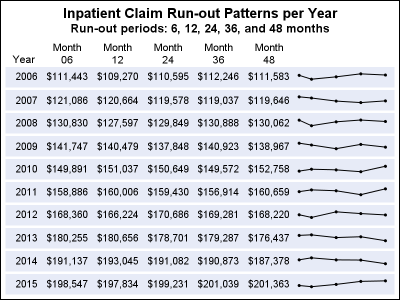
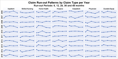
In the previous post, I discussed creating a 2D grid of spark lines by Year and Claim Type. This graph was presented in the SESUG conference held last week on SAS campus in the paper ""Methods for creating Sparklines using SAS" by Rick Andrews. This grid of sparklines was actually the
The 25th annual SESUG conference was held at in the SAS campus this week. I had the opportunity to meet and chat with many users and attend many excellent presentations. I will write about those that stood out (graphically) in my view. One excellent presentation was on "Methods for creating
When a plot is classified by one or more variables, the different classes values are displayed in the graph either by position or by using different plot attributes such as color, marker shape or line pattern. For plots that display the visual by a filled area (bar, bin, band, bubble,
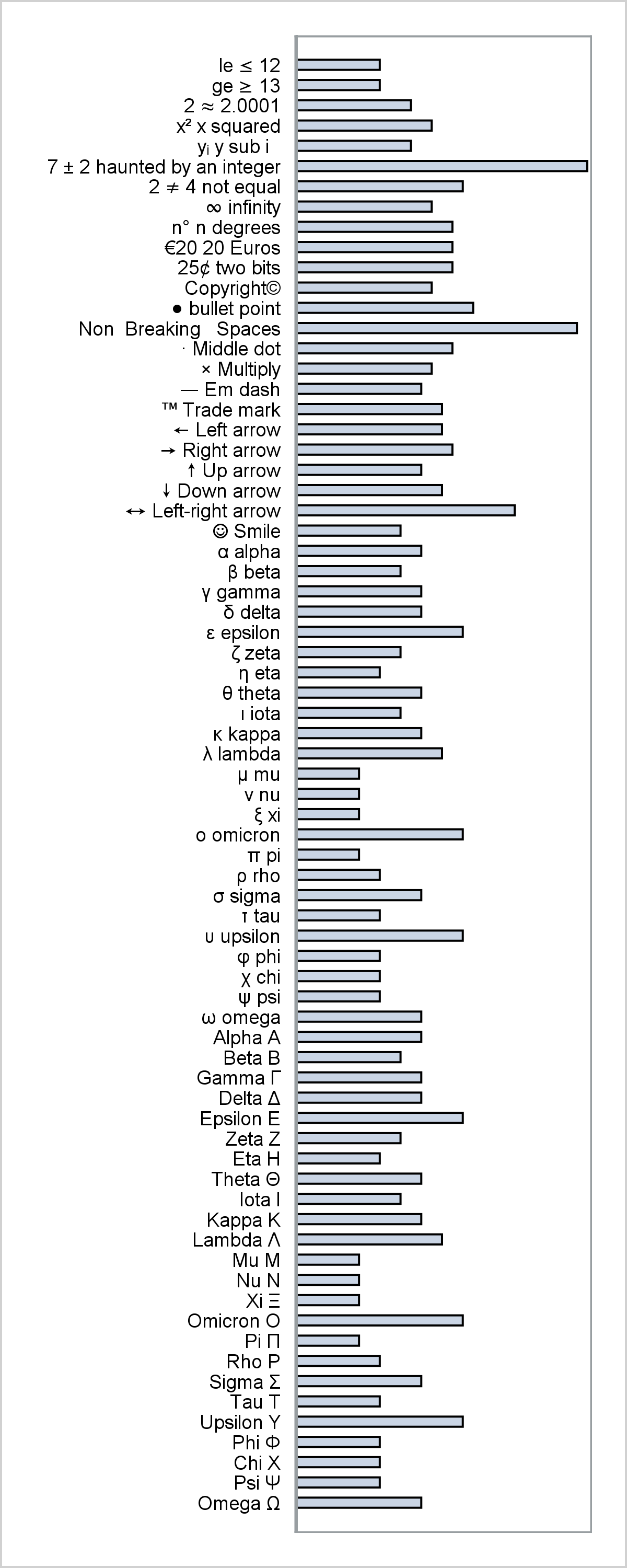
This post provides a general macro that enables you to easily display special characters (Unicode) in axis table columns.
This post shows how to use PROC SGPLOT together with PROC TRANSREG to fit monotonically increasing or decreasing functions through a scatter plot.
This is the 7th installment of the Getting Started series. The audience is the user who is new to the SG Procedures. Experienced users may also find some useful nuggets of information here. Starting with SAS 9.3 which was released 6 years ago, the SGPLOT procedure supports many new plot types including
You can use SG Annotation (and its GTL equivalent) to display one graph inside another.
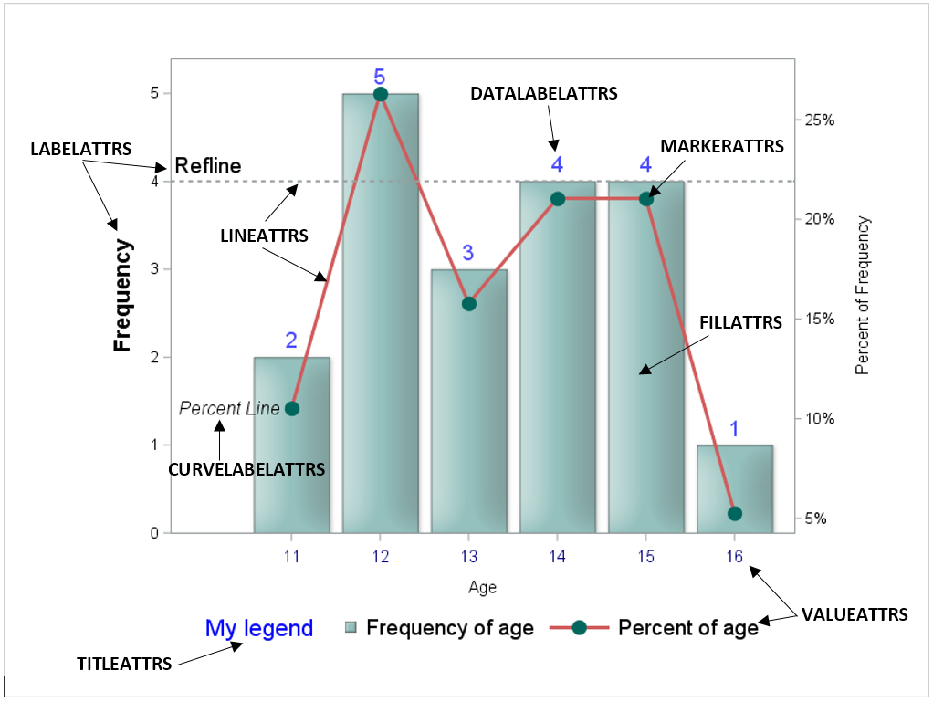
The SGPLOT procedure (as well as other ODS Graphics procedures) does a great job of creating nice- looking output with very little coding. However, there are times when you want to make adjustments to the output's appearance. For those occasions, we have an ATTRS for that! The statements in PROC

This post shows a variety of techniques including how to use PROC TEMPLATE and the SOURCE statement, PROC SGPLOT with multiple Y-axis tables, create comparable axes in two side-by-side graphs, create a broken axis, write and use a table template that wraps text, and find and display examples of certain statements in graph templates and fonts in style templates.
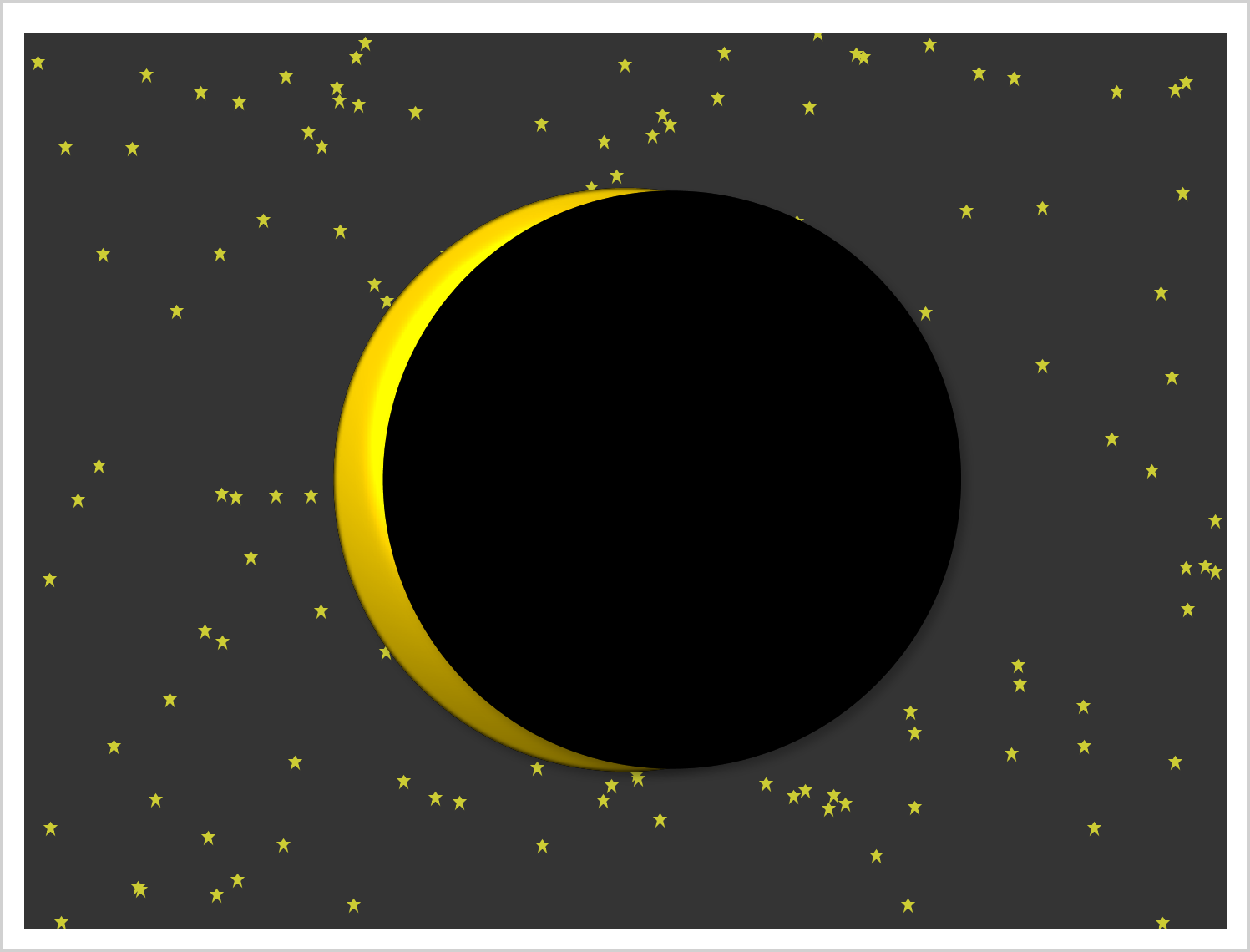
This example shows how to create two coordinated range attribute maps and use them in creating an animated gif of the eclipse.
SG annotation is a powerful technique for adding text, lines, arrows, shapes, and images to graphs. This post provides a macro that can help you when you make a mistake in writing the annotations.
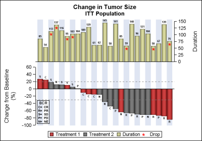
Waterfall plots have gained in popularity as a means to visualize the change in tumor size for subjects in a study. The graph displays the reduction in tumor size in ascending order with the subjects with the most reduction on the right. Each subject is represented by a bar classified by
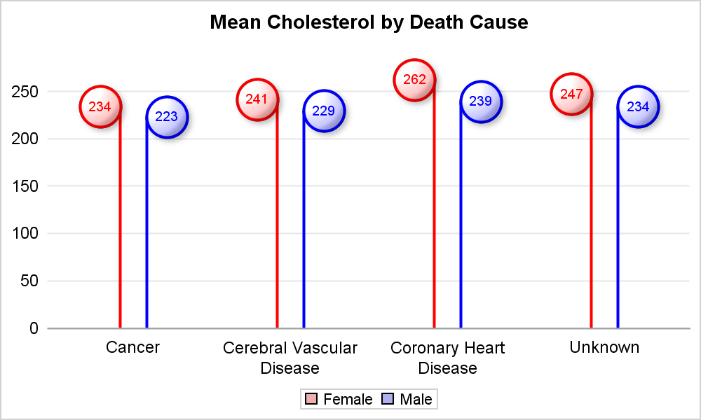
Recently, while reading up on Wilkinson and Cleveland Dot plots, I saw this excellent article by Xan Gregg on the topic. I also saw some interesting examples of Lollipop Charts, kind of a dot plot with statistics along with a drop line, maybe more suitable for sparse data. I thought
As many of the regular readers of this blog know, SGPLOT and GTL, provide extensive tools to build complex graphs by layering plot statements together. These plots work with axes, legends and attribute maps to create graphs that can scale easily to different data. There are, however, many instances where

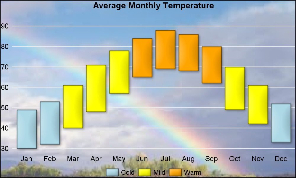
Tomorrow is Independence Day, a federal holiday in the United States. Flags are displayed everywhere, especially in Washington, D.C., where I live. So let's have a little Fun with Flags! The current U.S. flag has 50 stars, one per state, with five rows of six stars interleaved with four rows


