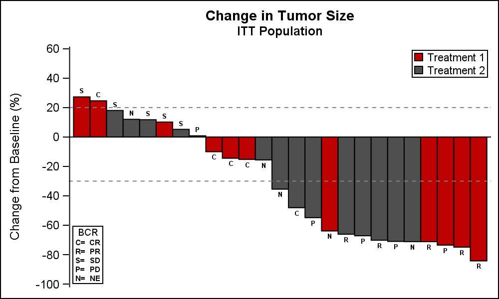
Waterfall plots have gained in popularity as a means to visualize the change in tumor size for subjects in a study. The graph displays the reduction in tumor size in ascending order with the subjects with the most reduction on the right. Each subject is represented by a bar classified by the treatment. The type of response is often shown at the end of the bar, such as CR - Complete Response, PD - Progressive Disease etc. See this PharmaSUG paper for complete information. Ways to create such plots using SGPLOT procedure are presented in the referenced paper, in a previous article in this blog and also in my book "Clinical Graphs using SAS". The graph is shown below.
Recently, an example of a 3D Waterfall plot was sent to me by a SAS user. The user indicated that such graphs (shown below) are being requested due to the ability to display more information in the same graph.

Reviewing the 3D graph provided by the user, certain aspects of the graph became evident. While the 3D visual is certainly an eye-catcher, there may be some significant drawbacks in this graph:
- The data depicted is really not 3D in nature. There is only one independent variable in the data, that is the subject id. These are placed along the bottom sorted by the change in tumor size. I will call this the x-axis.
- There are multiple measures being displayed by subject id. The tumor size is displayed on the vertical axis (z-axis). The duration of treatment is displayed along the axis going into the page (y-axis).
- Some additional indicators are also plotted on the duration bars indicating subjects who discontinued. There are some other indicators that are not very clear.
- Some bars can be (and are) occluded behind other bars.
- The x-axis does not show the subject id, but instead some other classification (maybe type). It is better to move these indicators closer to the bar ends.
- It is hard to line up the x-axis values with the tumor size bars and also the duration bars.
- There is a lot of wasted "blue" space in this visual.
- This visual uses perspective projection, so it is harder to visually compare the bar lengths.
- I don't know what the red dot in the middle is for, or what it is aligned with.
Since there is only one independent variable (SubjectId), it is possible to display all the necessary information in a 2D visual, as shown below. The visual is very clean and easy to understand, and shows all the information in the 3D graph. Let us keep in mind my data is purely simulated using random number functions.
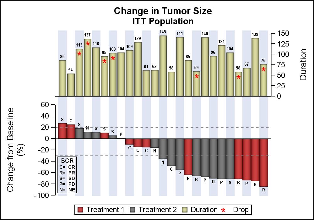
The subjects are again displayed along the horizontal x-axis in increasing order of reduction in tumor size. In this case, we have extended the original graph as follows:
- Display the duration of treatment for each subject in the upper part of the graph, each bar is correctly aligned with the subject id, and very easy to see.
- The actual duration in days can easily be displayed on top of the duration bar.
- A red star is displayed in the upper bar to indicate subjects that discontinued.
- Subdued blue alternate bands are displayed to help the eye line up the bars. These can be visible or not based on your screen settings and can be adjusted or removed.
- Additional response data can easily be incorporated as additional plot elements above or below this visual.
- Additional measures can be easily overlaid on either the tumor reduction, or duration bars.
In general, when there is only one independent variable in the data, displaying the multiple responses in a 2D graphs is very effective. Magnitude of the measures can be correctly compared, and additional indicators can be placed near the relevant item for easier decoding of the data.
In this graph, the tumor response bars are colored by treatment, but could also be colored by the dosage or other measures.
SGPLOT Program:
title 'Change in Tumor Size'; title2 'ITT Population'; proc sgplot data=TumorSizeSort nowall noborder nocycleattrs; styleattrs datacolors=(cxbf0000 cx4f4f4f) datacontrastcolors=(black) axisextent=data; symbolchar name=mystar char='002a'x / voffset=-0.5 scale=3; vbarparm category=cid response=change / group=group datalabel=label dataskin=pressed datalabelattrs=(size=5 weight=bold) groupdisplay=cluster clusterwidth=1; vbarparm category=cid response=duration / datalabel=duration y2axis dataskin=pressed datalabelattrs=(size=5 weight=bold) groupdisplay=cluster clusterwidth=1 fillattrs=(color=cxcfcf7f); scatter x=cid y=drop / y2axis markerattrs=(symbol=mystar color=red size=10); refline 20 -30 / lineattrs=(pattern=shortdash); xaxis display=none colorbands=odd colorbandsattrs=(transparency=0.6); yaxis values=(60 to -100 by -20) offsetmax=0.45 labelpos=datacenter offsetmin=0; y2axis offsetmin=0.6 offsetmax=0.02 labelpos=datacenter; inset ("C="="CR" "R="="PR" "S="="SD" "P="="PD" "N="="NE") / title='BCR' position=bottomleft border textattrs=(size=6 weight=bold) titleattrs=(size=7); keylegend / title='' border; run; |
With SGPLOT, it is possible to create this graph with two data areas as shown here, using the y and Y2 axes. It would be better to created this graph using GTL. GTL provides us extended functionality to create multiple data areas with axis alignment. This will allows us to place both the y axes on the left (or right), and add more data displays to include additional relevant data.
Full code: WaterFall


10 Comments
Nice redesign. Your two-panel graph is much easier to read and interpret. For additional ways to create a waterfall plot in SAS, as well as a dicussion of the cliical use of waterfall plots in oncology trials, see "Create a waterfall plot in SAS".
Is it possible to create such graph presented in 3D waterfall-swimlane plot example (even it is not really 3D) in SAS?
Can you please provided some code examples?
Yes, it is possible to create a 3D graph like you ask, using the code previously posted for 3D scatter plot article in this blog. It will need some changes to display bars instead of scatter points. There is no easy 3D container even in GTL that can create such a graph.
However, my question would be "Why?". This data is not really 3D. It has one independent axis (x-axis) and two responses. One of the tumor change plotted vertically, other of the duration plotted on the horizontal plane. Both of these responses can be clearly represented as separate bar charts on a common x-axis. This 2D layout (shown in the article) would be much cleaner and easier to understand. Just my opinion...
Hi
I am trying to generate a swim plot with following criteria
1.each bar one color for each treament group
2.in each treatment group end of the bar want to represent different symbol to represent response
3.each response and trearment representation in legend
suppose my data
subjid treatment pchg response
101 10mg -10 PD
102 10mg 20 PR
103 20mg -40 PD
I have successfully created a similar graph, but am unable to sort my vertical bars in the "change from baseline" graph into ascending sequence. How to I achieve this result?
If you are using a VBARPARM (like the code above), you will need to use PROC SORT to sort the data by the RESPONSE values before plotting them with SGPLOT to get that effect. There is an example of this in the "full-code" link above.
"The subjects are again displayed along the horizontal x-axis in increasing order of reduction in tumor size. " How did you create this with your code?
Oh, I am sorry, I missed your reply. Yes, I did sort the data. I will review full code again, but this was not the fix I expected it to be.
The key is to use PROC SORT to sort the bar data, as in the full-code example above:
proc sort data=TumorSize out=TumorSizeSort;
by descending change;
run;
Then use the "TumorSizeSort" data in the SGPLOT run.
I tried this method, but I only found success with adding discreteorder=data in the xaxis statement. Problem solved! Thank you for your help!