Recently, while reading up on Wilkinson and Cleveland Dot plots, I saw this excellent article by Xan Gregg on the topic. I also saw some interesting examples of Lollipop Charts, kind of a dot plot with statistics along with a drop line, maybe more suitable for sparse data. I thought it would be interesting to see how far I can get using the SGPLOT features in SAS 9.4. I should add this could classified as an "Infograph".
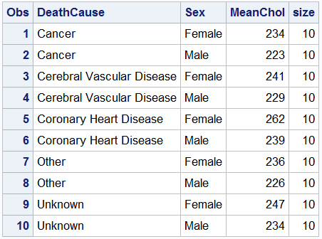 Using the sashelp.heart data set, first I computed a table of mean cholesterol by deathcause and sex as shown on the right. The Size=10 variable was added because I wanted to use the BUBBLE plot to draw part of the graph. I also made a dataset with only one classifier - deathcause to use without a group variable.
The idea seems relatively simple, display a NEEDLE with a BUBBLE on top that contains the data label. Let us start with the needle plot.
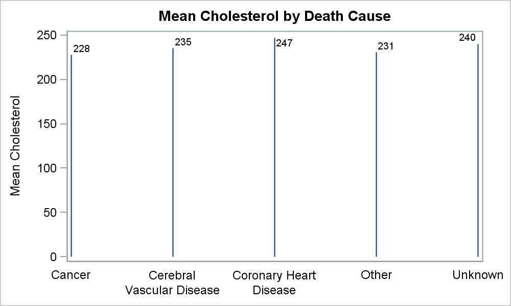
title 'Mean Cholesterol by Death Cause';
proc sgplot data=heart;
needle x=deathcause y=meanchol /
baselineattrs=(thickness=0) datalabel;
xaxis display=(nolabel noticks);
run;
Note, when using a NEEDLE plot with a discrete x axis, the first and last values are displayed close to the end of the axis, and not like a bar chart, where there is a 1/2 midpoint spacing offset. To get that behavior, we can set a group variable same as the category, and then set a GROUPDISPLAY as CLUSTER. This will cause the NEEDLE display similar to Bar chart.
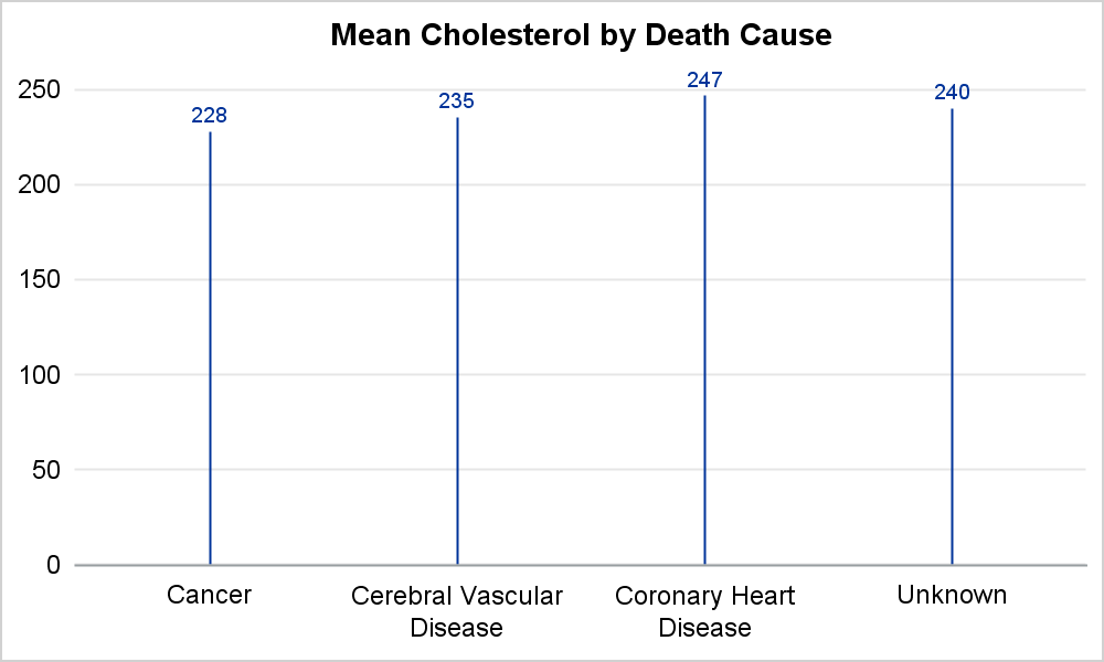 title 'Mean Cholesterol by Death Cause';
proc sgplot data=heart(where=(deathcause ne 'Other'))
noautolegend noborder;
needle x=deathcause y=meanchol / group=deathcause
groupdisplay=cluster lineattrs=graphdatadefault
baselineattrs=(thickness=0) datalabel datalabelpos=top;
xaxis display=(nolabel noticks);
yaxis offsetmin=0 display=(nolabel noticks noline) grid;
run;
Now, we can add the BUBBLE plot to display the values in a bubble.
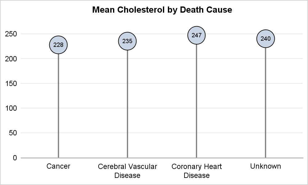 /*--Vert Lollipop--*/
ods listing style=htmlblue;
ods graphics / reset width=5in height=3in imagename='Lollipop_Vert';
title 'Mean Cholesterol by Death Cause';
proc sgplot data=heart(where=(deathcause ne 'Other'))
noautolegend noborder;
needle x=deathcause y=meanchol / group=deathcause
groupdisplay=cluster lineattrs=(thickness=2 color=gray)
baselineattrs=(thickness=0);
bubble x=deathcause y=meanchol size=size /
bradiusmin=16 datalabel datalabelpos=center;
xaxis display=(nolabel noticks);
yaxis offsetmin=0 display=(nolabel noticks noline) grid;
run;
We can continue and add a real GROUP role, and get the Lollipop graph. Note the following items:
- I had to change to using a SCATTER plot instead of BUBBLE because the BUBBLE plot does not support the GROUPDISPLAY=CLUSTER option. We will look into that later.
- I used the CLUSTERWIDTH option only with the NEEDLE plot. This gives the appearance of the offset lollipop tops. DATASKIN is used to shade the bubbles.
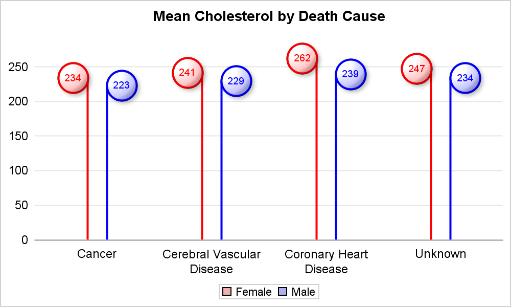
ods listing style=htmlblue; ods graphics / reset width=5in height=3in imagename='Lollipop_Vert_Group_2'; title 'Mean Cholesterol by Death Cause'; proc sgplot data=heart_group (where=(deathcause ne 'Other')) noborder; styleattrs datacolors=(cxefafaf cxafafef) datacontrastcolors=(red blue); needle x=deathcause y=meanchol / group=sex groupdisplay=cluster clusterwidth=0.34 lineattrs=(thickness=2) baselineattrs=(thickness=0); scatter x=deathcause y=meanchol / group=sex groupdisplay=cluster markerattrs=(symbol=circlefilled size=32) filledoutlinedmarkers datalabel datalabelpos=center name='a' dataskin=sheen; xaxis display=(nolabel noticks); yaxis offsetmin=0 display=(nolabel noticks noline) grid; keylegend 'a' / type=markercolor; run; |
The same idea can be used to make a horizontal Lollipop chart. However, we do not have horizontal version of the NEEDLE plot. So, I have to use a HBARPARM, with a small BARWIDTH to make the same graph. See the linked code below for the full code.

SGPLOT Code: Lollipop_Chart

6 Comments
Sweet... These DO look like lollipops!
Reminds me of a couple of SAS community posts on Lollipop charts. One you help solve with SGPANEL https://communities.sas.com/t5/SAS-GRAPH-and-ODS-Graphics/Lollipop-Chart-in-SAS/td-p/206316 and another one TC did with "Fun with ODS Graphics series" https://communities.sas.com/t5/SAS-GRAPH-and-ODS-Graphics/Fun-With-SAS-ODS-Graphics-All-the-Presidents-Heights/td-p/354854
Thanks for the cross references.
Thanks Sanjay, interesting to see. I would think of this more like an "infographic" rather than a chart. As a chart, I find the lollipops a little distracting, and people might mistakenly think the top of the circle indicates the value rather than the top of the bar that is attached to the circle. But as an infographic, I can see how people might like this. Found an anti-lollipop post here http://www.perceptualedge.com/blog/?p=2642, and a defense of lollipops here http://gravyanecdote.com/visual-analytics/lollipop-charts-revisited/. I like the example in the pro-lollipop plots, because the lollipops are basically dot plots (which I've become a fan of) with a light drop line to the axis.
I agree it is more like an "InfoGraph". Especially as the candy part gets bigger to accommodate the value. I started with looking at the Cleveland Dot plot, as rendered by the SGPLOT DOT statement. When an error bar is displayed, the direction of plotting the value is clear. Without the error bar, I felt it would be beneficial if we can drop a line from the dot (value) to the y-axis. This helps see the direction of the plot. One counter argument could be that such a line may encourage a magnitude comparison which may not be desirable when the baseline is non=zero. But it would be OK if the baseline is zero. We are debating adding an option to drop a line which will likely be OFF by default.
How to add a transparent color as background only for "Cancer" column in 'Lollipop_Vert_Group_2'?
Thanks,
You can make the background of the graph transparent by using the OPAQUE option. However, there is no way to make only the background behind "Cancer" category. Maybe you can do that by setting a background image for the "Wall" using SGANNOTATE which has transparent pixels behind the "Cancer" category only. Be sure to also make the background transparent.