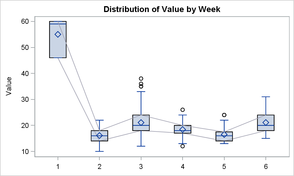
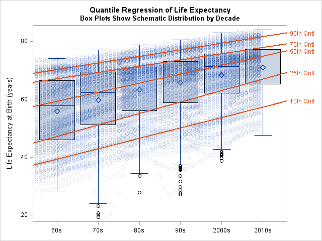
Search Results: sgplot (958)

Rick Wicklin 0
Overlay plots on a box plot in SAS: Discrete X axis

Box plots summarize the distribution of a continuous variable. You can display multiple box plots in a single graph by specifying a categorical variable. The resulting graph shows the distribution of subpopulations, such as different experimental groups. In the SGPLOT procedure, you can use the CATEGORY= option on the VBOX

Rick Wicklin 0
Create spaghetti plots in SAS

What is a spaghetti plot? Spaghetti plots are line plots that involve many overlapping lines. Like spaghetti on your plate, they can be hard to unravel, yet for many analysts they are a delicious staple of data visualization. This article presents the good, the bad, and the messy about spaghetti

Data Visualization
Sanjay Matange 0
Directed Link Networks

A few weeks ago I posted an article describing how to display simple Network Diagrams with Curved Links using SGPLOT procedure.  The key requirement is that the node positions have to be computed by user.  Often, for simple diagrams, nodes can be positioned using a simple layered layout.  Separately, I also

Data Visualization
Sanjay Matange 0
Coffee Recipes

For a long time, Starbucks represented to me as the good coffee cup, with me paying upwards of $4 for a Latte.  But on a recent visit to San Francisco, my son introduced me to a few other options. Philz crafts a great cup of java, with the barista making

Data Visualization
Sanjay Matange 0
Diagrams with curved links

Let us continue with our journey beyond standard plots and charts.  Often we need to create some simple diagrams to visualize the connections between different entities such as patients and providers or even a social network. Many of you may not have a custom tool to create diagrams.  But you have Base SAS, so

Data Visualization
Sanjay Matange 0
Infographics Bar Chart

Last week I posted an article on creating Infographics using SAS.   The interest shown by the SAS community in this topic came as a surprise.  Also, it so happened by coincidence, a SAS users also  called into Tech Support just about the same time with a query about creating  Infographics type graph

Data Visualization
Sanjay Matange 0
Infographics using SAS

Infographics are all the rage today.  Open any magazine or newspaper and we see data and numbers everywhere.  Often, such information is displayed by adding some graphical information to add context to the data.  A couple of good examples are Communicating numeric information, and Facts about Hot Dogs. Riley Benson, our UX

Data Visualization
Sanjay Matange 0
Legend Order

In the previous article on managing legends, I described the way to include items in a legend that may not exist in the data.  This is done by defining a Discrete Attribute Map, and then requesting that all the values defined in the map should be displayed in the legend. In

Data Visualization
Sanjay Matange 0
Legendary

Entries in a legend are populated automatically based on the data.  When creating a graph with group classification,  the display attributes for each bar are derived from the GraphData1-12 style elements from the active style. The graph on the right shows you the result of creating an adverse event timeline

Rick Wicklin 0
Compute a moving average in SAS

A common question on SAS discussion forums is how to compute a moving average in SAS. This article shows how to use PROC EXPAND and contains links to articles that use the DATA step or macros to compute moving averages in SAS. In a previous post, I explained how to

Learn SAS
Rick Wicklin 0
Compute a weighted mean in SAS

Weighted averages are all around us. Teachers use weighted averages to assign a test more weight than a quiz. Schools use weighted averages to compute grade-point averages. Financial companies compute the return on a portfolio as a weighted average of the component assets. Financial charts show (linearly) weighted moving averages

1 19 20 21 22 23 32