Let us start the new year by taking a trip back in history to SAS 9.2, first released in 2008, and the first SAS release that included the new ODS Graphics software including GTL and SG procedures. While we have recently released the third maintenance on SAS 9.4 (SAS 9.40M3), many of you are using various maintenance releases of SAS 9.3, and some are still using SAS 9.2.
One such SAS 9.2 user recently saw my post on creating a CandleStick Chart using SAS 9.3 which included a new plot type called the HighLow plot. This is a versatile plot that can not only handle the "Candlestick" chart commonly used in the financial domain, but is also useful to create many different graphs as you can see in other articles in this blog.. This user wanted to create a similar chart using SAS 9.2.
I first sent them a program to create a High-Low-Close type graph using the GPLOT procedure, but user wanted something similar the the graph shown the linked article.
 While I could not think of a way to create such a graph using SGPLOT, it was possible, with some effort to create one using GTL. The graph on the right is created using the GTL BoxPlotParm statement. This statement was originally added to provide the user a way to plot a custom box plot, where the values for the various features of the box are computed by the user. So, the data set provided by user needs to contain the various statistics like "High", "Low", "Q1", "Q3" and so on for each value of the category.
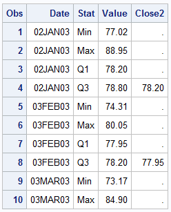 The data set would look like the table on the right. In this example, for each value of Date, we have 4 observations, one for each named statistic. Here we have the "Min", "Max", "Q1" and "Q3" values computed for each value of Date. The column names can be anything, but the "Stat" values must have the text strings shown.
In my case, I used a data step to compute these values. The Q1-Q3 range is represented by the "Open" and "Close" value of the stock, and the "Low" and "High" are the low and high values for the stock for that day.
proc sort data=sashelp.stocks
(where=(stock='IBM' and date > '01Jan2004'd))
out=ibm;
by date;
run;
data boxParm;
length Group $4;
format DateUp DateDn date7.;
keep Date DateUp DateDn Stat Value Group Close2;
set ibm;
Stat='Min'; Value=low; output;
Stat='Max'; Value=high; output;
Stat='Q1'; Value=min(open, close); output;
Stat='Q3'; Value=max(open, close); Close2=close; output;
run;
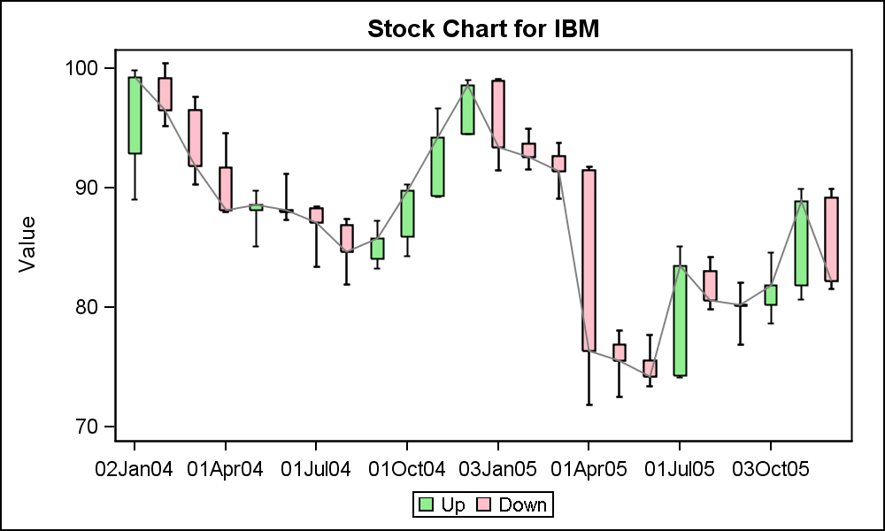
Now, we create a template using the BoxPlotParm statement for the graph. Note we have also superposed a Series plot to connect the "Close" value for each day.
/*--Template for OHLC plot--*/
proc template;
define statgraph OHLC;
begingraph;
entrytitle 'Stock Chart for IBM';
layout overlay / xaxisopts=(display=(ticks tickvalues line)
discreteopts=(tickvaluefitpolicy=thin));
boxplotparm x=date y=value stat=stat;
seriesplot x=date y=close2 / lineattrs=(color=gray);
endlayout;
endgraph;
end;
run;
/*--OHLC plot--*/
proc sgrender data=boxParm template=OHLC;
run;
User also wanted to see the boxes colored by whether the price was up or down. This would be easy with a GROUP option for the BoxPlotParm. Unfortunately, the SAS 9.2 release does not support a Group option. However, the saving grace was that this was not a real group, where there could be one or more group per category. Instead it is really a single colored box by the group classifier.
 With some creative coding we can achieve this result. Can you guess how I might have done this?
What I have done is displayed all the boxes by date using the green color. Then, I have overdrawn only the boxes for the days the stock value was down. This causes only some of the green boxes to be hidden by the red ones. See the program for the full data step and code.
/*--Template for OHLC plot by group--*/
proc template;
define statgraph OHLC_Grp;
begingraph;
entrytitle 'Stock Chart for IBM';
layout overlay / xaxisopts=(display=(ticks tickvalues line)
discreteopts=(tickvaluefitpolicy=thin));
boxplotparm x=date y=value stat=stat / fillattrs=graphdata2
name='All' legendlabel='Up';
boxplotparm x=datedn y=value stat=stat / fillattrs=graphdata1
name='Dn' legendlabel='Down';;
seriesplot x=date y=close2 / lineattrs=(color=gray);
discretelegend 'All' 'Dn';
endlayout;
endgraph;
end;
run;
SAS 9.2 Code for CandleStick Chart: Stock_Plot_92


