Recently a user was working with the HBAR statement with cluster groups with SG procedures. User wanted to see the group values on the axis. SGPLOT does not display multi level axes as these are shared with different plot types. However, with SGPLOT, there is often a way to get what you want.
As frequent readers of this blog know that the real power of SGPLOT is in the myriad ways you can combine different compatible plot types together in one graph to create just the graph you need. With SAS 9.4, you options are even greater. Let us see what we can do in this case.
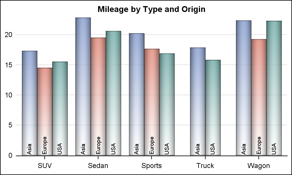
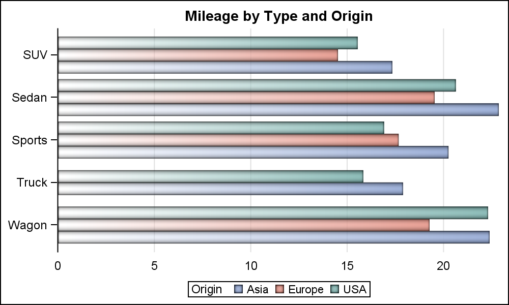 Here is a basic cluster grouped bar chart in SGPLOT for the SASHELP.CARS data set. We are viewing an HBAR of Response=mpg_city by Category=Type and Group=Origin.
The category values are displayed on the Y axis. All the group values for each category are displayed within each category, clustered around the tick mark. Each group value is colored by the group, and the values are displayed in the legend.
title 'Mileage by Type and Origin';
proc sgplot data=sashelp.cars(where=(type ne 'Hybrid')) noborder nowall;
hbar type / response=mpg_city stat=mean group=origin groupdisplay=cluster
dataskin=pressed filltype=gradient baselineattrs=(thickness=0);
xaxis display=(noline noticks nolabel) grid;
yaxis display=(nolabel);
run;
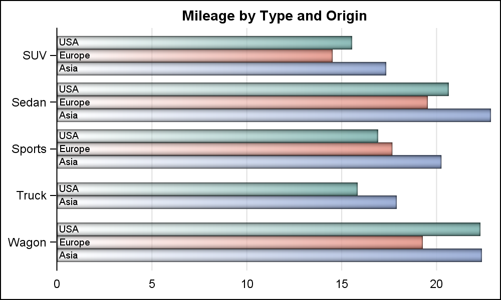 User wants to see the group values on the axis itself. To do this in SGPLOT, we can layer the values on top of each bar using a TEXT plot (SAS 9.4) or a SCATTER plot with MARKERCHAR option (SAS 9.3).
However, note that the HBAR statement does not allow layering of other basic plot types with it. So, to do this, we have to first summarize the data ourselves using the PROC MEANS procedure. Then, we will use the HBARPARM statement to draw the pre-summarized data with the group values. Click on the graph for a higher resolution image.
/*--Summarize the data by Type and Origin--*/
proc means data=sashelp.cars(where=(type ne 'Hybrid')) noprint;
class type origin;
var mpg_city;
output out=cars(where=(_type_ > 2))
mean=Mileage;
run;
/*--Add x and Y label locations--*/
data cars;
set cars;
xlbl=0.1; ylbl=0.1;
run;
/*--HBAR with cluster groups--*/
ods graphics / reset width=5in height=3in imagename='HBarChart';
title 'Mileage by Type and Origin';
proc sgplot data=sashelp.cars(where=(type ne 'Hybrid')) noborder nowall;
hbar type / response=mpg_city stat=mean group=origin groupdisplay=cluster
dataskin=pressed filltype=gradient baselineattrs=(thickness=0);
xaxis display=(noline noticks nolabel) grid;
yaxis display=(nolabel);
run;
 If the user really wants the group values displayed on the axis like in GCHART, we can use the AXISTABLE to draw the values to the left of the bars as shown on the right. Now, the label for the group values is also displayed at the top of the axis. We have removed the legend, and could also have changed all the bars to a single color if needed.
title 'Mileage by Type and Origin';
proc sgplot data=cars noborder nowall noautolegend;
hbarparm category=type response=mileage / group=origin groupdisplay=cluster
dataskin=pressed filltype=gradient baselineattrs=(thickness=0);
text y=type x=xlbl text=origin / group=origin groupdisplay=cluster
textattrs=(color=black size=7) position=right contributeoffsets=none;
xaxis display=(noline noticks nolabel) grid;
yaxis display=(nolabel);
run;
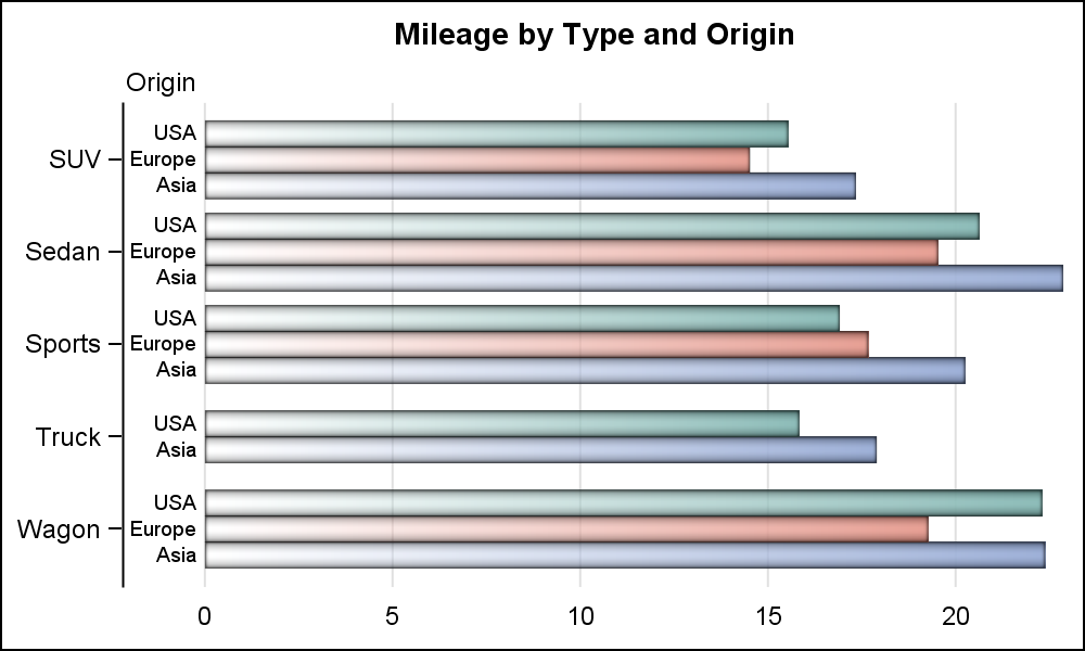
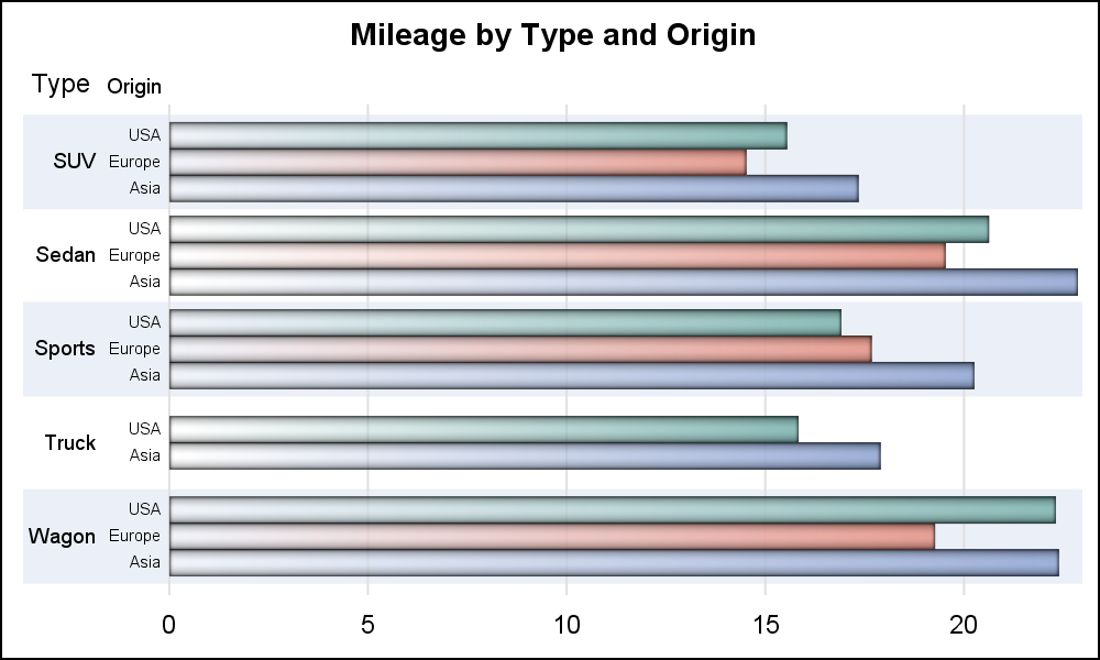 For a consistent look, we can do the same treatment for the category variable using another Text plot, and suppress the Y axis entirely as shown on the right.
Note, now we have the category axis on the outside. The group values are within each category tick value as indicated by the alternate color bands. The labels for the category and group axis are displayed at the top of each values.
title 'Mileage by Type and Origin';
proc sgplot data=cars noborder nowall noautolegend;
hbarparm category=type response=mileage / group=origin groupdisplay=cluster
dataskin=pressed filltype=gradient baselineattrs=(thickness=0);
yaxistable type / location=inside position=left
valuejustify=right;
yaxistable origin / class=origin classdisplay=cluster location=inside position=left
valuejustify=right valueattrs=(size=6) labelattrs=(size=7);
xaxis display=(noline noticks nolabel) grid;
yaxis display=none colorbands=odd colorbandsattrs=(transparency=0.5);
run;
 With a VBAR, adding group values can be a bit tricky as there may not be enough space to display all the group values in the space available. However, we can work around this issue by rotating the group values as shown on the right.
While I have shown you some ways to get an alternative look for the clustered bar chart, one can be sure you can customize the graph to your own specifications by combining the plot statements as you need.
title 'Mileage by Type and Origin';
proc sgplot data=cars noborder nowall ;
vbarparm category=type response=mileage / group=origin groupdisplay=cluster
dataskin=pressed filltype=gradient baselineattrs=(thickness=0);
text x=type y=ylbl text=origin / group=origin groupdisplay=cluster rotate=90
textattrs=(color=black size=7) position=right contributeoffsets=none;
yaxis display=(noline noticks nolabel) grid;
xaxis display=(nolabel);
run;
Full SAS 9.4 program: Group_Labels


2 Comments
Is there something wrong with your 2nd PROC GPLOT example? It produces the same chart as the first GPLOT. But the linked-to code is correct.
These are very nice. Anything that eliminates the need for the user to bounce his/her eyes and brain back and forth from the legend to the data is a big improvement for ease of immediate intake & comprehension.