Last month I wrote an article on connecting multiple statistics by category in a box plot using SGPLOT. In the first article I described the way you can do this using overlaid SERIES on a VBOX using SAS 9.4, which allows such a combination. However, if you have SAS 9.3, I described how you can do this using annotation.
Recently a question was posted on the SAS communities site for SAS/GRAPH and ODS Graphics, a question was posted on how to do this when using a BY variable. That got me thinking on whether there could be an easier way. Turns out there is.
Note, I changed the examples as connect makes more sense when x axis is numeric. The data is not important.
 Prior to SAS 9.4, the SGPLOT procedure limits the combination of some plot types. While "Basic" plots can be layered in any combination, Category plots (VBAR, VLINE) or Distribution plots (VBOX, Histogram) could only be combined with other plots of the same type. So, a SERIES plot could not be combined with a VBOX.
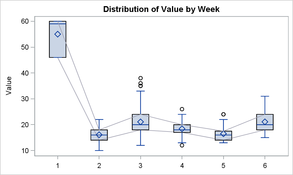
However, we are allowed to combine multiple VBOX plots since SAS 9.2 and CONNECT is available since SAS 9.3. So, the idea here is to overlay multiple VBOX statements, each with a different CONNECT option. This works just fine as shown above. The only trick is to make sure that only the first VBOX uses the FILL option (default) while all the others use NOFILL.
title 'Distribution of Value by Week';
proc sgplot data=ValueByWeek nocycleattrs noautolegend;
vbox value / category=week connect=q1;
vbox value / category=week nofill connect=q3;
xaxis display=(nolabel);
run;
What could be simpler than this approach? The additional benefit is that one can easily create a panel of such graphs.
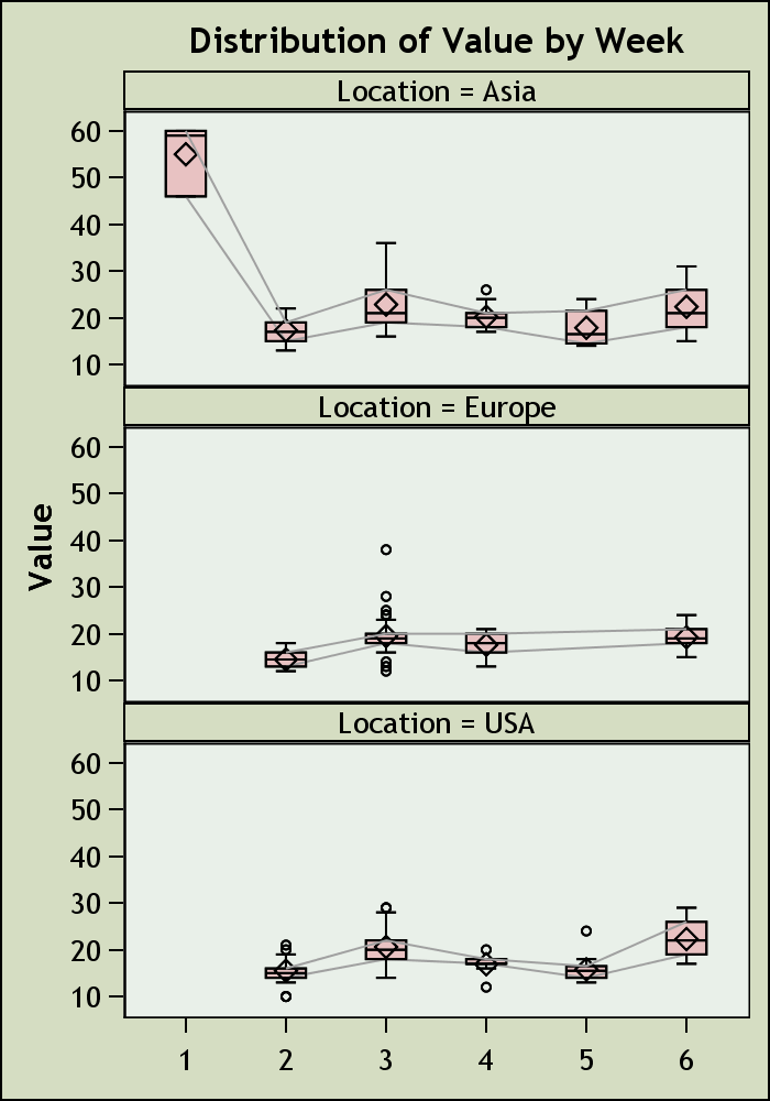
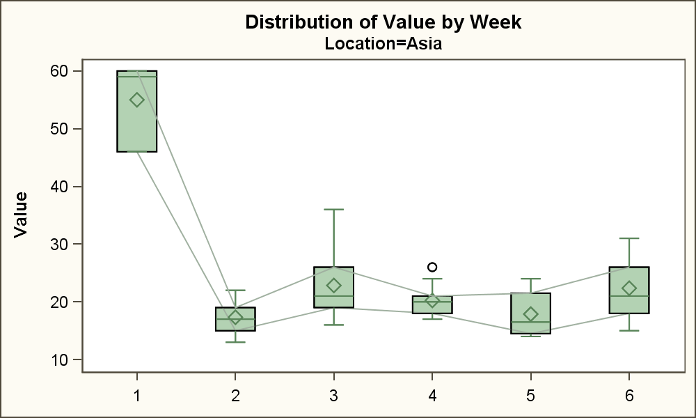
proc sgpanel data=ValueByWeek nocycleattrs noautolegend;
panelby location/ layout=panel columns=1;
vbox value / category=week connect=q1;
vbox value / category=week nofill connect=q3;
colaxis display=(nolabel);
run;
Further more, this also works when using BY variable processing. Now, the procedure correctly pages the graph by the BY variable, and each graph has the correct connect lines. No need to figure out the data needed for the overlaid SERIES plot, or the annotate data set.
title 'Distribution of Value by Week';
proc sgplot data=ValueByWeek nocycleattrs noautolegend;
by location;
vbox value / category=week connect=q1;
vbox value / category=week nofill connect=q3;
xaxis display=(nolabel);
run;
Full SAS 9.3 SGPLOT code: Box_Connect_Numeric


3 Comments
I like this article. Repeating statements but changing the attributes of the second statement is a useful graphical trick that I use a lot.
For your example, the X axis is categorical, and the connecting lines are used to guide the eye from one quantile to another. However, some people try to use this kind of plot when the X axis is actually continuous, but has been binned to create categorical values. In that case, a better choice is to omit the binning and use quantile regression to visualize the quantiles of the response variable for various values of the (continuous) explanatory variable.
I have question about EPS files.
Most journals often require EPS files for plots and figures.
I have been generating eps files using ods ps option in SAS with SGPLOT /or SGRENDER.
However, such eps files do not render well in ghostview and journals do not accept them.
Is SAS code available that will create good quality eps file with SGPLOT /or SGRENDER procedures. thanks
Neeta Shenvi
Use Outputfmt=EPSI on the ODS Graphics statement.