Last week I posted an article on creating Infographics using SAS. The interest shown by the SAS community in this topic came as a surprise. Also, it so happened by coincidence, a SAS users also called into Tech Support just about the same time with a query about creating Infographics type graph for their use.
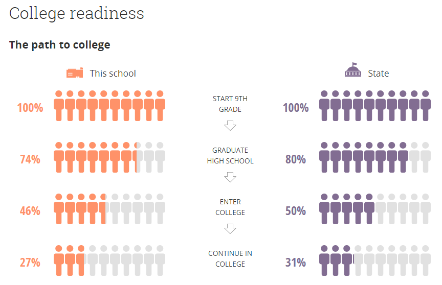 This users wants to create a graph shown in the Dover School link. The graph is shown on the right. Click on the graph for a higher resolution view. The readiness is displayed using icons for the students, one set for "This School" and one for "State" side by side. The actual values are displayed on the left of the "Bar".
Functionally, the information in the graph can be represented by a 2-cell horizontal bar chart, comparing the readiness of the students in this school for college by their level with the overall readiness for the state.
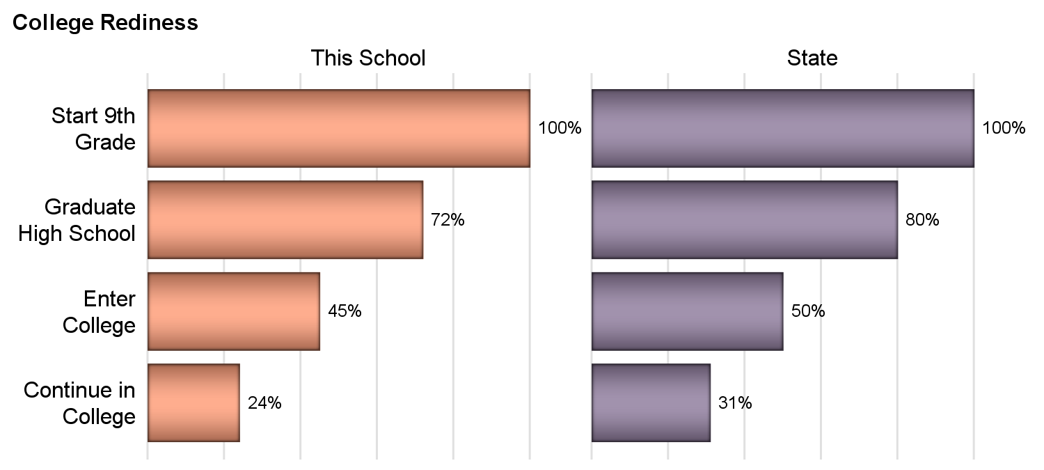 Now, there are many ways to visualize this data effectively. One simple way is shown on the right. The graph displays the same data as side by side bar charts in a class panel. The code for the graph is shown below, and is longer only because of appearance customization.
title j=l h=1 'College Rediness';
proc sgpanel data=Rediness_Bar_Panel noautolegend ;
styleattrs datacolors=(%rgbhex(254, 145, 104)
%rgbhex(130, 109, 146))
datacontrastcolors=(black);
 panelby School / columns=2 novarname onepanel sort=data
noheaderborder noborder;
hbar level / response=value datalabel group= school
baselineattrs=(thickness=0) dataskin=pressed;
rowaxis reverse display=(nolabel noticks noline) splitchar='.'
fitpolicy=splitalways;
colaxis offsetmin=0 display=none grid;
run;
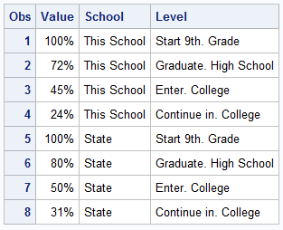
The data set is shown on the right. In this graph I have tried to mimic the layout of the display using simpler bar chart. However, a better comparison of the data for This School vs State can be made for each level using a clustered HBAR as shown below.
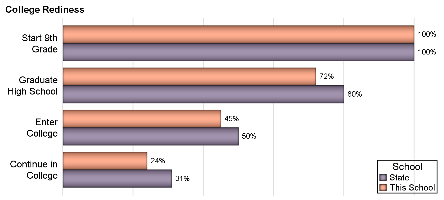 The graph on the right places the data for This School and State adjacent to each other by Level, and the proximity of the bars allows for a better comparison of the values. Yes, there is a way to make the order of the group values in the legend mimic the bars. See recent article on Legend Order.
title j=l h=1 'College Rediness';
proc sgplot data=Rediness_Bar_Panel nowall noborder;
styleattrs datacolors=(%rgbhex(254, 145, 104) %rgbhex(130, 109, 146))
datacontrastcolors=(black);
hbar level / response=value datalabel group=school groupdisplay=cluster
baselineattrs=(thickness=0) dataskin=pressed grouporder=reversedata;
yaxis reverse display=(nolabel noticks noline) splitchar='.' fitpolicy=splitalways;
xaxis offsetmin=0 display=none grid;
keylegend / location=inside position=bottomright across=1;
run;
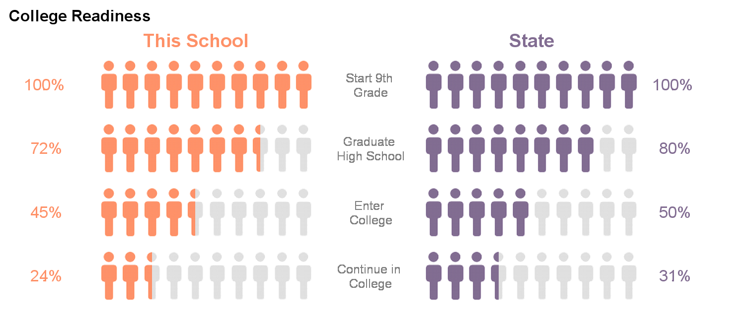 Having said that, let us now turn our attention to how we can create the "Infographics" type graph shown at the top using SGPLOT. The graph on the right is created using SAS 9.4 SGPLOT procedure. Click on the graph to see a higher resolution view. This graph is very much like the one on top, and the header icons can be added.
The main difference is that I have used only one "Partial" icon per school. In the graph at the top, a full color icon is displayed for every 10% value, and a gray icon is displayed for every 10% less than 100. But the icon for the partial number (say 74) is about 4% filled and 6% empty. In the graph on the right, I have used only one "Partial" icon to represent such a case.
For this graph I have use SCATTER plot to display an "ImageMarker" at every 10% location for each graph. So, I have to first expand the data into multiple observations, 10 for each Level and School. For each of these I generate either a full color icon, or the gray color icon. For the case where the value is not a round 10%, I have to generate a marker using the "Partial" marker.
I defined 5 icons, 2 full color icons for each school, 2 "Partial" icons for each school, and one gray icon. I used the SYMBOLIMAGE statement to create marker shapes from each of these, and then used them to draw the graph. The full code is attached in the link below. You will need the icons to really run the program, but you get the idea. More "Partial" icons could be created and used to get finer coloring like in the original graph above. I will leave that as an exercise to the interested reader.
Now, Dan Heath has suggested an interesting idea, where the icon could be a "Mask", that allows a background color to show through the marker, while masking the rest with opaque white. Then one could draw a bar chart of the right colors behind, and just draw the mask icons in front. Using an appropriately sized markers in front, one could get the correct fractional shaded shape, and we only need one icon, not 5. I suspect this will need some tweaking, but I will give it a go to see what can be done with this idea.
Graph and program updated to add headers.
SAS 9.4 SGPLOT Code: Info_Graphics_Bar_2


6 Comments
Very nice article, Sanjay!
Kirk
Nice! I didn't know SGPLOT could do this!
Well, it does need a bit of coding, and some new SAS 9.4 options.
Thanks Sanjay for sharing this tip! Sunil
This is very interesting. Robert Allison has a similar graph sample to this using SAS / GRAPH, but it doesn't have the option of partial icons. Could other icons be used, such as stars (I say this because I work on a couple of projects using star ratings for nursing homes and home health agencies)?
Any icons can be used, as long as the icons are pre-built, and can be used as appropriate. If you are doing an "Average Customer Rating" type graph with stars, you need one filled icon, one unfilled Icon, and one or more "partial" icons. Then, you can place the icons as necessary, with the actual rating at the end.