Infographics are all the rage today. Open any magazine or newspaper and we see data and numbers everywhere. Often, such information is displayed by adding some graphical information to add context to the data. A couple of good examples are Communicating numeric information, and Facts about Hot Dogs.
 Riley Benson, our UX expert explained it this way. The reason such infographics are used is to provide a memorable item associated with the numbers. An aesthetic graphic invites the user to spend more time viewing the graphic and number, thus making it more memorable. While the icon label is needed initially, frequent usage of the same icons makes them easier to recognize later without the label.
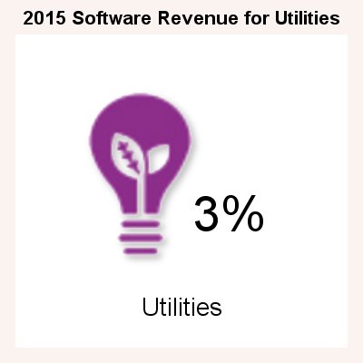
I was curious about how we could leverage GTL or SG procedures to make such graphs easier. So, I created the graphic on the right for display of the % revenues from a particular sector, in this case "Utilities". I found an image, and used PROC SGPLOT to create this "InfoGraphic"
Given a value to be displayed, an icon and the label, it is easy to create the display on the right. The SAS 9.4 code is shown below.
title h=1 '2015 Software Revenue for Utilities';
proc sgplot data=infographics (where=(industry='Utilities'))
pad=(left=20 right=20 bottom=20) noborder;
symbolimage name=Utilities image="&file7";
styleattrs backcolor=cxfaf3f0;
scatter x=x y=y / group=industry dataskin=sheen
markerattrs=(symbol=Utilities size=120);
text x=xlbl y=ylbl text=value / textattrs=(size=24);
text x=xnam y=ynam text=industry / textattrs=(size=12);
xaxis min=-2 max=2 display=none offsetmin=0 offsetmax=0;
yaxis min=-2 max=2 display=none offsetmin=0 offsetmax=0;
run;
In the code above, we have used the SYMBOLIMAGE statement to create a new marker symbol from the image icon for "Utilities", which is the "Bulb". Additional columns are used for the "Value" and also the (x, y) location of the icon and the value. In this example, I have customized the (x, y) locations for the icon and the value based on their arrangement.
 The data for the program is on the right. The data includes the Value, Industry, Image File Name for the icon, the (x, y) location for the icon center, the value label and the industry name. In the code above, only one industry (Utilities) is used.
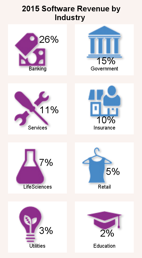
The nice part of using the code is that you can change the relative layout of the icon, value and label easily. Also, we can create a panel of the values by industry in any layout.
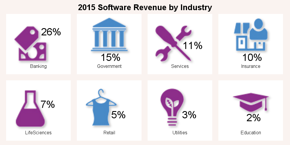 The graph on the right is a 4 column layout of all the industries using the SGPANEL procedure, showing all the icons and values from the data set above. I have used the SGPANEL procedure to arrange the layout. The icons, values and labels all fall into place easily.
The SGPANEL program is shown below. Note the use of ATTRPRIORITY=NONE on the ODS Graphics statement. This is required in case a color priority style like HTMLBlue is active, because we want to cycle through all marker shapes per group. Also note the use of SORT=DATA to ensure the panel classifiers are in the data order so the data and the layout are in sync.
 ods graphics / reset attrpriority=none noborder;
title '2015 Software Revenue by Industry';
proc sgpanel data=infographics pad=(left=20 right=20);
panelby industry / noborder noheader spacing=20
onepanel columns=4 sort=data;
symbolimage name=Banking image="&file1";
symbolimage name=Government image="&file2";
symbolimage name=Services image="&file3";
symbolimage name=Insurance image="&file4";
symbolimage name=LifeSciences image="&file5";
symbolimage name=Retail image="&file6";
symbolimage name=Utilities image="&file7";
symbolimage name=Education image="&file8";
styleattrs datasymbols=(Banking Government Services
Insurance LifeSciences Retail Utilities
Education) backcolor=cxfaf3f0;
scatter x=x y=y / group=industry markerattrs=(size=120)
dataskin=sheen;
text x=xval y=yval text=value / textattrs=(size=14);
text x=xnam y=ynam text=industry / textattrs=(size=7);
colaxis min=-2 max=2 display=none offsetmin=0 offsetmax=0;
rowaxis min=-2 max=2 display=none offsetmin=0 offsetmax=0;
run;
A 2x4 layout can easily be created by changing the panelby settings.
Full SAS 9.4 code: Info_Graphics

4 Comments
I was trying to run the full code to see if I could replicate and get the following error. I am fairly new to SAS so this could definitely be user error.
SYMBOLGEN: Macro variable GRAPHINIT resolves to GOPTIONS RESET=ALL GSFNAME=_GSFNAME;
50 &GRAPHINIT;
51 OPTIONS FIRSTOBS=1;
52 OPTIONS OBS=MAX;
53 OPTIONS DTRESET DATE NUMBER NOTES;
54 %put %bquote(NOTE: ODS statements in the SAS Studio environment may disable some
54 ! output features.);
NOTE: ODS statements in the SAS Studio environment may disable some output features.
55 OPTIONS NOSYNTAXCHECK;
56
57 ods graphics / reset width=2in height=2in imagename='Infographics1' noborder;
58 title h=1 '2015 Software Revenue for Utilities';
59 proc sgplot data=infographics
60 (where=(industry='Utilities'))
61 pad=(left=20 right=20 bottom=20) noborder;
62 symbolimage name=Utilities image="&file7";
SYMBOLGEN: Macro variable FILE7 resolves to C:\Work\Blogs\Graphically
Speaking\2016\Post_06_Feb_09_Info_Graphics\Utilities_Trans.png
63 styleattrs backcolor=cxfaf3f0;
_________
22
202
ERROR 22-322: Syntax error, expecting one of the following: ;, DATACOLORS, DATACONTRASTCOLORS,
DATALINEPATTERNS, DATASYMBOLS.
ERROR 202-322: The option or parameter is not recognized and will be ignored.
64 scatter x=x y=y / group=industry dataskin=sheen
65 markerattrs=(symbol=Utilities size=120);
66 text x=xval y=yval text=value / textattrs=(size=24);
67 text x=xnam y=ynam text=industry / textattrs=(size=12);
68 xaxis min=-2 max=2 display=none offsetmin=0 offsetmax=0;
69 yaxis min=-2 max=2 display=none offsetmin=0 offsetmax=0;
70 run;
NOTE: The SAS System stopped processing this step because of errors.
NOTE: PROCEDURE SGPLOT used (Total process time):
real time 0.00 seconds
cpu time 0.00 seconds
Based on the syntax error message, you should remove the BackColor option on the StyleAttrs statement. Also, to run the program as it is, you would need to have the images in the right folder on your computer. The attached program is FYI, and will need to be updated to be used with your data and image icons.
Where would I obtain the file with the image icons?
Pingback: Infographics Bar Chart - Graphically Speaking