Tips and Tricks
PROC SGMAP, Base SAS Procedures and MAPSSAS Data Sets

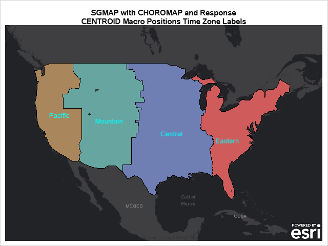
Starting with SAS 9.4M6, procedures that used to be provided with a SAS/GRAPH installation are now available with Base SAS. Using these procedures along with PROC SGMAP can help you create some very nice maps. This blog builds on previous posts and highlights the: MAPSSAS Data Sets GREMOVE procedure %CENTROID