In this post, I will show you how to control the order of the entries in a legend and explicitly control the correspondence between groups and style elements in PROC SGPLOT. In many cases, the colors that are used to differentiate groups do not matter--the graph simply needs to display different groups using different colors. That is not true for other graphs. It might be confusing if males were displayed using pink markers and lines and if females were displayed using blue markers and lines. For adverse events, you might prefer to use green for mildly adverse events and red for more severe events. Furthermore, you might want to order the events in the legend from mild to severe, and that might not conveniently depend on the order of the events in the data or a sorted order. The easiest way to control both legend order and group to style element correspondence is by using attribute maps. A series of examples provides background and shows other options.
The first graphs show default legend orderings and correspondence. They show that these can change depending on the data and the type of graph that you create. The fifth graph shows how you can use the STYLEATTRS statement in PROC SGPLOT to override components of style elements. The seventh (and last) graph shows how you can use an attribute map to control both the order of the entries in a legend and the correspondence between groups and style elements. With attribute maps, you do not have to know the original order. You can completely control the legend order and assign or override the default style elements. The PROC SGPLOT documentation contains much more information about the STYLEATTRS statement and attribute maps.
All of the graphs use this format in creating the legend:
proc format; value $sex 'M' = 'Male' 'F' = 'Female'; run; |
This step creates a simple scatter plot with two groups:
proc sgplot data=sashelp.class; title '(1) Scatter Plot of the Class Data Set by Sex'; scatter y=height x=weight / group=sex; format sex $sex6.; footnote1 justify=left 'Males (GraphData1) are first in the data set and legend.'; footnote2 justify=left 'Females (GraphData2) are second in the data set and legend.'; run; |
Click on a graph to enlarge.
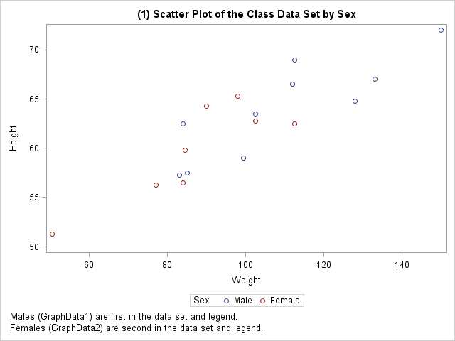
The GROUP= option is specified in the SCATTER statement so that males are displayed differently from females. The first observation in the SASHelp.Class data set is a male. Therefore, males are displayed using the GraphData1 style element (blue circles) and females are displayed using the GraphData2 style element (red circles). The legend entries are similarly ordered male and then female.
The following step creates a regression fit plot with two groups:
proc sgplot data=sashelp.class;
   title '(2) Fit Plot of the Class Data Set by Sex';
   reg y=height x=weight / group=sex degree=2 nomarkers;
   format sex $sex6.;
   footnote1 justify=left 'Males (GraphData2) are first in the data set.';
   footnote2 justify=left 'Males are second in the legend and use GraphData2 '
                          'because the male function was fit second.';
   footnote3 justify=left 'Females (GraphData1) are second in the data set.';
   footnote4 justify=left 'Females are first in the legend and use GraphData1 '
                          'because the female function was fit first.';
run; |
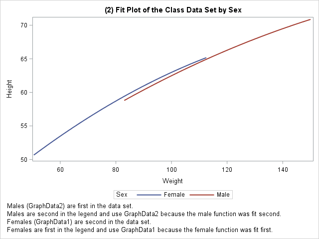
Males are still first in the data set, but now males appear second in the legend and are plotted using GraphData2 (red line), and females appear first in the legend and are plotted using GraphData1 (blue line). This is because the regression code gathers together the females first and then the males('F' is sorted ahead of 'M'). Therefore, the legend order and the GraphDatan assignment changes from the scatter plot.
The following step uses both a SCATTER and a REG statement:
proc sgplot data=sashelp.class;
   title '(3) Fit Plot of the Class Data Set by Sex';
   scatter y=height x=weight / group=sex;
   reg     y=height x=weight / group=sex degree=2 nomarkers;
   format sex $sex6.;
   footnote1 justify=left 'Males (GraphData2) are first in the data set.';
   footnote2 justify=left 'Males are second in the legend and use GraphData2 '
                          'because the male function was fit second.';
   footnote3 justify=left 'Females (GraphData1) are second in the data set.';
   footnote4 justify=left 'Females are first in the legend and use GraphData1 '
                          'because the female function was fit first.';
run; |
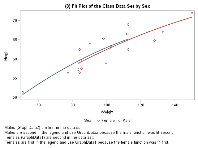
The legend order and the GraphDatan assignment still depends on the order in which the regression analysis is performed for each group.
The next step creates a grouped scatter plot from sorted data:
proc sort data=sashelp.class out=class; by sex; run; proc sgplot data=class; title '(4) Scatter Plot of the Sorted Class Data Set by Sex'; scatter y=height x=weight / group=sex; format sex $sex6.; footnote1 justify=left 'Males (GraphData2) are second in the data set and legend.'; footnote2 justify=left 'Females (GraphData1) are second in the data set and legend.'; run; |
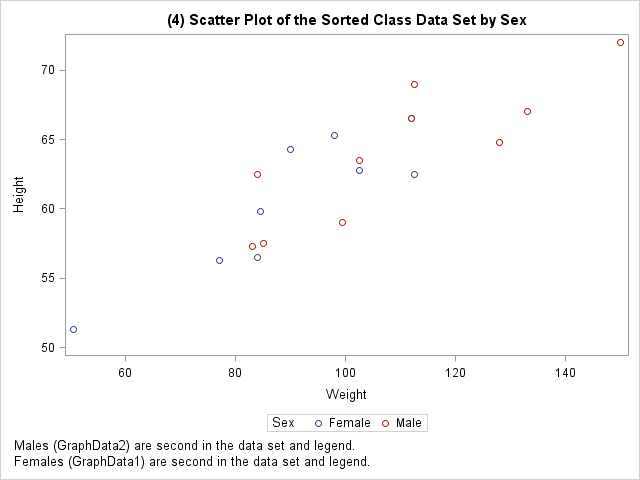
Since females now appear first in the data, they appear first in the legend and are displayed using GraphData1. Males appear second in the legend and are displayed using GraphData2.
The next step relies on the default group order (males then females in this case) and uses the STYLEATTRS statement to set the marker and line colors:
proc sgplot data=sashelp.class;
   styleattrs datacontrastcolors=(Blue cxFFAAAA);
   title '(5) Fit Plot of the Class Data Set by Sex';
   reg y=height x=weight / group=sex degree=2;
   format sex $sex6.;
   footnote1 justify=left 'Males (Blue) are first in the data set.';
   footnote2 justify=left 'Males are second in the legend '
                          'because the male function was fit second.';
   footnote3 justify=left 'Females (Pink) are second in the data set.';
   footnote4 justify=left 'Females are first in the legend '
                          'because the female function was fit first.';
   footnote5 justify=left 'The STYLEATTRS statement sets the colors for '
                          'males then females.';
run; |
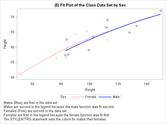
The STYLEATTRS statement sets the contrast colors to blue and a shade of pink for GraphData1 and GraphData2. The order of the legend entries is alphabetized, and the colors are consistent with gender identity colors.
Notice that the preceding step uses a REG statement without the NOMARKERS option. With this combination, the assignment of style elements to groups is reversed from the example with the REG statement and the NOMARKERS option. If you cannot anticipate which style element is used with which group, do not worry about it; it will all become easier in the last example. You can use attribute maps to control the order of the legend and override the GraphDatan style elements.
This second last example still relies on knowing the default group assignment. The first step creates an attribute map with females first and then males. Therefore, females will appear first in the legend. In this example, the only attribute that is set is FillColor, which is irrelevant in this graph. Specifying an irrelevant variable like this enables you to use an attribute map to simply control legend order:
data order;
   input Value $;
   retain ID 'A' Show 'AttrMap' FillColor 'Red';
   datalines;
Female
Male
;

proc sgplot data=sashelp.class dattrmap=order;
   title '(6) Scatter Plot of the Class Data Set by Sex';
   scatter y=height x=weight / group=sex attrid=A;
   format sex $sex6.;
   footnote1 justify=left 'Males (GraphData1) are first in the data set.';
   footnote2 justify=left 'Males are second in the legend '
                          'because they are second in the attribute map.';
   footnote3 justify=left 'Females (GraphData2) are second in the data set.';
   footnote4 justify=left 'Females are first in the legend '
                          'because they are first in the attribute map.';
run; |
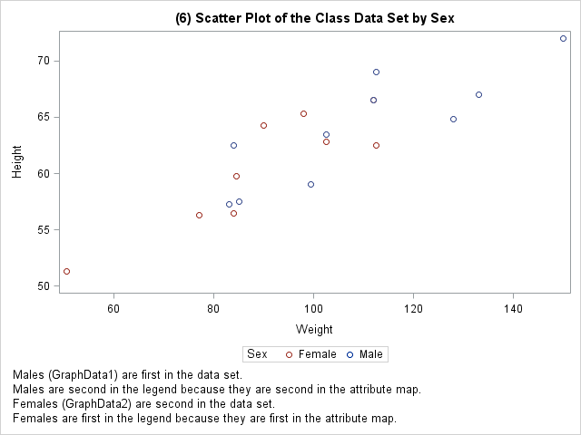
The last example is more typical, and it does not require you to know the default group order. The attribute map names females first and males second so that the legend entries appear in that order. Furthermore, females are explicitly specified to use all of the components of the GraphData2 style element and males use all of the components of GraphData1.
data order;
   input Value $ n;
   retain ID 'A' Show 'AttrMap';
   FillStyle        = cats('GraphData', n);
   LineStyle        = cats('GraphData', n);
   MarkerStyle      = cats('GraphData', n);
   TextStyleElement = cats('GraphData', n);
   datalines;
Female 2
Male   1
;

proc sgplot data=sashelp.class dattrmap=order;
   title '(7) Scatter Plot of the Class Data Set by Sex';
   scatter y=height x=weight / group=sex attrid=A;
   format sex $sex6.;
   footnote1 justify=left 'Males (GraphData1) are first in the data set.';
   footnote2 justify=left 'Males are second in the legend '
                          'because they are second in the attribute map.';
   footnote3 justify=left 'Females (GraphData2) are second in the data set.';
   footnote4 justify=left 'Females are first in the legend '
                          'because they are first in the attribute map.';
   footnote5 justify=left 'Males are explicitly assigned GraphData1.';
   footnote6 justify=left 'Females are explicitly assigned GraphData2.';
run; |
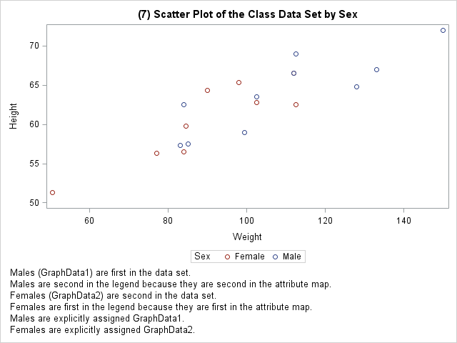
The correspondence between groups of observations and GraphDatan style elements can be confusing. It might depend on the order of the observations in the data set or it might depend on the order in which ODS Graphics does computations. You can use STYLEATTRS to override GraphDatan style elements. Even more powerfully, you can use attribute maps to control the order of the legend and correspondence between groups of observations and GraphDatan style elements. The STYLEATTRS statement and attribute maps are much more powerful than is shown here. See the PROC SGPLOT documentation for more information.

7 Comments
This is a nice comprehensive discussion of the connection between data order and attributes. I think this is something that every SAS programmer has struggled with at some point, and it is a frequent question on SAS discussion forums. The SHOW variable in discrete attribute maps is a new SAS 9.4m3 feature that Sanjay discussed in a previous post.
For another example of using the DATTRMAP= option to specify an attribute map, see the article "Specify the colors of groups in SAS statistical graphics."
In some situations, I find that it useful to prepend some fake data to the data set so that the categories appear in legends in a known order---even if the data might not contain all category levels!
Thanks Rick! There are often several ways to deal with issues. The fake data technique was the staple for SAS/STAT developers during the early days of ODS Graphics. Another technique that I did not mention (because I like the attribute maps better) is to create a format, informat, and group variable so that you can sort the data on the unformatted value into the order that you want but display formatted values in the legend in the desired order. I contemplated showing techniques for adding elements to the legend beyond those that normally appear, but I decided that was an entire blog topic by itself.
This is fantastic! I have struggled with this on a number of occasions and it has cause me to nearly tear my hair out. This explains how to control the ordering of groups really well in easy to follow examples. This is so great! Thanks again!!!
Thanks for the kind words Rie! I am glad I could help!
Pingback: Automate the creation of a discrete attribute map - The DO Loop
Pingback: Create a discrete heat map with PROC SGPLOT - The DO Loop
Pingback: Two-dimensional convex hulls in SAS - The DO Loop