If you are a SAS programmer and use the GROUP= option in PROC SGPLOT, you might have encountered a thorny issue: if you use a WHERE clause to omit certain observations, then the marker colors for groups might change from one plot to another. This happens because the marker colors depend on the data by default. If you change the number of groups (or the order of groups), the marker colors also change.
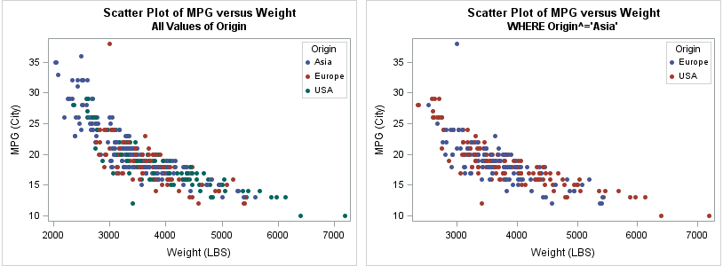
A simple example demonstrates the problem. The following scatter plots are colored by the ORIGIN variable in the SasHelp.Cars data. (Click to enlarge.) The ORIGIN variable has three levels: Asia, Europe, and USA. On the left, all values of the ORIGIN variable are present in the graph. On the right, the Asian vehicles are excluded by using WHERE ORIGIN^="Asia". Notice that the colors of the markers on the right are not consistent with the values on the left.
Warren Kuhfeld wrote an excellent introduction to legend order and group attributes, and he describes several other ways that group colors can change from one plot to another. To solve this problem, Kuhfeld and other experts recommend that you create a discrete attribute map. A discrete attribute map is a SAS data set that specifies the colors to use for each group value. If you are not familiar with discrete attribute maps, I provide several references at the end of this article.
Automatically create a discrete attribute map for PROC SGPLOT #SASTip Share on XAutomatic creation of a discrete attribute map
The discrete attribute map is powerful, flexible, and enables the programmer to completely determine the legend order and color for all categories. However, I rarely use discrete attribute maps in my work because the process requires the manual creation of a data set. The data set has to contain all categories (spelled and capitalized correctly) and you have to remember (or look up) the structure of the data set. Furthermore, many examples use hard-coded color values such as CXFFAAAA or "LightBlue," whereas I prefer to use the GraphDatan style elements in the current ODS style.
However, I recently realized that PROC FREQ and the SAS DATA step can lessen the burden of creating a discrete attribute map. A colleague pointed out that the documentation for the discrete attribute map mentions a column named MarkerStyleElement (or MarkerStyle), which specifies the names of style elements such as GraphData1, GraphData2, and so on. Therefore, you can use PROC FREQ to write the category levels to a data set, and use a simple DATA step to add the MarkerStyleElement variable. For example, you can create a discrete attribute map for the ORIGIN variable, as follows:
/* semi-automatic way to create a DATTRMAP= data set */ %let VarName = Origin; /* specify name of grouping variable */ proc freq data=sashelp.cars ORDER=FORMATTED; /* or ORDER=DATA|FREQ */ tables &VarName / out=Attrs(rename=(&VarName=Value)); run; data DAttrs; ID = "&VarName"; /* or "ID_&VarName" */ set Attrs(keep=Value); length MarkerStyleElement $11.; MarkerStyleElement = cats("GraphData", 1+mod(_N_-1, 12)); /* GraphData1, GraphData2, etc */ run; proc print; run; |
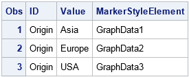
Voila! The result is a valid discrete attribute data set for the ORIGIN variable. The DATTRS data set contains all the information you need to ensure that the first category is always displayed by using the GraphData1 element, the second category is displayed by using GraphData2, and so on. The program does not require that you manually type the categories or even know how many categories there are. Obviously, you could write a macro that makes it easy to generate these statements.
This data set uses the alphabetical order of the formatted values to determine the group order. However, you can use the ORDER=DATA option in PROC FREQ to order by the order of categories in the data set. You can also use the ORDER=FREQ option to order by the most frequent categories. Because most SAS-supplied styles define 12 style elements, the MOD function is used to handle categorical variable that have more than 12 levels.
Use the discrete attribute map
To use the discrete attribute map, you need to specify the DATTRMAP= option on the PROC SGPLOT statement. You also need to specify the ATTRID= option on every SGPLOT statements that will use the map. Notice that I set the value of the ID variable to be the name of the GROUP= variable. (If that is confusing, you could choose a different value, as noted in the comments of the program.) The following statements are similar to the statements that create the right-hand graph at the top of this article, except this call to PROC SGPLOT uses the DATTRS discrete attribute map:
proc sgplot data=sashelp.cars DATTRMAP=DAttrs; where origin^='Asia' && type^="Hybrid"; scatter x=weight y=mpg_city / group=Origin ATTRID=Origin markerattrs=(symbol=CircleFilled); keylegend / location=inside position=TopRight across=1; run; |
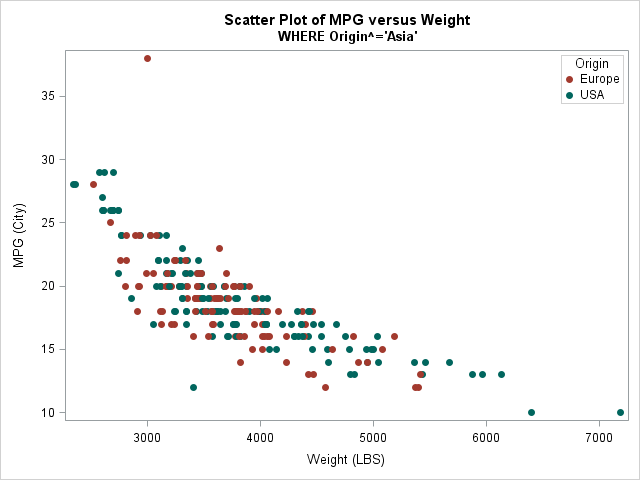
Notice that the colors in this scatter plot are the same as for the left-hand graph at the top of this article. The group colors are now consistent, even though the number of groups is different.
Generalizing the automatic creation of a discrete attribute map
The previous section showed how to create a discrete attribute map for one variable. You can use a similar approach to automatically create a discrete data map that contains several variables. The main steps are as follows:
- Use ODS OUTPUT to save the OneWayFreqs tables from PROC FREQ to a SAS data set.
- Use the SUBSTR function to extract the variable name into the ID variable.
- Use the COALESCEC function to form a Value column that contains the values of the categorical variables.
- Use BY-group processing and the UNSORTED option to assign the style elements GraphDatan.
ods select none; proc freq data=sashelp.cars; tables Type Origin; /* specify VARS here */ ods output OneWayFreqs=Freqs; run; ods select all; data Freqs2; set Freqs; length ID $32.; ID = substr(Table, 7); /* original values are "Table VarName" */ Value = COALESCEC(F_Type, F_Origin); /* also specify F_VARS here */ keep ID Value; run; data DAttrs(drop=count); set Freqs2; length MarkerStyleElement $11.; by ID notsorted; if first.ID then count = 0; count + 1; MarkerStyleElement = cats("GraphData", 1 + mod(count-1, 12)); run; |
The preceding program is not completely general, but it shows the main ideas. You can adapt the program to your own data. If you are proficient with the SAS macro language, you can even write a macro that generates appropriate code for an arbitrary number of variables. Leave a comment if this technique proves useful in your work or if you have ideas for improving the technique.
References
- SAS ODS Graphics documentation about discrete attribute maps
- D. Heath, "Putting on the Ritz: New Ways to Style Your ODS Graphics to the Max", Proceedings of the SAS Global Forum 2014 Conference, Cary, NC: SAS Institute Inc.
- S. Matange, "Attribute Maps - 1", Graphically Speaking blog, Apr 2013
- S. Matange, "Consistent Group Colors by Value", Graphically Speaking blog, Oct 2014
- W. Kuhfeld, "Legend order and group attributes," Graphically Speaking blog, Sep 2016

5 Comments
Nice article. It would be nice to make a macro to extract the information from specific classifiers from a full data set.
Just a little nit on the code for your Generalizing example.
In the data freqs2 step. The line:
ID = substr(Table, 6);
should probably be
ID = substr(Table, 7);
to avoid picking up the blank before the "ID" that you are looking for.
This is a great article.
Thank you! Obviously I have problems counting past five, probably because it requires me to use both hands! I have corrected the error.
Thanks for sharing. It was really helpful.
Pingback: What colors does PROC SGPLOT use for markers? - The DO Loop