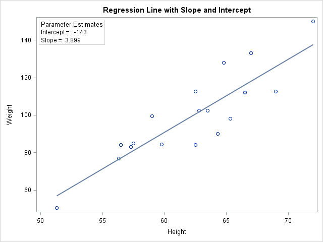
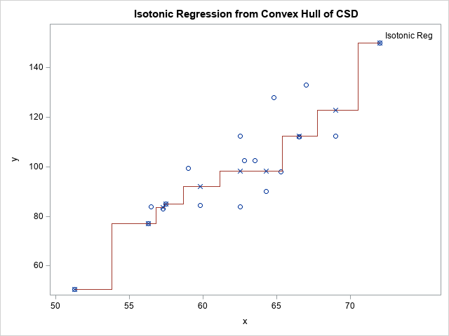
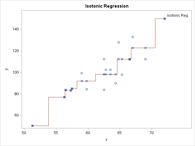
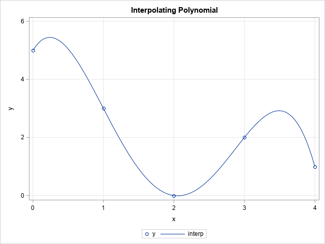
I recently showed someone a trick to create a graph, and he was extremely pleased to learn it. The trick is well known to many SAS users, but I hope that this article will introduce it to even more SAS users. At issue is how to use the SGPLOT procedure
Search Results: sgplot (958)
A SAS user asked an interesting question on the SAS/GRAPH and ODS Graphics Support Forum. The question is: Does PROC SGPLOT support a way to display the slope of the regression line that is computed by the REG statement? Recall that the REG statement in PROC SGPLOT fits and displays
It seemed like an easy task. A SAS user asked me how to use the SGPLOT procedure to create a bar chart where the vertical axis shows percentages instead of counts. I assumed that there was some simple option that would change the scale of the vertical axis from counts
The other day I was using PROC SGPLOT to create a box plot and I ran a program that was similar to the following: proc sgplot data=sashelp.cars; title "Box Plot: Category = Origin"; vbox Horsepower / category=origin; run; An hour or so later I had a need for another box
This week's tip comes from Ron Cody - SAS author and expert extraordinaire. Ron's written several bestselling SAS Press books including his latest SAS Statistics by Example. If you haven't taken a look at Ron's extensive work, I'd invite you to visit his author page. You can read a free chapter from each of
Some SAS products such as SAS/IML Studio (which is included FREE as part of SAS/IML software) have interactive graphics. This makes it easy to interrogate a graph to determine values of "hidden" variables that might not appear in the graph. For example, in a scatter plot in SAS/IML Studio, you
In a previous article we discussed how to add axis aligned statistics table to a Lipid graph using GTL. Other graphs such as the Survival Plot also utilize the same technique to display the "at risk" statistics aligned by time or visits along the X axis. Often, we also need to display
In this blog we will discuss many aspects of the SG Procedures. This article will cover some basic features and workings of the SGPLOT procedure to establish a baseline. The single-cell graph is the work horse for data visualization. From the simple bar chart to the complex patient profiles for clinical
Sometimes you want to label only certain observations in a plot. This is useful in many ways, but one use is to label outliers on a scatter plot. In the SGPLOT procedure, the DATALABEL= option enables you to specify the name of a variable that is used to label observations.
At SAS Global Forum last week, a customer approached me with a very specific request. The conversation went something like this: Customer: My client demands a bar chart that uses a bar for one response, and a symbol for other responses, all on the same chart. We know it's possible
While reviewing a book on numerical analysis, I was reminded of a classic interpolation problem. Suppose you have n pairs of points in the plane: (x1,y1), (x2,y2), ..., (xn,yn), where the first coordinates are distinct. Then you can construct a unique polynomial of degree (at most) n-1 that passes through
A previous article discusses a formula for a confidence interval for R-square in a linear regression model (Olkin and Finn (1995) "Correlations redux", Psychological Bulletin) The formula is useful for large data sets, but should be used with caution for small samples. At the end of the previous article, I
A SAS analyst ran a linear regression model and obtained an R-square statistic for the fit. However, he wanted a confidence interval, so he posted a question to a discussion forum asking how to obtain a confidence interval for the R-square parameter. Someone suggested a formula from a textbook (Cohen,
A SAS analyst read my previous article about visualizing the predicted values for a regression model that uses spline effects. Because the original explanatory variable does not appear in the model, the analyst had several questions: How do you score the model on new data? The previous example has only
Batch manufacturing involves producing goods in batches rather than in a continuous stream. This approach is common in industries such as pharmaceuticals, chemicals, and materials processing, where precise control over the production process is essential to ensure product quality and consistency. One critical aspect of batch manufacturing is the need to manage and understand inherent time delays that occur at various stages of the process.
A SAS programmer wanted to visualize density estimate for some univariate data. The data had several groups, so he wanted to create a panel of density estimate, which you can easily do by using PROC SGPANEL in SAS. However, the programmer's boss wanted to see filled density estimates, such as
After writing a program that simulates data, it is important to check that the statistical properties of the simulated (synthetic) data match the properties of the model. As a first step, you can generate a large random sample from the model distribution and compare the sample statistics to the expected
A SAS statistical programmer recently asked a theoretical question about statistics. "I've read that 'p-values are uniformly distributed under the null hypothesis,'" he began, "but what does that mean in practice? Is it important?" I think data simulation is a great way to discuss the conditions for which p-values are
Years ago, I wrote an article that showed how to visualize patterns of missing data. During a recent data visualization talk, I discussed the program, which used a small number of SAS IML statements. An audience member asked whether it is possible to construct the same visualization by using only
The moment-ratio diagram is a tool that is useful when choosing a distribution that models a sample of univariate data. As I show in my book (Simulating Data with SAS, Wicklin, 2013), you first plot the skewness and kurtosis of the sample on the moment-ratio diagram to see what common
A SAS programmer wanted to simulate samples from a family of Beta(a,b) distributions for a simulation study. (Recall that a Beta random variable is bounded with values in the range [0,1].) She wanted to choose the parameters such that the skewness and kurtosis of the distributions varied over range of
A dot plot is a standard statistical graphic that displays a statistic (often a mean) and the uncertainty of the statistic for one or more groups. Statisticians and data scientists use it in the analysis of group data. In late 2023, I started noticing headlines about "dot plots" in the
My colleague Rick Wicklin maintains a nifty chart that shows the timeline of SAS releases since Version 8. A few of you asked if I could post a similar chart for SAS Enterprise Guide. Here it is. Like Rick, I used new features in SAS 9.4 to produce this chart
Recently, I saw a scatter plot that displayed the ticks, values, and labels for a vertical axis on the right side of a graph. In the SGPLOT procedure in SAS, you can use the Y2AXIS option to move an axis on the right side of a graph. Similarly, you can
I sometimes see analysts overuse colors in statistical graphics. My rule of thumb is that you do not need to use color to represent a variable that is already represented in a graph. For example, it is redundant to use a continuous color ramp to represent the lengths of bars
This phenomenon has been in the news recently, so I've updated this article that I originally published in 2017. The paper currency in circulation in the US is mostly $100 bills. And not just by a little bit -- these account for 34% of the notes by denomination and nearly
I read a journal article in which a researcher used a formula for the probability density function (PDF) of the sample correlation coefficient. The formula was rather complicated, and presented with no citation, so I was curious to learn more. I found the distribution for the correlation coefficient in the
Some hearts are famous. For example, there is the "Heart of Gold" (Neil Young), the "Heart of Glass" (Blondie), and the Heart of Darkness (Joseph Conrad). But have you heard of the "Heart of Ellipses"? No? Well, in 2023, Ted Conway published an amusingly titled article, "Total Ellipse of the
This article looks at a geometric method for estimating the center of a multivariate point cloud. The method is known as convex-hull peeling. In two-dimensions, you can perform convex-hull peeling in SAS 9 by using the CVEXHULL function in SAS IML software. For higher dimensions, you can use the CONVEXHULL
Transitioning from SAS9 to SAS Viya can be uncertain for SAS programmers. Whether your organization is making the move and you’re curious about your current SAS analytical workflows, or you're contemplating moving to SAS Viya and concerned about its impact on your SAS expertise and programs. The hesitation is understandable.