This article demonstrates how to use PROC GENMOD to perform a Poisson regression in SAS. There are different examples in the SAS documentation and in conference papers, but I chose this example because it uses two categorical explanatory variables. Therefore, the Poisson regression can be visualized by using a contingency table. Thus, the example shows a relationship between count models and analyzing certain types of contingency tables. (For more information about the relationship, see Stokes, Davis, and Koch (2nd Ed, 2000, pp. 588-590).) Equivalently, you can use heat maps to visualize the contingency table for the data, for the model, and for the residuals.
What is Poisson regression?
Poisson regression is a type of regression that can model a response that is a count or a rate. The rate can be temporal, spatial, or general. For example, you can "accidents per day" (temporal), "animals per square kilometer" (spatial), or the proportion of events within groups of different sizes (general). Poisson regression is one of several "count regression" models, which also includes negative binomial models and "zero-inflated" models. In SAS, analysts most often use the GENMOD or GLIMMIX procedures to model counts or rates.
Count regression models can contain both continuous and categorical explanatory variables. If the explanatory variables are all categorical, then the data and the predicted values can be visualized by using contingency tables. If you want to model rates instead of counts, you can include an "offset variable" in the model, as explained in the next section.
SAS has an informative web page that discusses many of the statistical issues associated with estimating rates by using count regression with an offset variable.
What is an offset variable?
An offset variable is used to convert raw counts into a standardized rate. For example, if you model the number of infections in hospitals, you can convert raw counts into rates by dividing each hospital's count by the number of patients that the hospital treated. The proportion of infections at the i_th site is therefore the ratio Count[i]/N[i]. In regression, it is fruitful to assume that the log of this quantity is modeled by a linear combination of covariates and random variation. Suppressing the subscripts, the expected rate is modeled by using the formula
log(Count/N) = β0 + β1 X1 + ... + βk Xk
or
log(Count) = log(N) + β0 + β1 X1 + ... + βk Xk
The term "log(N)" (or log(N[i]) for each i) is called the offset term. It is factor that is added to the linear combination of the covariates. In general, an offset is the log of a variable that indicates the size of a group.
An offset enables you to model rates "per unit" time/area/size instead of counts.
Data for a Poisson regression
The SAS documentation discusses several Poisson regression models that include an offset. The following example is from the documentation for the GENMOD procedure. A manufacturer wants to model the count of ingots that are not ready for processing after preparation that involves soaking and heating. The experiment is performed for five levels of the Soak variable (1, 1.7, 2.2, 2.8, and 4 hours) and at four heat settings, as follows:
data ingots; input Heat Soak Notready Total @@; logTotal= log(Total); PropNotready = NotReady / Total; ObsNum = _N_; datalines; 7 1.0 0 10 14 1.0 0 31 27 1.0 1 56 51 1.0 3 13 7 1.7 0 17 14 1.7 0 43 27 1.7 4 44 51 1.7 0 1 7 2.2 0 7 14 2.2 2 33 27 2.2 0 21 51 2.2 0 1 7 2.8 0 12 14 2.8 0 31 27 2.8 1 22 7 4.0 0 9 14 4.0 0 19 27 4.0 1 16 51 4.0 0 1 ; |
Because the two factors are discrete, you can visualize the raw data (both counts and proportions) by using a contingency table:
proc freq data=ingots order=data; tables Soak*Heat / norow nocol; weight PropNotready / zeros; run; |
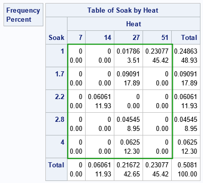
Ignore the marginal totals and focus on the cells inside the green rectangle. In the rectangle, each cell contains two values. The first value is the count of ingots that were not ready for rolling. The second value is the proportion of ingots that were not ready.
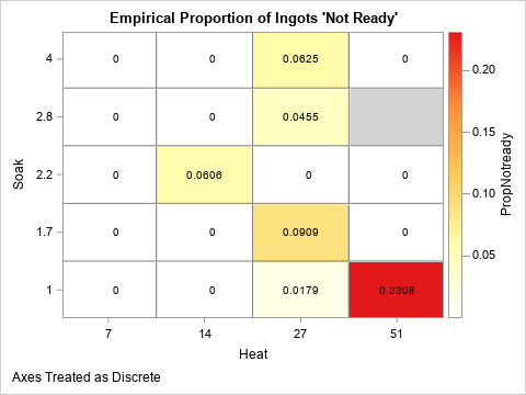
Alternatively, you can use a heat map to visualize the proportion of ingots that are not ready. The following heat map shows the same information. (The only difference is that the Soak variable increases in the graph as you move up; in the table the Soak values increase as you move down the rows.) The following heat map visualizes the empirical proportions of ingots for each of the 19 joint combinations of factors in the experiment:
%let WhiteYeOrRed = (CXFFFFFF CXFFFFB2 CXFECC5C CXFD8D3C CXE31A1C); footnote J=L "Axes Treated as Discrete"; title "Empirical Proportion of Ingots 'Not Ready'"; proc sgplot data=ingots noautolegend; styleattrs wallcolor=LightGray; heatmapparm x=heat y=soak colorresponse=PropNotready / discretex discretey outline outlineattrs=(color=gray) colormodel=&WhiteYeOrRed; text x=heat y=soak text=PropNotready; gradlegend; run; |
A Poisson regression model
You can use PROC GENMOD and the DIST=POISSON option to model the counts or proportions (rates) for this experiment. The following data and model are from the the documentation for the GENMOD procedure, which discusses the model in more detail.
A Poisson regression can support continuous covariates, but these data have only discrete factors. Accordingly, both explanatory variables are listed on the CLASS statement. The following call to PROC GENMOD uses the OFFSET=logTotal option to define the offset variable as the log of the number of trials at each joint level of factors. Therefore, the model predicts the proportion of ingots that are not ready for rolling:
proc genmod data=ingots; class Soak Heat / param=ref; model Notready = Heat Soak / offset=logTotal dist=Poisson link=log; output out=PoiModel pred=PredCount xbeta=xbeta; run; |
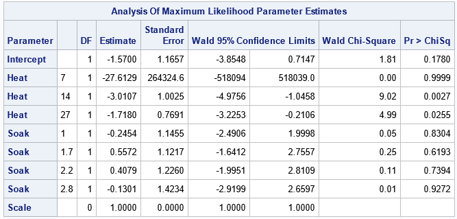
Let's ignore the fact that the Soak variable is insignificant and could be dropped from the model. Instead, let's visualize the model's predicted proportions. The output data set contains the predicted counts, but we can form the predicted proportions and visualize the predictions, as follows:
data PoiModel; set PoiModel; PredProp = PredCount / Total; Resid = PropNotready - PredProp; PredPropLabel = put(PredProp, 4.2); ResidLabel = put(Resid, 5.2); run; title "Predicted Proportions for Ingots 'Not Ready'"; proc sgplot data=PoiModel noautolegend; styleattrs wallcolor=LightGray; heatmapparm x=heat y=soak colorresponse=PredProp / discretex discretey outline outlineattrs=(color=gray) colormodel=&WhiteYeOrRed; text x=heat y=soak text=PredPropLabel; gradlegend; run; |

The model predicts that the proportions increase with the Heat value. In particular, the model predicts the largest proportions when Heat=51. The empirical and predicted proportions differ in an important way along the column where Heat=51. For that level of Heat, the experiment was run only once for Soak=1.7, Soak=2.2, and Soak=4.0. So the empirical proportions for those cells are 0/1 whereas the predicted proportions are nonzero.
You can visualize the difference between the empirical and predicted proportions by graphing the residuals, as follows:
%let BlueWhitePink = (CX053061 CX2166AC CX4393C3 CX92C5DE CXD1E5F0 CXF7F7F7 CXFDDBC7); title "Difference Between Observed and Predicted Proportions"; proc sgplot data=PoiModel noautolegend; styleattrs wallcolor=LightGray; heatmapparm x=heat y=soak colorresponse=Resid / discretex discretey outline outlineattrs=(color=gray) colormodel=&BlueWhitePink; text x=heat y=soak text=residLabel; gradlegend; run; footnote; |
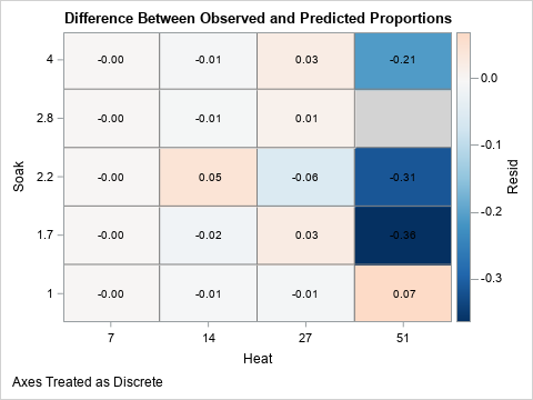
The plot of the residuals shows that the biggest differences between the empirical proportions and the predicted proportions are in the cells on the right hand side of the graph. These cells represent experimental designs for which there was a single trial and no events. These cells are shaded in dark shades of blue because the differences are large and negative. In contrast, the other cells are in muted colors, which indicate a close agreement between the empirical and the predicted proportions (small residuals).
Summary
This article shows an example of performing a Poisson regression in SAS by using PROC GENMOD. Poisson regression is one of several "count models" that are available in SAS. In the example, there are two explanatory variables, and they are each categorical. Consequently, you can visualize the empirical and predicted counts or rates by using a table or a heat map. (You can also visualize the residuals in a similar way.) To predict rates instead of counts, include an offset variable in the model. The offset variable is the logarithm of a variable that indicates something about the size of each joint category.

5 Comments
Rick,
"Thus, the example shows a relationship between count models and analyzing certain types of contingency tables. "
Yes. It is called Log Linear Model. You can model these count data (contingency table) with PROC CATMOD .
Correct. The Appendix in Stokes, Koch, and Davis (2000) describes the relationship between Poisson regression and loglinear models. Other parts of that book show how to use PROC CATMOD for the analysis. They also state, "much of the
Poisson regression should be fairly accessible, but the loglinear discussion is somewhat advanced."
Pingback: Simulate data from a Poisson regression model - The DO Loop
Generally I like to write the equation as:
log(E[Count]) = \beta_0 + \beta_1(X) + 1*Offset
Sometimes people are confused when writing log(Count), as they think they need to take the logarithms of the count before the regression equation. And then different software sometimes uses the term "exposure", which is typically the raw population, whereas "offset" it should be the logged population. https://apwheele.github.io/MathPosts/PoissonReg.html
I still have the idea in the queue from an older post of yours Rick to show the difference in error distributions for Poisson/Negative Binomial/OLS of logged counts.
Thanks for writing. Yes, the model is for the expected values of the counts. If you specify LINK=LOG in the MODEL statement, you do not need to take the log of the count, but you DO need to take the log of the denominator of the ratio.