A SAS user asked an interesting question on the SAS/GRAPH and ODS Graphics Support Forum. The question is: Does PROC SGPLOT support a way to display the slope of the regression line that is computed by the REG statement? Recall that the REG statement in PROC SGPLOT fits and displays a line through points in a scatter plot.
In SAS 9.3, you cannot obtain this information directly from PROC SGPLOT. Instead, you need to use PROC REG to compute this information. You can use the following steps to create a plot that displays the parameter estimates:
- Use PROC REG to compute the parameter estimates (slope and intercept). Save this information to a SAS data set.
- Use a DATA step to create macro variables that contain the parameter estimates.
- Use the INSET statement in PROC SGPLOT to add this information to the fitted scatter plot\.
Step 1: Save the parameter estimates
You can use the OUTEST= option or the ODS OUPUT statements to save the parameter estimates to a SAS data set. In the following example, the ODS OUTPUT statement saves the ParameterEstimates table to the PE data set:
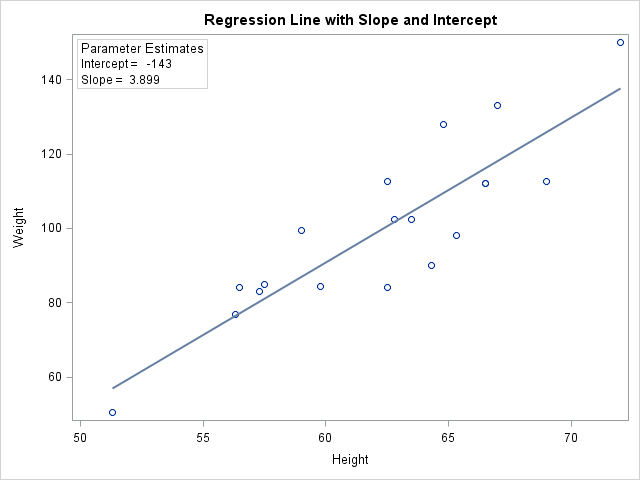
ods graphics off; proc reg data=sashelp.class; model weight = height; ods output ParameterEstimates=PE; run; |
Step 2: Create macro variables
In the PE data set, the ESTIMATE variable contains the parameter estimates. The first row contains the estimate for the intercept term; the second row contains the estimate for the slope. The following DATA step saves these into macro variables:
data _null_;
   set PE;
   if _n_ = 1 then call symput('Int', put(estimate, BEST6.));
   else            call symput('Slope', put(estimate, BEST6.));
run; |
Step 3: Use the INSET Statement to display the parameter estimates
You can now create the plot by using PROC SGPLOT. Use the INSET statement to display the parameter estimates in a text box:
proc sgplot data=sashelp.class noautolegend;
   title "Regression Line with Slope and Intercept";
   reg y=weight x=height;
   inset "Intercept = &Int" "Slope = &Slope" /
         border title="Parameter Estimates" position=topleft;
run; |
Of course, you can use a similar strategy to display any other relevant statistics on the scatter plot. There is an example in the SAS/STAT User's Guide that shows other fit statistics, as well as how to use Greek letters and superscripts in the inset text. You can also display a formula that shows the equation of a displayed line.

43 Comments
I use sgplot using reg but with group option to perform an ANCOVA and ancova plot is generated. Is there a way to plot additional data series onto the ancovaplot (just like in gplot overlay). The additional data series is not part of the regression analysis from which confidence bands are generated. Thanks in advance.
I think you are saying that you use the SGPLOT procedure and use the REG statement with the GROUP= option to get several regression fits overlaid on the same plot. If that is so, the answer is yes. In the same procedure you can add one or more SERIES statements that display (precomputed) curves. The only "trick" is that the additional series need to use variables in the same data set as the regression data. For example, if the MYDATA data set contains the 500 observations for the regression, you might need to merge that data with the precomputed curves in the MYCURVES data set, which might have fewer points, like this:
data A;
set MYDATA MYCURVES;
run;
proc sgplot data=A;
reg x=x y=y / group=group;
series x=curveX y=curveY;
run;
Thanks Rick. That works. This is a great feature that would save me lots of steps in my project.
I posted this question in the SAS community but haven't gotten any response so I thought I try it here:
The ANCOVAPLOT generated using PROC GLM is very useful. I need to show intersection of a reference line in Y axis with the CLM (confidence interval). Is there a way to draw such reference line on the Y axis? Addtionally, can the axis be modified (scale, min-max, etc)?
The PROC REG method Rick outline in the prior thread would take care of generating the reference line. However, if I have a categorical variable that I am grouping by in the model, the confidence interval that would be constructed would use the individual RMSE's in fitting regression by group. Whereas, in PROC GLM it uses the pooled RMSE depending on the model, thus I prefer to use PROC GLM for generating ancovaplot. But from what I read in SAS literature, it does not offer any option for adding reference lines, scaling, etc.
Thanks in advance for the help.
-Richard
You were correct to post your question to the SAS Community, but you posted to the wrong forum. You'll get more feedback if you post to the SAS Statistical Procedures Community.
I am trying to plot just one line that includes a linear regression with its covariates (up to three). I see how you can make multiple lines, but can you make just one of the entire adjusted model?
PROC SGPLOT only supports scatter plot smoothers, possibly with a group variable:
REG X=xVar Y=yVar / GROUP=groupVar;
For more complicated visualizations, use a regression procedure and the EFFECTPLOT statement in the procedure or in PROC PLM.
Rick, Can I ask another plotting question. I would have a regression model from a DOE study, for example:
Y = A B A*B
I need to display plot of Y as it varies with the explored range of factor A (along with predicted interval). However since factor B also influences Y, but graphing is limited to two-dimension, I would have to fix the value of B, say the upper level of the explored range (+1). Is there a way to generate such kind of plot using either the ODS graphics in PROC GLM or in PROC SGPLOT. I am not sure if the reg option in PROC SGPLOT can handle beyond a multiple regressor model, possibly, with interactions. Thank you very much.
Use the RSREG procedure, which is designed for these types of situations.
Thanks for the tip, I will explore RSREG.
Hi,
I want to graph rate of change (slope) of x1 but I am working with multiple linear regression and data is weighted so I am using Proc Surveyreg. Is there any way to use this procedure or something similar?
Regards,
Russell
See Sharon Lohr's paper: http://support.sas.com/resources/papers/proceedings12/343-2012.pdf
Pingback: 13 popular articles from 2013 - The DO Loop
I am not able to run this code. I get a warning at step 2 that variable PE is uninitialized. I have checked my spelling and removed all null values from the dataset. Any suggestions? Thanks.
Here is the program in one block so that you don't need to copy/paste three separate segments:
ods graphics off; proc reg data=sashelp.class; model weight = height; ods output ParameterEstimates=PE; run; data _null_; set PE; if _n_ = 1 then call symput('Int', put(estimate, BEST6.)); else call symput('Slope', put(estimate, BEST6.)); run; proc sgplot data=sashelp.class noautolegend; title "Regression Line with Slope and Intercept"; reg y=weight x=height; inset "Intercept = &Int" "Slope = &Slope" / border title="Parameter Estimates" position=topleft; run;Hi Rick
I am using SAS university edition, which is not supporting PROC GPLOT. so I have to use PROC SGPLOT to generate graph.
the code you showed above, only fit a linear line to a plot.
My question for you is that how to fit a QUADRATIC or LOG line into plot or scatter plot?
thank you
See the article "How to overlay custom curves with PROC SGPLOT.
You can ask question like this at the SAS Support Communities.
Hi Rick,
Thanks for the very helpful article. Do you know if SAS 9.4 can display the regression line created by the REG statement in SGPLOT?
Thank you!
Yes, the REG statement in PROC SGPLOT displays a scatter plot with a regression line. If you just want the line, use the NOMARKERS options. You can even use DEGREE=2 or DEGREE=3 to compute polynomial smoothers.
Thanks so much for your reply! I didn't word my question very well -- what I meant to say is, is it possible to see the actual parameter estimates (slope and intercept) that SAS computes and that correspond to regression line in PROC SGPLOT?
Thanks again!
No, PROC SGPLOT does not display any statistics or estimates. That information is produced only by analytical procedures, such as PROC REG.
Hi Rick,
How can I plot multiple regression lines ? What I mean is, I ran several PROC REG's, and saved the intercept and slope. Then I merged them into a single dataset. I want to plot, let's say, 3 lines in one scatter. Is is possible ?
For multiple lines, use the LINEPARM statement as described in the article "Add a diagonal line to a scatter plot." For multiple curves, see the article "How to overlay custom curves with PROC SGPLOT."
Hi Rick,
Thanks for the informative article. How can we plot regression line during the linear phase of the concentration vs. time data to estimate the terminal disposition rate constant (lambda) using best fit method?
You can ask programming questions at the SAS Supp ort Communities. If this is a regression question, use the Statistical Community. If it is a graphing question, use the Graphing Community. In either case, show some sample data and what you want the result to look like.
Thank you for your suggestion. I have asked that question at the SAS Statistical Community.
Rick,
Thank you for the demo! This is so helpful. I needed to quickly test correlation between a bunch of variables yesterday. So I saved the statistics from PROC CORR and used the SGPLOT code you provided to display the correlation coefficient and p-value on the scatter plot. It worked like a charm!
Great idea! I like it!
Is there a way to get the slope coefficient for each group separately?
For example I have the current code:
PROC sGPLOT DATA = &data (where =( &group ne .)) noautolegend dattrmap = attrmap ;
reg x = &x y = &y /group = &group clm clmtransparency = 0.4 attrid = &group;
title "&title";
inset "Intercept = &Int" "Slope = &Slope" /
border title="Parameter Estimates" position=topleft;
run;
I used the code you mentioned above, this only generates the intercept and slope for the first group listed. Is there any way to generate the slope for each group, (in my case there are 3 groups)?
Yes. See my article "Label multiple regression lines in SAS" and a follow-up article by Warren Kuhfeld, "Displaying a grouped regression fit plot along with the parameter estimates."
I was trying to use your code to label the regression lines but I keep on getting the error that &Int and &Slope cannot be resolved.
%DO I=1 %TO 2;
PROC SGPLOT DATA=MODDATA.ZIP_WO_&STRT_MTH._&END_MTH.;
SCATTER X = %SCAN(&VAR1,&I) Y = S_POST / MARKERATTRS=(COLOR=ORANGE) TRANSPARENCY=0.5;
REG X = %SCAN(&VAR1,&I) Y = S_POST / NOMARKERS;
TITLE 'S_POST vs '%SCAN(&VAR1,&I);
inset "Intercept = &INT" "Slope = &Slope" / border title="Parameter Estimates" position=topleft;
RUN;
%END;
It sounds like you didn't define the macro variables. They are defined by the SYMPUT statement in the preceding DATA step. For your example, you might want to define Int1, Int2, Slope1, and Slope2. If you have questions, post to the communities.sas.com.
Hi Rick, I am the regular follower of your SAS blog, and I think your blog helps us a lot especially in how to make nice graphs.
I found another easier way to display the slope and intercept of a regression line in sgplot procedure. That is, use the combination of scatter and reg statement in sgplot procedure.
Here is the blog link:
https://blogs.sas.com/content/graphicallyspeaking/2018/02/21/getting-started-sgplot-part-10-regression-plot/
proc sgplot data=sashelp.class;
scatter y=weight x=height / group=sex ;
reg y=weight x=height ;
run;
I simulate his example and do SAS coding in my own data set, and I found that I successfully produced 4 symbols for group and only 1 regression line in my plot, which can not be achieved when only using reg statement( when only using reg statement, it will produce 4 regression lines of my data set).Here is my coding:
Proc sgplot data=;
by week;
styleattrs datacontrastcolors=(black)
datasymbols=(circle circlefilled square squarefilled);
scatter x=Fdintsowandpiglet y=resid/group=piggroup;
reg x=Fdintsowandpiglet y=resid;
run;
Regards,
Tianyue
Thanks for witing. You need to add the NOMARKERS option to the REG statement so that the scatter plot markers are not obscured by the markers from the REG statement.
Hi
I would possibly like to fit my data into a linear plus exponential curve. the current regression line that SAS gives me is a quadratic line. For agricultural purposes it is suggested Linear+ exponential is the best option.
How can I access to the commands for this purpose?
You can post sample data and your question to the SAS Support Communities.
With PROC REG, how can I test if the slope of the regression line is equal o not to 1?
You can ask questions like this on the SAS Support Communities.
The answer is that you use the TEST statement to test the hypothesis that the slope of x equals 1:
TEST x = 1;
If you reject the hypothesis, then you conclude the slope is not equal to 1.
Dear Rick,
I am using proc mixed commend to do multilevel analysis and proc plm to test interaction. I save the estimate in a new data set and then use it to draw a plot using sgplot.
I am trying to add the values of the intercept and the slope for each group. Can I do that? Here is the syntax I use:
PROC MIXED DATA=temp5 METHOD = REML COVTEST NAMELEN=100;
CLASS group therapist id session;
MODEL wai_J_mc =
wai_T_mc|group
/ SOLUTION DDFM = sat ;
LSMEANS group / slice = group DIFF=ALL CL;
RANDOM intercept wai_T_mc
/SUB=id type=un ;
repeated session/subject = id type = ar(1);
store catcont;
run;
*****Turn on ODS output to create dataset from results output object (output object name from SAS system=SliceFitPlot);
ods output SliceFitPlot=Plot_catcont;
*****Run proc plm to create single panel graph with two series (interaction chart);
proc plm restore=catcont noclprint;
effectplot slicefit(x=wai_T_mc sliceby=group= 0 1)/ clm;
run;
*****Close output dataset creation command;
ods output close;
*****Basic formatting on dataset for use with SGPLOT;
data Plot_catcont1;
set Plot_catcont;
*Program time as 1-5;
wai_T_mc=_XCONT1;
*Separate out the two different series for use in interaction graph (Tx vs TAU);
if _INDEX=1 then control=_PREDICTED;
if _INDEX=2 then oxt=_PREDICTED;
if _INDEX=1 then l_control=_lclm;
if _INDEX=2 then l_oxt=_lclm;
if _INDEX=1 then u_control=_uclm;
if _INDEX=2 then u_oxt=_uclm;
run;
******Create plot;
proc sgplot data=Plot_catcont1 noautolegend ;
*TITLE;
*title font="times new roman" "Temporal Congruance by Oxytocin Group" ;
*LINES;
SERIES X=wai_T_mc Y=oxt / LEGENDLABEL = 'Oxytocin Group'
/*MARKERS*/ LINEATTRS = (THICKNESS=2 COLOR=CXCF0000 PATTERN=LongDash);*med dark red ;
SERIES X=wai_T_mc Y=control / LEGENDLABEL = 'Placebo'
/*MARKERS*/ LINEATTRS = (THICKNESS=2 COLOR=CX0000CF PATTERN=Solid);*med dark blue ;
XAXIS LABEL = 'Patients alliance' LABELATTRS=(family="times new roman" size=11 weight=bold)valueattrs=(family="times new roman")
MIN = -2
MAX = 1;
YAXIS LABEL = 'Therapists alliance' LABELATTRS=(family="times new roman" size=11 weight=bold)valueattrs=(family="times new roman")
MIN = -2
MAX = 0;
band X=wai_T_mc lower=l_control upper=u_control / legendlabel="95% CI" fillattrs=(color=blue transparency=.90);
band X=wai_T_mc lower=l_oxt upper=u_oxt / legendlabel="95% CI" fillattrs=(color=red transparency=.90) ;
KEYLEGEND / LOCATION=inside POSITION=TopRight ACROSS=4 ;
run;
1. You can look at the INSET statement, which enables you to add custom information like statistics to the plot.
2. You can post your question to the SAS Support Communities, where someone will help you.
Pingback: 4 ways to display an inset that contains statistics on a SAS graph - The DO Loop
I am not able to run this code. I get a warning at step 2 that variable PE is uninitialized. I have checked my spelling and removed all null values from the dataset. Any suggestions? Thank you..
'PE' is not a variable, it is a data set. Check the SAS log to determine why the call to PROC REG in Step 1 failed to create the 'PE' data set. If you can't fid the problem, post your question, your code, and the SAS log to the SAS Support Communities.