In this blog we will discuss many aspects of the SG Procedures. This article will cover some basic features and workings of the SGPLOT procedure to establish a baseline.
The single-cell graph is the work horse for data visualization. From the simple bar chart to the complex patient profiles for clinical research, this type of graph does most of the heavy lifting. The SGPLOT procedure is particularly suited to create such graphs.
Distribution Plot: This graph is commonly used to visualize a univariate distribution and can be created with just a few lines of code as shown below.
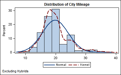
ods graphics / reset width=4in height=2.5in imagename='Histogram';
title 'Distribution of City Mileage';
footnote j=l 'Excluding Hybrids';
proc sgplot data=sashelp.cars(where=(type ne 'Hybrid'));
  histogram mpg_city;
  density mpg_city;
  density mpg_city / type=kernel;
  xaxis display=(nolabel);
  run;
- A Histogram, a Normal Density and a Kernel Density statements are overlaid to build this graph.
- A Title and a Footnote are used.
- Each axis is automatically computed by the procedure as a union of all the data assigned to it.
- The X axis is customozed to drop the display of the axis label, since that is covered in the title.
- The discrete legend is automatically generated by the procedure.
- Basic plots - scatter, series, step, needle, band, vector, etc.
- Fit plots - regression, loess, pbspline, ellipse.
- Distribution plots - histogram, density, box.
- Categoriazation plots - vbar, hbar, vline, hline, dot.
- Other statements - refline, keylegend, xaxis, yaxis, x2axis, y2axis, insets, etc.
Statements in groups 1-4 can be freely mixed and matched with other plots in the same group and with statements in group 5. Plots in groups 1 & 2 can be used together. In the distribution graph above, we have combined plots from group 3 and 5.
Bar-Line Graph: This is an example of a commonly used Bar-Line graph.

- Overlay a VLINE statement on a VBAR statement.
- Add a reference line at Y=25, to indicate the desired level of interest.
- The automatically generated legend is moved inside the data area.
- The X axis is customized to suppress the axis label.
- Y axis label is customized and gridlines are displayed.
ods graphics / reset width=4in height=2.5in imagename='Bar_Line';
title 'City and Highway Mileage by Type';
proc sgplot data=sashelp.cars cycleattrs;
  vbar type / response=mpg_city stat=mean;
  vline type / response=mpg_highway stat=mean transparency=0.6
               lineattrs=(thickness=10 pattern=solid);
  refline 25 / lineattrs=(thickness=2) label='Desired Mileage' labelloc=inside;
  keylegend / location=inside position=topright across=1;
  yaxis offsetmin=0 grid label='Mileage';;
  xaxis display=(nolabel);
  run;
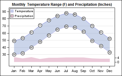
- The temperature range is represented by a band plot.
- Two scatter plots each are used to create the top and bottom "bubbles".
- A third scatter plot is used to print the value in the bubble using the MARKERCHAR option.
- A second band plot is used for the precepitation on the Y2 axis.
- The Y axis uses the upper 80% of the graph, and the Y2 axis the lower 15%.
ods graphics / reset width=4in height=2.5in imagename='Weather';
title 'Monthly  Temperature Range (F) and Precipitation (Inches)';
proc sgplot data=weather noautolegend cycleattrs;
  band x=month upper=high lower=low / fill outline transparency=0.6 name='temp'
          legendlabel='Temperature';
  scatter x=month y=high / markerattrs=(size=15 symbol=circlefilled color=black);
  scatter x=month y=high / markerattrs=(size=13 symbol=circlefilled color=white);
  scatter x=month y=high / markerchar=high;
  scatter x=month y=low / markerattrs=(size=15 symbol=circlefilled color=black);
  scatter x=month y=low / markerattrs=(size=13 symbol=circlefilled color=white);
  scatter x=month y=low / markerchar=low;
  band x=month upper=precip lower=0 / fill  transparency=0.6 y2axis name='rain'
          legendlabel='Precipitation';
  keylegend 'temp' 'rain' / location=inside position=topleft across=1;
  yaxis grid offsetmin=0.2 display=(nolabel);
  y2axis offsetmax=0.85 display=(nolabel);
  xaxis offsetmin=0.05 offsetmax=0.05 display=(nolabel);
  run;


