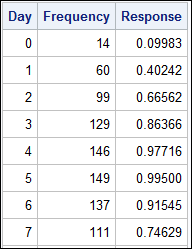
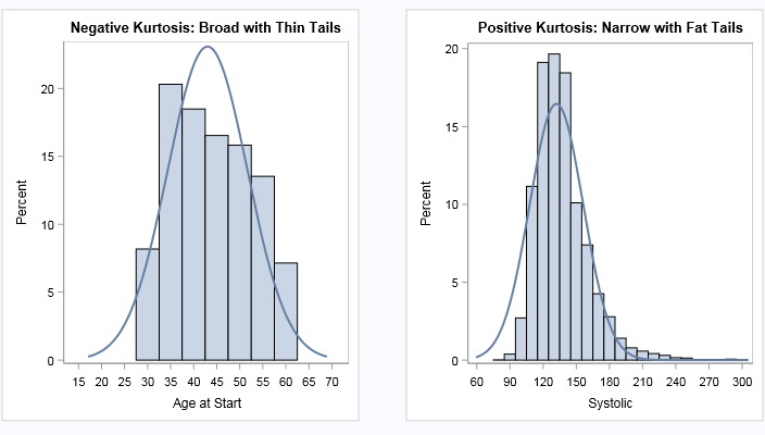
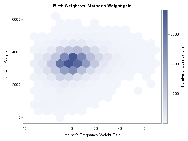
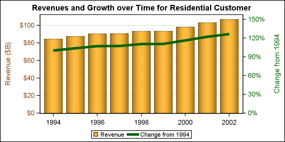
Search Results: sgplot (958)

Rick Wicklin 0
The frequency of letters in an English corpus

It's time for another blog post about ciphers. As I indicated in my previous blog post about substitution ciphers, the classical substitution cipher is no longer used to encrypt ultra-secret messages because the enciphered text is prone to a type of statistical attack known as frequency analysis. At the root

Data Visualization
Sanjay Matange 0
PharmaSUG-China 2014

The Third PharmaSUG-China conference was held in Beijing last week, and I had the pleasure to attend this excellent conference along with a record number of attendees. On Thursday, I presented two 1/2 day seminars on ODS Graphics.  One titled "Advanced Topics in GTL" and another titled "Complex Clinical Graphs

Data Visualization
Sanjay Matange 0
Binary Response Graph

Often we need to plot the response values for binary cases of a classifier.  The graph below is created to simulate one seen at http://www.people.vcu.edu/ web site of the shock index for subjects with or without a pulmonary embolism.  In this case, the data is simulated for illustration purposes only. There

Rick Wicklin 0
Order variables by values of a statistic

When I create a graph of data that contains a categorical variable, I rarely want to display the categories in alphabetical order. For example, the box plot to the left is a plot of 10 standardized variables where the variables are ordered by their median value. The ordering makes it

Rick Wicklin 0
How to create a hexagonal bin plot in SAS

While I was working on my recent blog post about two-dimensional binning, a colleague asked whether I would be discussing "the new hexagonal binning method that was added to the SURVEYREG procedure in SAS/STAT 13.2." I was intrigued: I was not aware that hexagonal binning had been added to a

Learn SAS
Rick Wicklin 0
Choosing bins for histograms in SAS

When you create a histogram with statistical software, the software uses the data (including the sample size) to automatically choose the width and location of the histogram bins. The resulting histogram is an attempt to balance statistical considerations, such as estimating the underlying density, and "human considerations," such as choosing

Data Visualization
Sanjay Matange 0
More on Spaghetti Plots

In her article Creating Spaghetti Plots Just got Easy, Lelia McConnell has provided us a glimpse into some new useful features in the SAS 9.4M2 release.  The term Spaghetti plots generally refers to cases where time series plots have to be  identified by multiple group classifications.  The support for the

Data Visualization
Sanjay Matange 0
Overlay Bar Charts

A couple of days back, Rick Wicklin forwarded me a link to an article on the BadHessian Blog on creating a Bar Chart using six different freeware packages in R, Python and Julia.   The target bar chart was one produced by the Jetpack stat module with WordPress.  The graph is shown below. The unique feature of

Data Visualization
Sanjay Matange 0
Group order in GTL

This post could be titled something like "Everything you wanted to know about Group Order in GTL - and more."   The group ordering shows up in three different ways in your graph. Assignment of attributes (color, marker symbol) to group values. Position of group values in the graph. Display of the group

Rick Wicklin 0
Add a prediction ellipse to a scatter plot in SAS

It is common in statistical graphics to overlay a prediction ellipse on a scatter plot. This article describes two easy ways to overlay prediction ellipses on a scatter plot by using SAS software. It also describes how to overlay multiple prediction ellipses for subpopulations. What is a prediction ellipse? A

Data Visualization
Sanjay Matange 0
Spirals

Spirals are cool.  And useful.  We use them every day without thinking about it.  Every time the road turns from a straight line to a curve, we go through a transition spiral.  Spirals allow us to change curvature in a steady increasing or decreasing fashion.   Without a spiral, this

Data Visualization
Sanjay Matange 0
Proportional Euler Diagram

The topic of VENN diagrams had come up a while ago.  At that time, I thought it may be interesting to build a proportional VENN diagram.  But, reading up on VENN Diagrams, I learned that VENN diagrams represent all intersections of N sets, regardless of whether there are actually any observations in one

Rick Wicklin 0
Simulating data for a logistic regression model

In my book Simulating Data with SAS, I show how to use the SAS DATA step to simulate data from a logistic regression model. Recently there have been discussions on the SAS/IML Support Community about simulating logistic data by using the SAS/IML language. This article describes how to efficiently simulate

Rick Wicklin 0
Creating ODS graphics from the SAS/IML language

As you develop a program in the SAS/IML language, it is often useful to create graphs to visualize intermediate results. The language supports basic statistical graphics such as bar charts, histograms, scatter plots, and so on. However, you can create more advanced graphics without leaving PROC IML by using the

Data Visualization
Sanjay Matange 0
Swimmer plot

At PharmaSUG 2014 in San Diego, I had the pleasure of attending "Swimmer Plot: Tell a Graphical Story of Your Time to Response Data Using PROC SGPLOT", by Stacey Phillips.  In this paper, Stacey presented an interesting graph showing the effects of a study drug on patients' tumor size. Stacey

Data Visualization
Sanjay Matange 0
Grouped Timeline

Recently, a user posed a question on how to plot stacked frequencies on a time axis.  The data included frequencies of different viruses by week.  The data is modified to preserve confidentiality and is shown below. The user's first instinct was to use a bar chart with stacked groups.  This works for automatically computing frequencies

Data Visualization
Sanjay Matange 0
Report from PharmaSUG 2014

Just getting back from PharmaSUG 2014 in San Diego.  The conference was great, both inside and outside.  The organizers ordered up some great weather for the Padres game and also for dinner on the flight deck of the Midway Carrier. Our focus here being on graphics, we were all extremely gratified by the presentations in

1 23 24 25 26 27 32