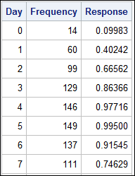
 A common scenario is where we have a table of multiple measures over time. Here we have a simple example of Frequency and Response by Day. The Response is a linear function of the Frequency, as shown in the table on the left below.
The shape of the data is not easily seen in the table alone. Here is where we can benefit from a visual display of the same data as shown in the graph below on the right.
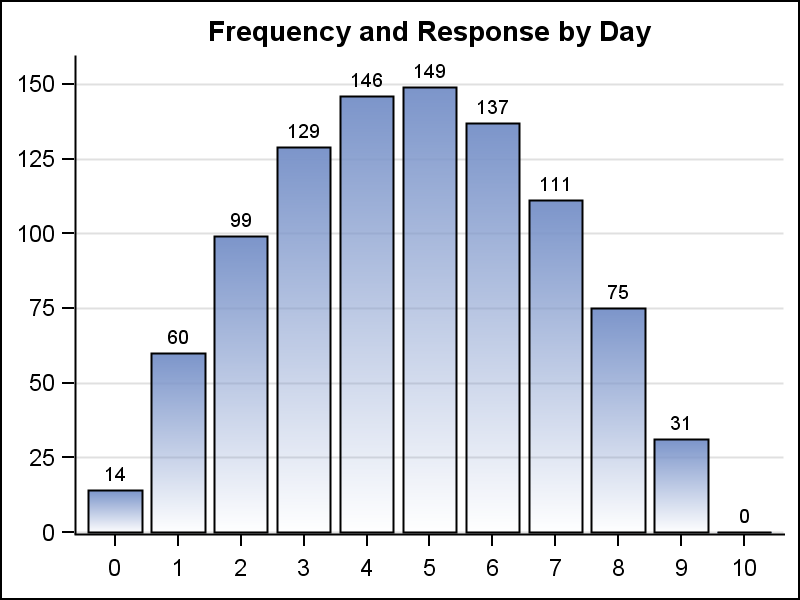 The shape of the data is clearly visible in the graph of Frequency by Day. The Frequency values are also displayed as bar labels. The Response values will have the same shape, but displaying more than one bar value will add clutter to the graph.
Here is where a "Graph Table" comes very handy. Instead of displaying a separate graph, I can display all the data columns and also add a display of the shape of the data all in one display.
With SAS 9.4, the YAxisTable can be used to easily create such a graph. The code is shown below:
proc sgplot data=data nowall noborder; hbar day / response=Frequency filltype=gradient fillattrs=graphdata2 nostatlabel baselineattrs=(thickness=0); yaxistable Day Frequency Response / location=inside position=left nostatlabel; yaxis display=none; xaxis display=none grid offsetmin=0.05; run; |
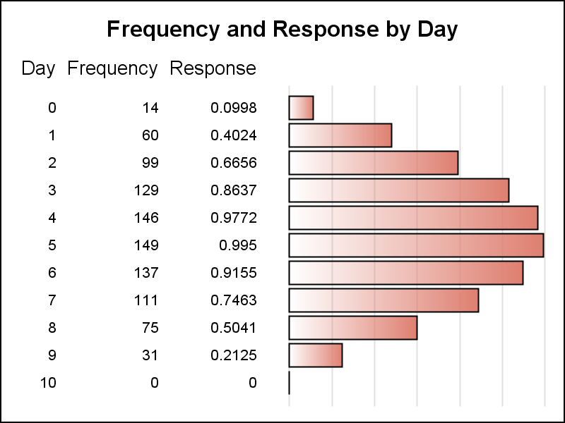 The Graph Table display is shown on the right. Note, all the columns from the table are included, and a HBar is added to display the shape of the response columns. In this case since the shape of both the columns is the same, I have left out the x axis information.
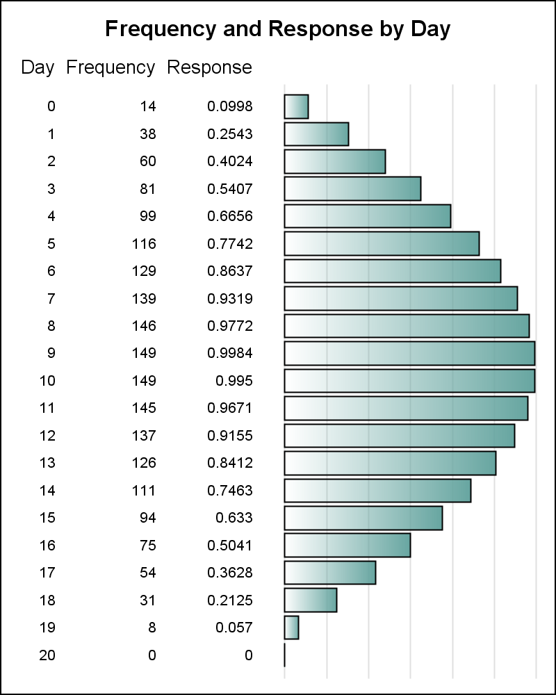
An additional benefit of this display is that it is scalable. As the data set gets longer, using a traditional VBAR chart can get cumbersome. The x axis will need to get longer till the graph will no longer fit a traditional report. A HBAR however, can grow vertically with the data to as much height as you may want.
For the graph below on the right, I have tied the height of the graph to the number of observations in the data set. So the graph grows with the table. See the full program attached at the bottom.
 If the data set gets too long to fit on a page of a document, you can split the graph into smaller sections to fit one on each page. This can be done by adding a classifier column with page values '1', '2' and so on for every N observations and then use the "BY" statement to produce graphs with a fixed number of observations per page. The graph axis is automatically scaled uniformly across all pages. This extension is left to the reader.
A popular use case of the Graph Table is the Forest plot. Here, you have multiple observations, one per study, with multiple columns of data and an odds ratio graph. The YAxisTable or its GTL sibling - the AxisTable makes creating such graphs very easy.
SAS 9.4 Code for Graph Tables: GraphTable


3 Comments
Is there any way I produce a step gradient filltype as the color of my hbar?
Thanks
It is not clear to me what result you are looking for.
Pingback: CTSPedia Clinical Graphs - Subgrouped Forest Plot - Graphically Speaking