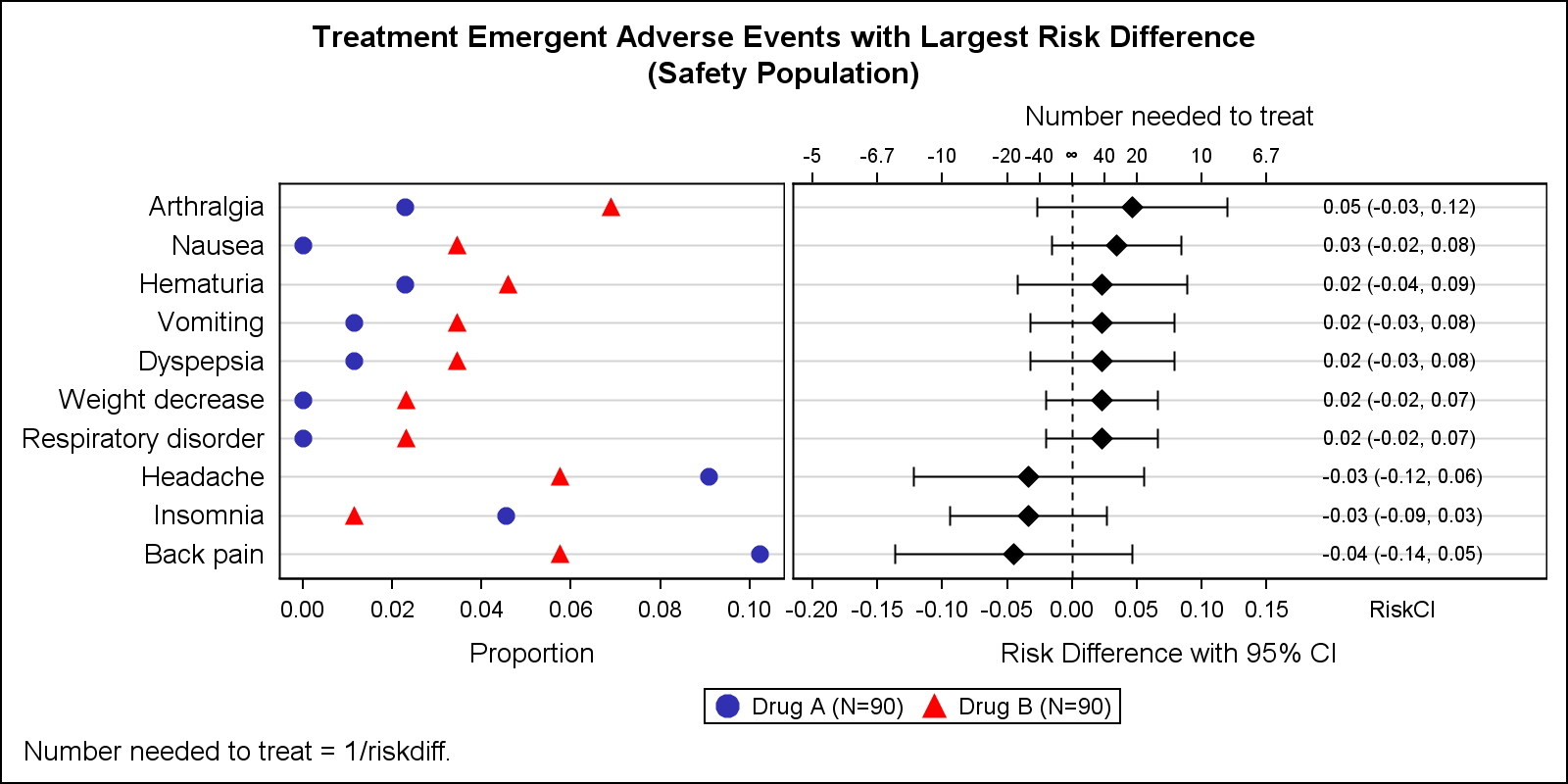
Tag: AXISTABLE

Data Visualization
Sanjay Matange 0
Graph Table

A common scenario is where we have a table of multiple measures over time. Here we have a simple example of Frequency and Response by Day.  The Response is a linear function of the Frequency, as shown in the table on the left below. The  shape of the data is

Data Visualization
Sanjay Matange 0
Survival Plot

One of the most popular graph amongst clinical and pharmaceutical users is the Survival Plot as created from the LIFETEST Procedure.  This is one graph that users most often want to customize.  See Creating and Customizing the Kaplan-Meier Survival Plot in PROC LIFETEST - Warren F. Kuhfeld and Ying So, SAS Institute