 Often, we have data where most of the observations are clustered within a narrow range, with a few outliers positioned far away. When all the data is plotted, the axis is scaled to accommodate all the data, thus skewing the scale. Techniques to handle such data have been addressed earlier in the article Broken Y Axis and Using Log Axes.
Users have previously voiced the need to support axis breaks in the procedures. This feature can get complicated very quickly, so our plan was to start with the simpler case, and then build based on your feedback.
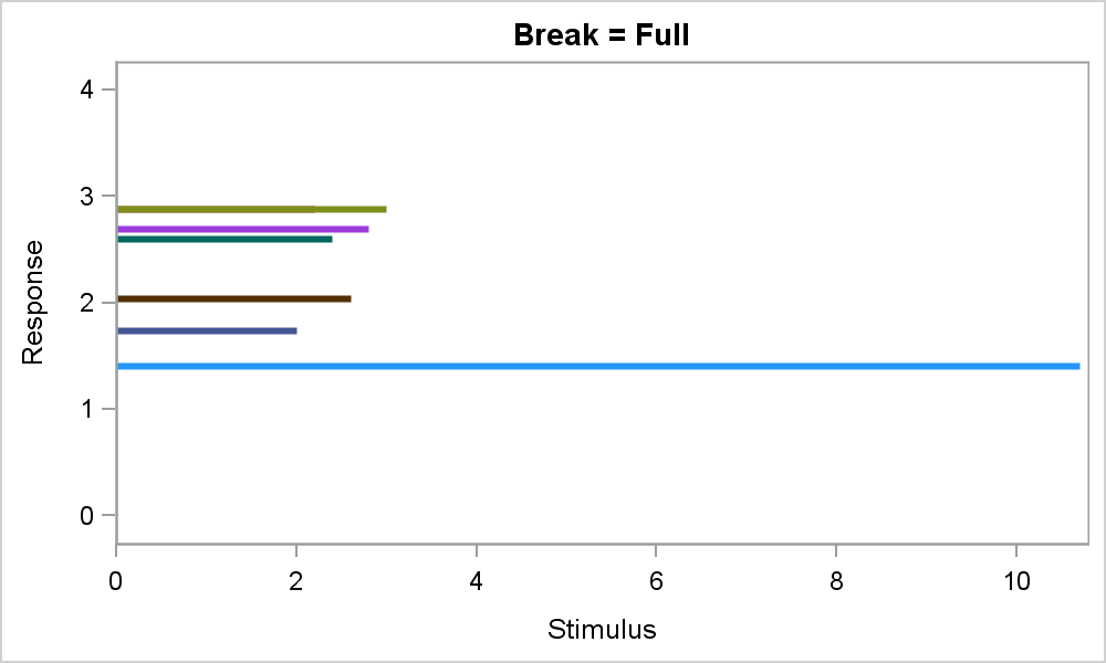
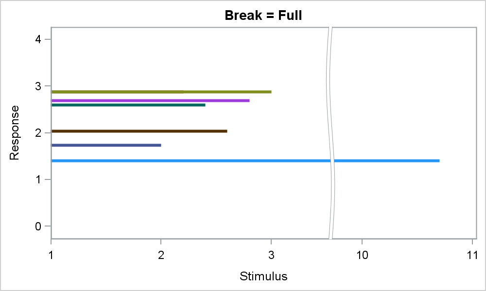 Support for axis ranges on one axis at a time is included in SAS 9.4M1. You can specify one or more breaks by providing the data range(s) that are to be retained. In the graph on the right, most of my data is between 2 and 3 on the x axis, with one outlier at x > 10. I use the RANGES option on the x axis to retain the data ranges 1-3.5 and 9.75-11.
SAS 9.4 SGPLOT code:
proc sgplot data=break noautolegend; highlow y=y low=zero high=x / group=y lineattrs=(thickness=3); xaxis ranges=(1 - 3.5 9.75-11) integer; yaxis min=0 max=4; run; |
As you can see in the graph above, only the ranges specified in the RANGES option are displayed on the x axis. An attempt is made to keep the tick value increments the same in the displayed regions. A full height break indicator is displayed across the entire height of the data area. Such breaks are useful when using plots like bars, needles or series. If the full break was not shown, it would not be obvious at first glance that the blue needle is broken.
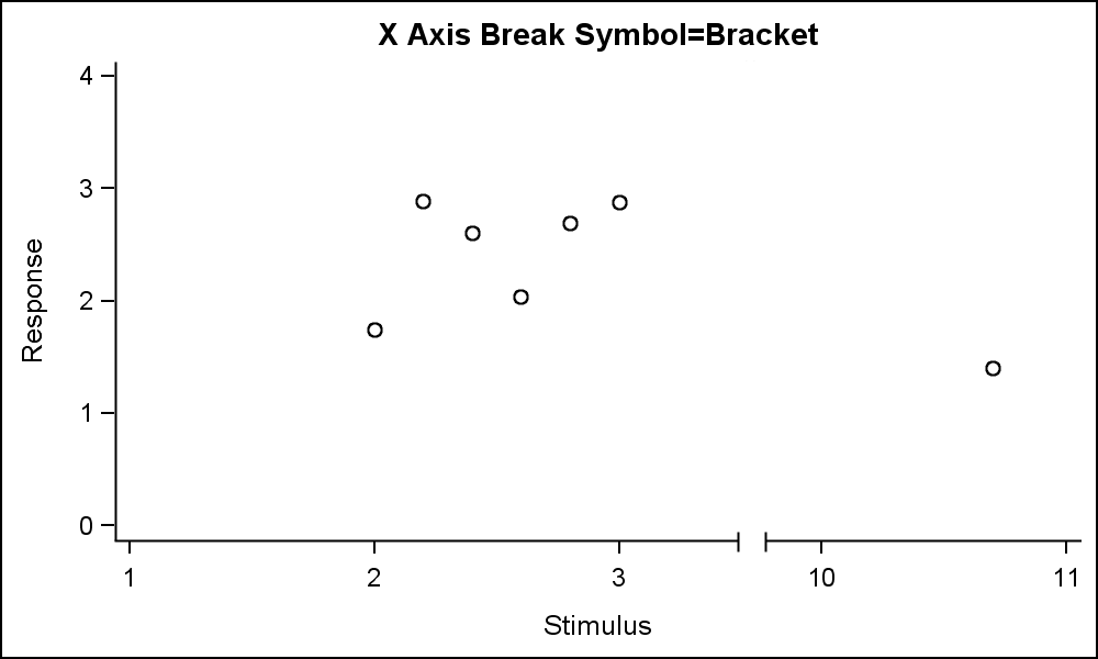 However, in many cases, such a full height break indicator is not desirable. When using scatter plots, users have expressed the need for axis break symbols on the axis only, without the display of the full break indicator. Such an axis break is shown in the graph on the right. One has to look carefully to see the "Bracket" break indicator shown on the x axis between "3" and "10". Click on the graph for a higher resolution image.
I created the above graph using the SGPLOT procedure, so how did I get this appearance? Well, the good news is that the procedure does all the hard work needed to draw only the necessary ranges, etc. and position the data correctly Now, all we have to do is replace the full axis break indicator with the axis break symbol. This task can be done using annotate. Since I know exactly the data extent of the break as provided by me in the RANGES option. I can use this information to erase the break indicator, and draw my own symbol on the axis.
The idea is simple. Use the POLYGON function to erase the full break using the same color as the wall or background. I go from the upper edge of the lower range and the lower edge of the upper range. Each coordinate is correctly transformed to the right location by the procedure. Then make the polygon the full height of the graph data area. Using a RECTANGLE function will not work, as we do not know the pixel width of the break. Note in the attached program, I adjusted the values a bit to allow for the curvy line. Then, I draw the axis break myself between the Low and High values of the ranges.
I converted the code into a macro to erase the full break and draw axis break symbol for the case of one break:
%AxisBreak (Axis=, Low=, High=, DataOut=, Type=, Back=, Aspect);
 Axis is X or Y, Low and High are the data values for the break region. So, in my case for the example above, Low=3.5, High=9.75. DataOut is the name of the annotation data set generated, Type is the break type. Back indicated whether or not you include the wall in the display, and Aspect is the aspect of the graph.
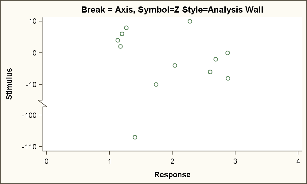
The macro generates the necessary annotation data set that erases the full break, and replaces it with a simple axis break of type Bracket or Z. The graph on the right uses a "Z" break symbol on the Y axis. Note, the data range of the axis cover -ive and +ive values.
SGPLOT code with Macro:
%AxisBreak (Axis=X, low=3.5, high=9.75, dataout=anno, back=Wall type=Bracket); proc sgplot data=break noborder sganno=anno; scatter x=x y=y; xaxis ranges=(1 - 3.5 9.75 - 11) integer; yaxis min=0 max=4; run; |
Due to the way axis breaks are implemented in the code, only break symbols of type Bracket and Z can be drawn reliable using this technique. But at least you now have a way to display simple axis break symbols, instead of the full length or width break indicator. We plan to include simple axis break symbols in the next release as requested by you. So, keep your ideas coming. Till then, you can use the ideas used in this macro.
I have tested the macro for a few different cases with different styles, with or without wall, different dpi, different graph sizes and data ranges. It seems to handle most cases of one break on one axis, but I have not tested for presence of required variables, etc. or bad data. It is provided just as a tool. I am sure the idea can be extended to multiple breaks on one axis if you have such a case. I'll leave that exercise to the reader.
SAS Code: Axis_Break_Poly_Macro


3 Comments
Hi Sanjay,
Thank you for the code. Is this also applicable in the proc template? Thanks!
Jane
Hi Sanjay,
I have been trying to use this macro to whiteout the curvy lines on the y-axis but it doesn't cover the entire line. Do you know of any way to fix that? Has anyone encountered this problem? Is SAS working on an option to edit the curvy line into a "straight line" or "no line" options?
NOTE: this box is not allowing me to show you the plot I am working on. Please see code below.
David-Erick
%AxisBreak (Axis=Y, low=2.3, high=2.4, dataout=anno, back=WALL, type=BRACKET);
proc sgplot data = CRPM4 noautolegend sganno = anno ;
title justify = L " ";
series x = x y = y;
vbox CRPM / category=day clusterwidth = 0.5 fillattrs=(color=lightgray) datalabelattrs=(size=9) boxwidth=.5;
series x = x y = y;
xaxis label="Time points" values=(0 365);
YAXIS LABEL = "C-Reactive Protein (mg/dL)" values=(.1 to .8 by .1 2.3 to 2.4 by .1 3.5 to 3.6 by .1) ranges=(0-.9 2.3-2.4 3.5-3.6) ;
format day visit_APOAI. ;
inset " p=0.6422 " / position=top;
run;
Yes, SAS 9.40M3 provides different ways to display axis break. While the "Full break' is still supported, the software now also provides options to break only the axis, with 6 different symbols. This may be more suitable for some cases. See http://blogs.sas.com/content/graphicallyspeaking/2015/09/02/broken-axis-redux/