Often when the data includes some extreme difference in measures or some outliers, the plot of the data points can get skewed due to the need to accommodate the extreme outliers. The bulk of the observations get squeezed into a smaller region of the plot. While this may be useful in some cases, often we want to allow the data to fill the plot region while still drawing the outliers.
 In such cases, a broken axis allows us to do just this. The previous article described how to use the Broken Axis feature first released with SAS 9.40M1.
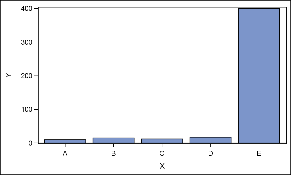
On the right is a contrived example of a case where the response value for one of the categories (E) is very large as compared to the other values. The large value causes the other values for categories "A", "B", "C" and "D" to be scaled down to where it is hard to make a good comparisons between these values.
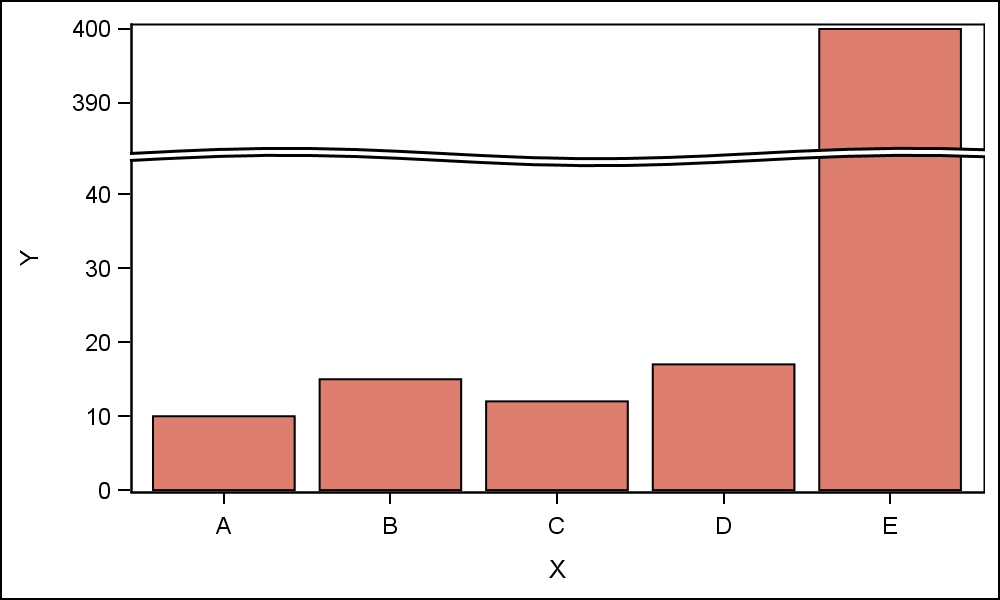
The graph on the right uses the Broken Axis feature first released with SAS 9.4M1, using the code shown below. The RANGES option on the YAXIS statement allows us to specify the data ranges we want to keep in the graph.
proc sgplot data=tallbar;
vbar x / response=y nostatlabel;
yaxis ranges=(min-44 384-max) values=(0 to 400 by 10);
run;
In this case, we have requested to keep the ranges from minimum to 44 and from 384 to maximum. Note, the value "44" is selected to place the break between the ticks. Also, the axis VALUES need to be provided to give the best results. The same tick interval is preserved in all the axis ranges. There can be more than one break, but on only one axis at a time.
 With SAS 9.40M1, the break was represented in the graph as the "Full Break" shown in the graph above. This was useful when breaking plot elements like bars or needles that have a continuous nature, and span over large parts of the graph width or height. However, this type of break was considered too distracting, and not preferred when breaking an axis for a scatter plot.
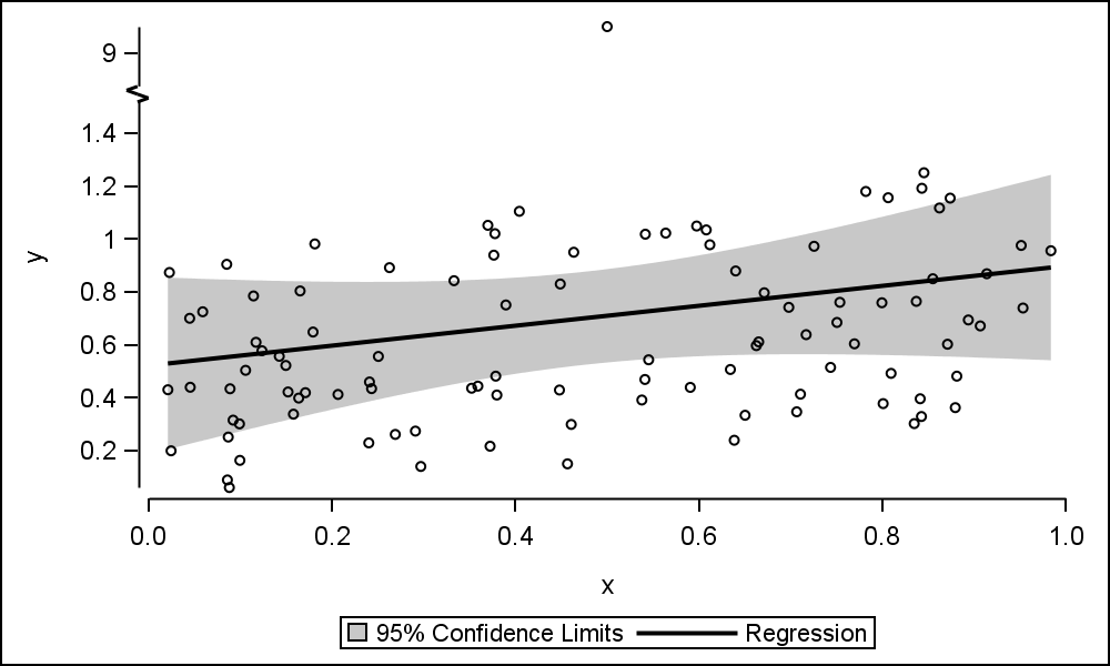
Based on such feedback from users, SAS 9.40M3 release includes the ability for us to request a lighter weight "Axis Break" as shown in the graph on the right. The code is shown below. Note the use of the AXISBREAK option inthe STYLEATTRS statement. Here we have selected "Bracket", which breaks only the axis using the two short bars. Click on the graph for a higher resolution view.
proc sgplot data=outOfRange;
styleattrs axisbreak=bracket;
reg x=x y=y / clm markerattrs=(size=5);
yaxis ranges=(min-1.5 8.9-max) values=(0 to 10 by 0.2) valueshint;
run;
 Many different types of break symbols can be used, such as the "Spark" shown in the graph on the right. If the axis line is absent, then the symbol is not shown.
Note another interesting feature in the graph on the right. The X and Y axis lines does not extend all the way to touch each other. This provides another "look and feel" for the graph display, often preferred by some users. This is controlled by the AXISEXTENT option on the STYLEATTRS statement as shown below. Note, the axis line extends to the data range only. So, in this case, the data range goes beyond the extreme tick marks on the y-axis.
styleattrs axisbreak=spark axisextent=data ;
Full SAS9.40M3 Code: BrokenAxis


7 Comments
Hi Sanjay,
I was using the code above for scatter plot where I wanted to break x axis. and I was getting an error. 121 ods listing style=analysis;
122 ods graphics / reset width=5in height=3in imagename='ScatterBrokenAxisBracket';
123 proc sgplot data=esc ;
124 where Analysis_Time_Point_Hours>0;
125 styleattrs axisbreak=bracket;
---------
22
202
ERROR 22-322: Syntax error, expecting one of the following: ;, DATACOLORS, DATACONTRASTCOLORS,
DATALINEPATTERNS, DATASYMBOLS.
ERROR 202-322: The option or parameter is not recognized and will be ignored.
126 scatter x= time1/*Analysis_Time_Point_Hours*/ y=avg_conc /group=Actual_Treatment
126! yerrorlower=lower yerrorupper=upper markerattrs=(symbol=CircleFilled );
127 series x= time1/*Analysis_Time_Point_Hours*/ y=avg_conc /group=Actual_Treatment
127! lineattrs=(thickness=2 pattern=solid );
128 yaxis values=(0 to 60000 by 5000)
129 label="Mean (+/- SD)" minor;
130
131 xaxis ranges= (min-350 650-1425) values=(0 to 1425 by 50) valueshint
132 label="Scheduled Time Point (Hours)" ;
133 title1 'Mean Plasma Concentration (ng/mL) by Scheduled Sampling Time(hours) for Escalation
133! Cohorts, linear scale (PK Population)';
134 title2 'DRAFT';
135 *REFLINE 0 / TRANSPARENCY = 0.5 AXIS=Y;
136 run;
NOTE: The SAS System stopped processing this step because of errors.
NOTE: PROCEDURE SGPLOT used (Total process time):
real time 0.00 seconds
cpu time 0.00 seconds
Do you know why?
This is a new feature released with SAS 9.40M3. Do you have that release level?
Pingback: High school rankings of top NCAA wrestlers - The DO Loop
Thank you very much! This has been very useful feature.
Hello Sanjay,
Do you have any suggestions for implementing a broken axis command in PROC SGPANEL? As far as I'm aware, the 'ranges' option is not available in SGPANEL.
Thanks.
Can this be used within STATGRAPH Templates specifically PROC REG? And can you do it on both axes at once? I have data on the log scale where there are no data available from 0-3 log, but want the axes to reflect that the data could be possible so want something like:
proc template;
define statgraph Stat.Reg.Graphics.Fit / store = SASuser.Templat;
notes " ";
dynamic _DEPLABEL _DEPNAME _MODELLABEL _SHOWSTATS _NSTATSCOLS _SHOWNObs
_SHOWTOTFREQ _SHOWNParm _SHOWEDF _SHOWMSE _SHOWRSquare _SHOWAdjRSq
_SHOWSSE _SHOWDepMean _SHOWCV _SHOWAIC _SHOWBIC _SHOWCP _SHOWGMSEP
_SHOWJP _SHOWPC _SHOWSBC _SHOWSP _NObs _NParm _EDF _MSE _RSquare
_AdjRSq _SSE _DepMean _CV _AIC _BIC _CP _GMSEP _JP _PC _SBC _SP
_PREDLIMITS _CONFLIMITS _XVAR _SHOWCLM _SHOWCLI _WEIGHT _SHORTXLABEL
_SHORTYLABEL _TITLE _TOTFreq _byline_ _bytitle_ _byfootnote_;
BeginGraph;
entrytitle halign=left textattrs=GRAPHVALUETEXT _MODELLABEL halign=
center textattrs=GRAPHTITLETEXT "Linear regression of Roche and Aptima viral load assays, log10 copies/ml";
layout Overlay / yaxisopts=(label=_DEPLABEL shortlabel=_SHORTYLABEL
linearopts=(viewmin=0 viewmax=7 ranges=(0-0.1 2.9-max)))
xaxisopts=(shortlabel=_SHORTXLABEL linearopts=(viewmin=0 viewmax=7 ranges=(0-0.1 2.9-max)));
…
Is that possible? I am not seeing it in the documentation but hope that it's in the latest version?? NOTE: SAS (r) Proprietary Software 9.4 (TS1M3)
In GTL, the option is called INCLUDERANGES, and yes, it is supported in 9.4m3. However, you currently can use it only on one axis at a time.