 Beginning with the first maintenance of SAS 9.4, you have the ability to define your own symbol markers using the SYMBOLCHAR and SYMBOLIMAGE statements. With these statements you can select a Unicode value or you can select an image file that exists on the local file system—making the possibilities for customizing your graphs almost unlimited.
In releases prior to SAS 9.4, the symbol markers supported by the SG procedures are limited to the ones listed in this table:

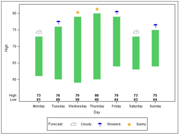
In the examples below, I’ll use a weather chart to show you two different methods for creating custom symbols to suit almost any graph or reporting need. Both techniques begin with standard Unicode values and the new SYMBOLCHAR statement.
Creating the symbols
The first program below includes three SYMBOLCHAR statements. Each SYMBOLCHAR statement contains the name of the symbol and a corresponding Unicode value. Supported image types are GIF, JPEG and PNG files.
Keep in mind that these Unicode values are not SAS specific. A list of valid Unicode values can be found on the Unicode Character Name Index page supplied by The Unicode Consortium. Our data is weather related so I found Unicode values for these symbols:
- sun ‘2600’x
- cloud ‘2601’x
- umbrella ‘2602’x
In this example I want to offset the symbols vertically so they do not overlap the HIGHLOW interpolation. Offsetting is done with the VOFFSET option on the SYMBOLCHAR statement. Here’s how those symbols will be used in the final graph:
Producing the graph with Graph Template Language
Once the symbols are defined, I set up a discrete attribute map to assign the color for each symbol based on the values in the data set: Sunny, Cloudy and Showers. Everything is tied together through the DISCRETEATTRVAR statement by associating an attribute variable, SIGN, with the data set variable, FORECAST. Assigning the GROUP option a value of SIGN is the final step.
The AXISTABLE statement, which is a new statement in SAS 9.4, produces the table containing the high and low temperatures inside the axes at the bottom the graph.
data temperatures;
input Day : $9. High Low Forecast $7.;
datalines;
Monday 73 61 Cloudy
Tuesday 76 60 Showers
Wednesday 79 59 Sunny
Thursday 80 60 Sunny
Friday 79 64 Showers
Saturday 73 63 Cloudy
Sunday 75 64 Showers
;
run;

ods path(prepend) work.templat(update);
proc template;
 define statgraph temp;
 begingraph;
 symbolchar name=cloudy char='2601'x /voffset=.5;
 symbolchar name=sunny char='2600'x / voffset=.5;
 symbolchar name=showers char='2602'x / voffset=.5;

 discreteattrmap name='symbolmap';
   value 'Sunny' / markerattrs=(symbol=sunny color=orange);
   value 'Cloudy' / markerattrs=(symbol=cloudy color=grey);
   value 'Showers' / markerattrs=(symbol=showers color=blue);
enddiscreteattrmap;
discreteattrvar attrvar=sign var=forecast attrmap='symbolmap';

 layout overlay;
    highlowplot x=day low=low high=high / lineattrs=(color=biyg thickness=20pt);
    scatterplot x=day y=high /group=sign markerattrs=(size=25pt) name='weather';
  discretelegend 'weather' / title='Forecast';
    innermargin / align=bottom;
      axistable x=day value=high / valueattrs=(size=9pt weight=bold);
      axistable x=day value=low / valueattrs=(size=9pt weight=bold);
    endinnermargin;
 endlayout;
 endgraph;
 end;

proc sgrender template=temp data=temperatures;
run;
Producing the graph with PROC SGPLOT
This graph can also be produced with PROC SGPLOT using the SYMBOLCHAR statements. In this instance the attribute map is defined within the data step that creates the data set MYATTRMAP. The attribute map is referenced with the ATTRID option on the SCATTER statement. Below is sample code that illustrates the syntax.
data temperatures;
input Day : $9. High Low Forecast $7.;
datalines;
Monday 73 61 Cloudy
Tuesday 76 60 Showers
Wednesday 79 59 Sunny
Thursday 80 60 Sunny
Friday 79 64 Showers
Saturday 73 63 Cloudy
Sunday 75 64 Showers
;
run;

data myattrmap;
  input id $ value $ markercolor $ markersymbol $;
datalines;
myid Cloudy grey cloud
myid Sunny orange sun
myid Showers blue umbrella
;
run;
proc sgplot data=temperatures dattrmap=myattrmap;
   highlow x=day low=low high=high /lineattrs=(color=biyg thickness=20pt);
   scatter x=day y=high / markerattrs=(size=25pt) attrid=myid group=forecast;
   symbolchar name=Cloud  char='2601'x / voffset=.5;
   symbolchar name=Sun char='2600'x / voffset=.5;
   symbolchar name=Umbrella char='2602'x / voffset=.5;
   xaxistable high / valueattrs=(size=9pt weight=bold)location=inside ;
   xaxistable low / valueattrs=(size=9pt weight=bold) location=inside;
run;
You can download the full programs from the following SAS Samples:
- Sample 54314: Customize your symbols with the SYMBOLCHAR statement in the Graph Template Language (GTL)
- Sample 54315: Customize your symbols with the SYMBOLCHAR statement in PROC SGPLOT
What special symbols can you use in your graphs? Let me know how the new SYMBOLCHAR statement will work for you!

5 Comments
PSA: If your symbols are cut off at the top, simply change VOFFSET from 0.5 to something smaller. I used 0.23.
I was unable to find something to analogously vertically offset the XAXISTABLE, but it's a small win, none-the-less.
Use the yaxis statement with the max=... option to change your y-axis and give room for the symbol.
Below is sample code that illustrates how to specify a white filled marker with a black outline so the line connecting the points is not seen through the markers:
proc sgplot data=sashelp.class;
series x=name y=age / markers markerattrs=( symbol=circlefilled color=white) markeroutlineattrs=(color=black) filledoutlinedmarkers ;
run;
Regards,
Lelia
Dear SAS users,
I have a question about the symbols in sgplot that I hope you might be able to help me with.
When SAS generates my graphs I see that the lines goes through the symbol=circle, but I was wondering if SAS 9.4 is able to place the markers/symbols in front. So that the lines are not visable within the open circle?
Best regards,
Mark
Great post Lelia to show the 2 procs in action... I also like Sanjay Matange's post about the SYMBOLCHAR and SYMBOLIMAGE statements where he highlights how the rotate option can be useful http://blogs.sas.com/content/graphicallyspeaking/2014/01/26/more-symbols-you-say/