Users have often expressed the need for more marker symbols. ODS Graphics supports over 30 scalable marker symbols, both filled and empty. As mentioned in an earlier article, with SAS 9.4, filled markers can now have outlines and fills, and can also have special effects.
Also with SAS 9.4, now you can specify group colors or markers that you want to use using the STYLEATTRS statement. With SAS 9.4 M1, you can now define your own marker shapes, so you can have exactly the marker you need. This can be done using two new statements in GTL and SG. I will demonstrate the feature using SG syntax.
One new statement is SYMBOLCHAR. With this statement you can define a symbol using any character from any font. The other is SYMBOLIMAGE. As expected, you can define a symbol using any image. With these two statements you can literally have any symbol you need.
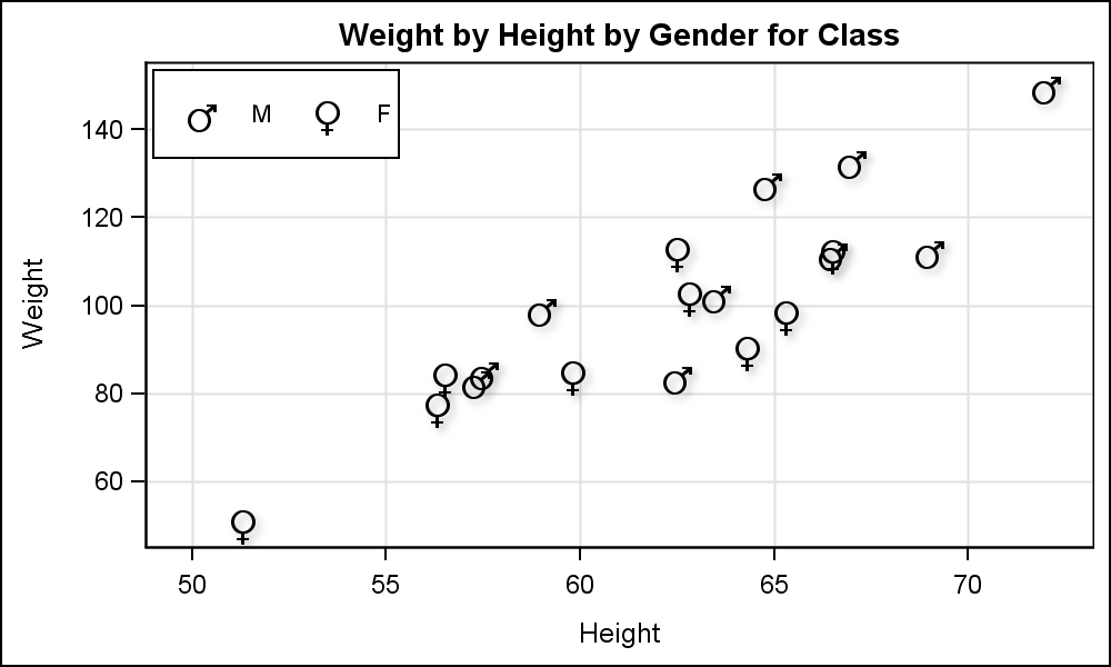
Here is an example of using the SYMBOLCHAR statement to define two new marker symbols from the ARIAL Unicode MS font. I have use the Greek symbols for males and females. Here is the graph using the SASHELP.CLASS data set. Click on the graph for a high resolution version.
SAS 9.4 SGPLOT code:
Title 'Weight by Height by Gender for Class'; proc sgplot data= sashelp.class; symbolchar name=male char='2642'x / textattrs=(family='Arial Unicode MS' weight=bold); symbolchar name=female char='2640'x / textattrs=(family='Arial Unicode MS' weight=bold); styleattrs datasymbols=(male female); scatter y=weight x=height / group=sex name='a' markerattrs=(color=black size=30) dataskin=sheen; keylegend / location=inside position=topleft opaque; xaxis grid offsetmin=0.05 offsetmax=0.05; yaxis grid offsetmin=0.05 offsetmax=0.05;; run; |
In this program, I have used the following features:
- I have used two SYMBOLCHAR statements to define two new symbols called 'male' and 'female'.
- I have used the new STYLEATTRS statement to use only these two symbols for groups.
- Now, it so happens the order of the data is as expected. Else we can use the Discrete Attribute Map statement to associate the correct symbol to the correct group value.
- The symbols thus defined also respond to other marker attributes like color and size. Here we have explicitly set the color to black. Also, a faint drop shadow can be seen due to DATASKIN.
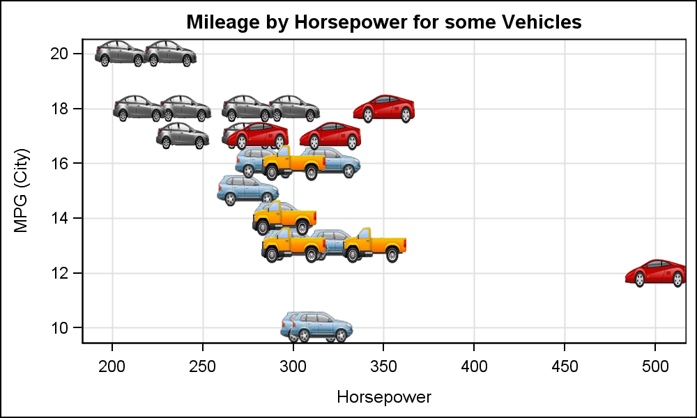
In the graph below, I have used the new SYMBOLIMAGE statement to define marker symbols from images. This can be very useful, as you can use familiar images for groups, thus reducing the effort for decoding the graph. This is very useful when using logos. I did not use company logos to avoid any copyright issue but you can likely see the use case. While I would recomment caution when using images from the web, you can certainly use images owned by your own company.
SAS 9.4 SGPLOT code:
Title 'Mileage by Horsepower for some Vehicles'; proc sgplot data=cars; symbolimage name=sedan image='C:\Sedan_Trans.png'; symbolimage name=sports image='C:\Sports_Trans.png'; symbolimage name=suv image='C:\SUV_Trans.png'; symbolimage name=truck image='C:\Truck_Trans.png'; styleattrs datasymbols=(suv sedan sports truck); scatter x=horsepower y=mpg_city / group=type markerattrs=(size=50); xaxis grid offsetmin=0.05 offsetmax=0.05; yaxis grid offsetmin=0.05 offsetmax=0.05;; run; |
In this program, I have used the following features:
- I have used four SYMBOLIMAGE statements to define four different marker symbols named 'sedan', 'sports', 'suv' and 'truck', each from the associated image from the file system.
- Note, I have used "transparent" images where the pixels outside the actual image are transparent. So, these icons only draw the needed pixels, not the background pixels that make up the rectangular bounding box.
- Once again, I have used the STYLEATTRS statement to define the list of marker symbols to be used for the groups.
- Here, I have skipped adding the legend. Can you make out just by the icons which one is which type?
Finally, both SymbolChar and SymbolImage support a rotation angle. In the example below, I have used that feature to use angular orientation for classification. I originally saw this idea in a paper by Dr. Healey from NC State University, where he proposed that symbol orientation can be a "pre-attentive" feature for classification.
Here, I used the '25AC'x Unicode character, which is the simple horizontal bar. I defined a symbol using this character with rotation angle of zero, and one with angle of 90. Here is the graph:

SAS 9.4 SGPLOT code:
Title 'Weight by Height by Gender for Class'; proc sgplot data= sashelp.class; symbolchar name=male char='25AC'x / textattrs=(family='Arial Unicode MS' weight=bold) rotate=0; symbolchar name=female char='25AC'x / textattrs=(family='Arial Unicode MS' weight=bold) rotate=90; styleattrs datasymbols=(male female); scatter y=weight x=height / group=sex name='a' markerattrs=(color=black size=30) dataskin=sheen; keylegend / location=inside position=topleft opaque; xaxis grid offsetmin=0.05 offsetmax=0.05; yaxis grid offsetmin=0.05 offsetmax=0.05;; run; |
Full SAS 9.4 code: Symbols


