Often we need graphs that display two or more responses by the same category values. In many cases it is useful to plot both responses on the same response (Y) axis. This can be helpful to understand the data and compare the magnitudes side by side. This works when the scales of both the response values are comparable and consistent.
 However, the scales for the two responses may not be similar or consistent. One common use case is when we are visualizing the actual and % changes for some categories as shown in the graph on the right.
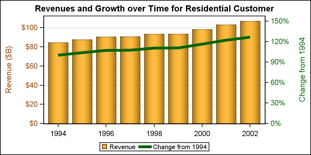
For this example, I have run the MEANS procedure to compute the revenues by year for all the customers by year, and selected only the "Residential" customer for the graph. I have also computed the change in the values for subsequent years from the first year (1994).
In the graph above, I have plotted the actual revenues in Billions of $ for Residential customers as a bar chart on the default Y (left) axis. The "Change" values with a PERCENT format are plotted as a Series plot on the Y2 (right) axis . I have colored the Y axis ticks and label using a color consistent with the bars and the Y2 axis ticks and label using color consistent with the line. This graph displays all the data correctly, in a way that is easy to comprehend. Note: I am actually using HIGHLOW instead of VBAR as it allows me to use a linear axis.
title 'Revenues and Growth over Time for Residential Customer'; proc sgplot data=ElecRevChange(where=(customer='Residential')); styleattrs datacolors=(orange orange) datacontrastcolors=(cx8f3f00 darkgreen); highlow x=year low=zero high=revenue / name='a' legendlabel='Revenue' type=bar nooutline fillattrs=graphdata1 dataskin=pressed; series x=year y=change / name='b' lineattrs=graphdata2(thickness=5) y2axis; xaxis integer display=(nolabel); yaxis offsetmin=0 min=0 valueattrs=graphdata1 labelattrs=graphdata1 grid; y2axis offsetmin=0 min=0 values=(0 .30 .60 .90 1.20 1.50) valueattrs=graphdata2 labelattrs=graphdata2; keylegend / linelength=20px; run; |
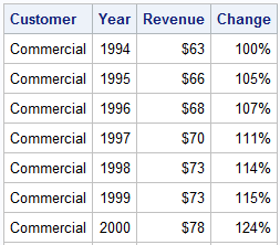 As we can see in the data table on the right, while the "Change" values are shown with a % format, the values themselves are fractional between 1.0 - 2.0. The Percent format converts the fractional values into a % number. So, mixing values with Percent and non-Percent format on the same axis can result in a bad graph.
The axis format is determined by the "Primary" plot, usually the first plot in the list. In this case, the revenues are plotted first using a bars on the default Y axis. So, the default format for the Y axis comes from the bar. If the series plot is also plotted on the same axis, those fractional values will be displayed with a non-percent format, and will not be visible in comparison with the revenue values as shown in the graph below on the right.
 In the graph on the right, the green line showing change is way down near the baseline. This is because the response values are all fractional numbers between 1-2, and are plotted on the same axis as the revenues with an axis range of 100.
Things get even worse if the plot with the % format is primary, causing the axis format to be %. Plotting data having a n0n-percent format on the same axis,will cause those values to be scaled by 100.
proc sgplot data=ElecRevChange(where=(customer='Residential')); styleattrs datacolors=(orange orange) datacontrastcolors=(cx8f3f00 darkgreen); highlow x=year low=zero high=revenue / name='a' legendlabel='Revenue' type=bar nooutline fillattrs=graphdata1 dataskin=pressed; series x=year y=change / name='b' lineattrs=graphdata2(thickness=5); xaxis integer display=(nolabel); yaxis offsetmin=0 min=0 valueattrs=graphdata1 labelattrs=graphdata1 grid; keylegend / linelength=20px; run; |
In such cases, it is best to use a graph with two independent response axes, as shown in the graph at the top of this article. Now, each axis has data with consistent formats, and life is good. Note, each axis has its own data range. In order to have nice grid lines, one has to ensure each axis has equal number of ticks so the grid lines from one axis can work for both. Else, you will have two sets of grid lines.
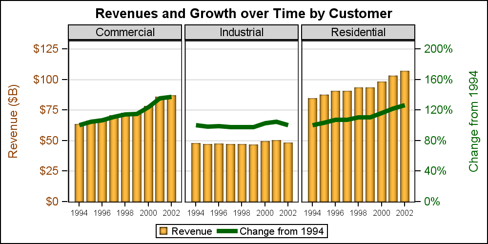 So far so good. But now let us take the next step. We want to plot the graph for all customers, Commercial, Industrial and Residential in a panel. We still want to see both revenues and change as a panel shown on the right.
One would think this would be a simple matter of changing from using a SGPLOT to SGPANEL, using "customer" as the panel variable. In general, you would be right, except here we have crossed the 80-20 feature balance between SG and GTL. Supporting dual response axes for SGPANEL is a much harder task, and something not frequently requested by users. So, what do we do, and how did make the graph on the right?
Well, here is where we have to step out of the comfort zone of SG Procedures and move into the domain of GTL. Clearly, all of SG features are implemented using GTL programs behind the scenes. SGPANEL uses the GTL LAYOUT DATAPANEL and LAYOUT DATALATTICE to create the panels. GTL does support dual response (and category) axes for panels. So, now I have used the Layout DataPanel container in GTL, along with the BarChart and SeriesPLot statements. The relevant part of the code is shown below, stripping all the options. As you can see, it is not so hard to follow. Full code is included in the attached program.
layout datapanel classvars=(customer) / rows=1 headerlabeldisplay=value layout prototype / cycleattrs=true; highlowplot x=year low=zero high=revenue / name='a' legendlabel='Revenue' type=bar; seriesplot x=year y=change / name='b' lineattrs=graphdata2(thickness=5) yaxis=y2; endlayout; endlayout; |
Dual Axis Graphs: DualAxis


2 Comments
Good afternoon!
I would like to make a graphic similar to this, but I needed the colors of the bars to be dynamic, if it exceeded the value of the line, it would change color, how could I do that?
In this case, the line and bar have different scale values entirely, and use two different y-axes. So, your use case would not work. You would need to plot both line and bar on same y-axis. You can change the color of the bar, but you have to do it be computing another column for each bar which has a value of "Above" or "Below" based on whether the bar exceeds the line for each category. Then, use that as a GROUP role to change the color of the bar.