SAS 9.4 maintenance release M2 was released early in August. This release contains some exciting new features in GTL and SG Procedures. In this article, I will describe some of the new options added to the existing plot statements. Note, I will use the SG examples here, but these are also available in GTL.
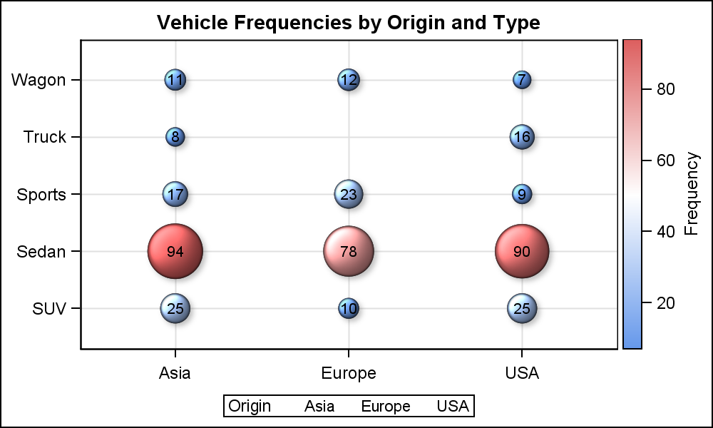 Bubble Plot with Response Color: The bubble plot now supports color response role, so you can color each bubble by a color that represents the level as shown in the graph on the right. A gradient legend is also displayed by default. Bubble labels can be displayed at one of the nine locations around the bubble. Color response role is also supported for Scatter and Polygon plot. In addition, a new GradLegend statement is added to display the color gradient.
The bubble plot supports both discrete and interval axis for both X and Y axis. In this case, both the size and the bubble color are based on the frequency variable N, previously computed using the MEANS procedure. Data skin is used to enhance the bubble rendering.
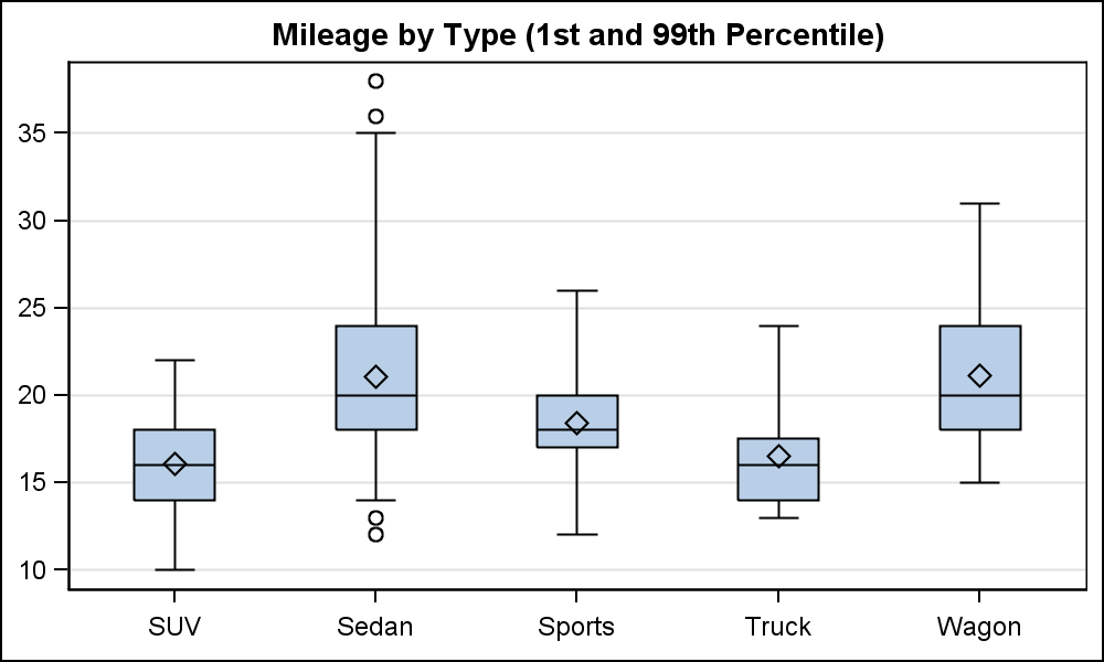 Box Whisker Percentile: This is a feature often requested by users to control the percentile of the whiskers in the box plots. A new option WhiskerPct=number is supported, where number is between 0 and 25. The graph on the left uses WhiskerPct=1, thus displaying the 1st and 99th percentile whiskers. Jittered markers can be overlaid on a box plot, and a new JitterWidth option is added to control the spread of the jittered markers.
VBarParm with Stacked Groups: Stacked groups were previously disallowed in SGPLOT due to the complexity of getting uniform axes across BY variables. Now, this has been added.
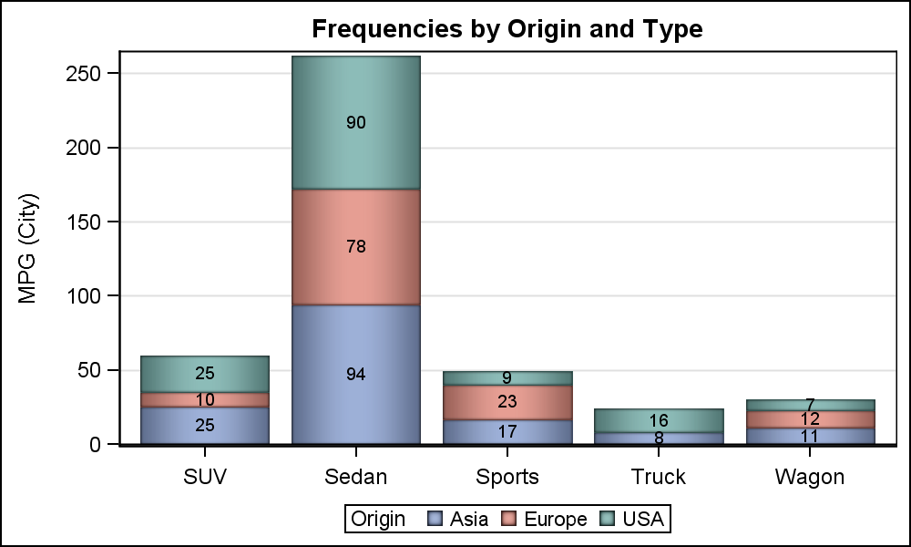 Segment labels are also added both to VBar/HBar and VBarParm/HBarParm. This allows us to display the labels for each segment of the bar (stacked or clustered) in the center of the bar. DataLabels can still be displayed at the top. SegmentLabelFitPolicy allows you to control whether the labels are clipped if they do not fit in the space. Here, the policy=none, so labels are all displayed.
Grouped Histograms and Fill Type: Another user requested feature is the grouped histogram and density plots. Earlier, you could create Comparative Histograms using overlay of two variables, like Systolic and Diastolic in the SASHELP.HEART data set. Now, you can do the same if these are group levels in the data set.
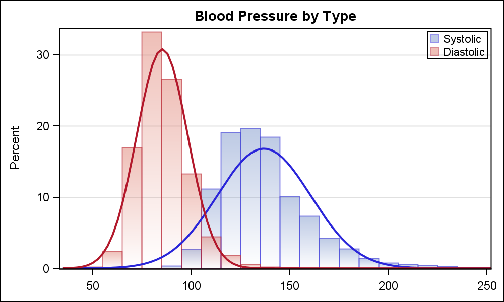 In this example, I have reformatted the heart data into a "grouped" structure, using Type=Systolic / Diastolic, with the BP column keeping the value. Now, I can set the role GROUP=Type to create the histogram shown on the right.
Note, I have taken the liberty of using the new FillType=Gradient option to get a different aesthetic look for the Histogram. Normally, one does not use such an option for histograms, but I used it mainly to avoid making another example with bar chart. The gradient is an Alpha gradient, not a color gradient, so more of the backdrop shows through near the bottom. In this case, it allows the shorter bins of the other group to show through, as can be seen near X=100. This type of gradient fill is available for histograms and bar charts.
Line color, Line Pattern, Marker color and Marker Symbol groups are now added to the Series Plot. This is a useful feature as explained in earlier articles on Spaghetti Plots. Many more little features and enhancements have been added, too numerous to enumerate here. You can review these in the Online Doc for SAS 9.4 and maintenance releases.
In the next article, I will discuss the whole new statement called TextPlot that has been added to both GTL and SG.
Full SAS 9.4M2 program for new features: SAS_94M2_Features_2


5 Comments
Where can I find the documentation for these new features? For instance, I tried searching support.sas.com for 'WhiskerPct' and zero hits were returned.
You have found a documentation defect. The correct syntax for the SGPLOT VBOX is indeed WhiskerPct=number. For GTL it is WhiskerPercentile=number. However, the doc shows both the GTL way. This will be fixed. The code attached to the article shows all the correct code.
Hello,
I am trying to plot "Bubble Plot with Response Color" with my data set but unable to do that. I would really appreciate if you could share the template/information for the same.
Thank you very much
Code for the bubble plot example is included in the same article. See the link to the code at the bottom of the article.
The code for the bubble plot is included in the link at the bottom of the blog article.